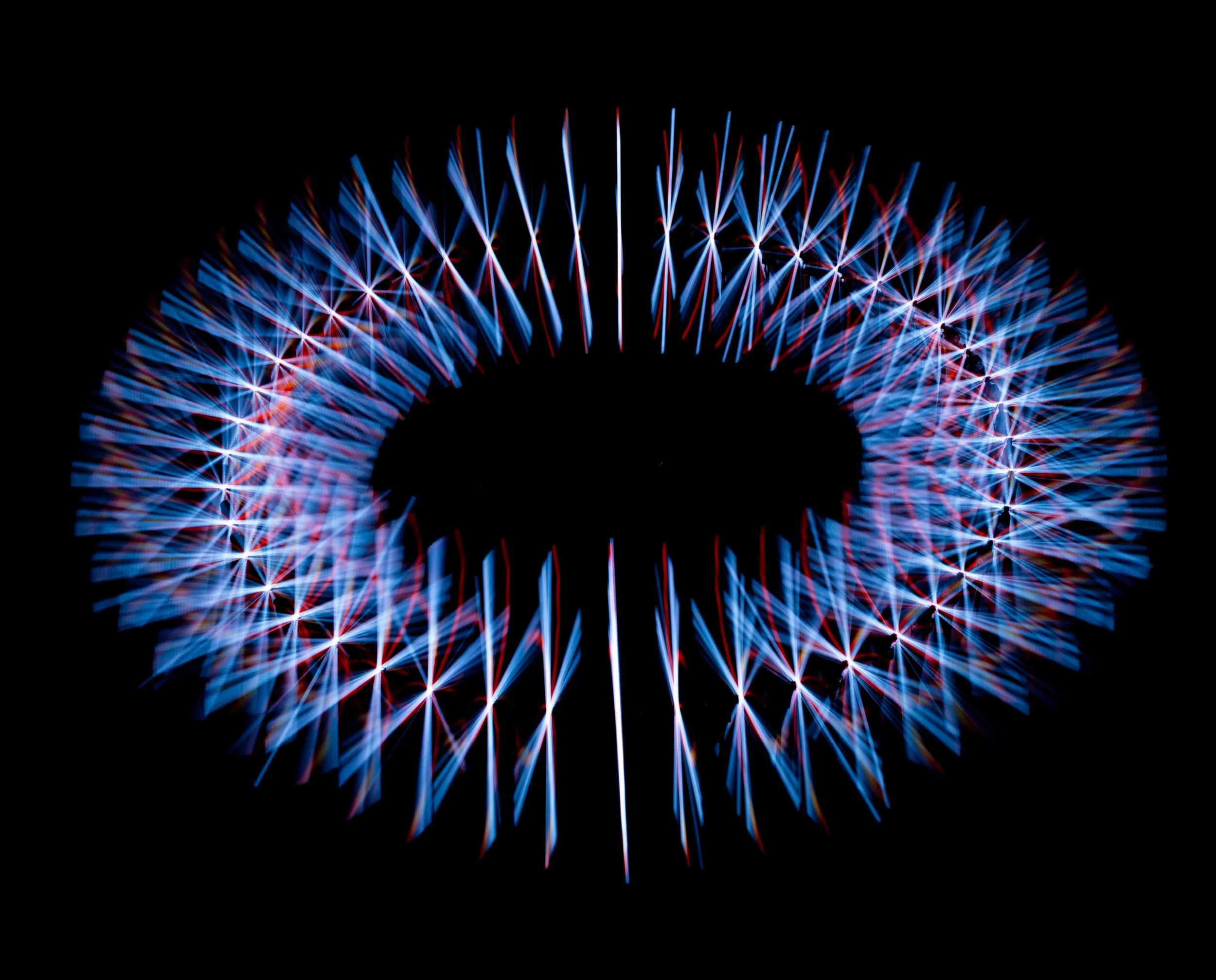
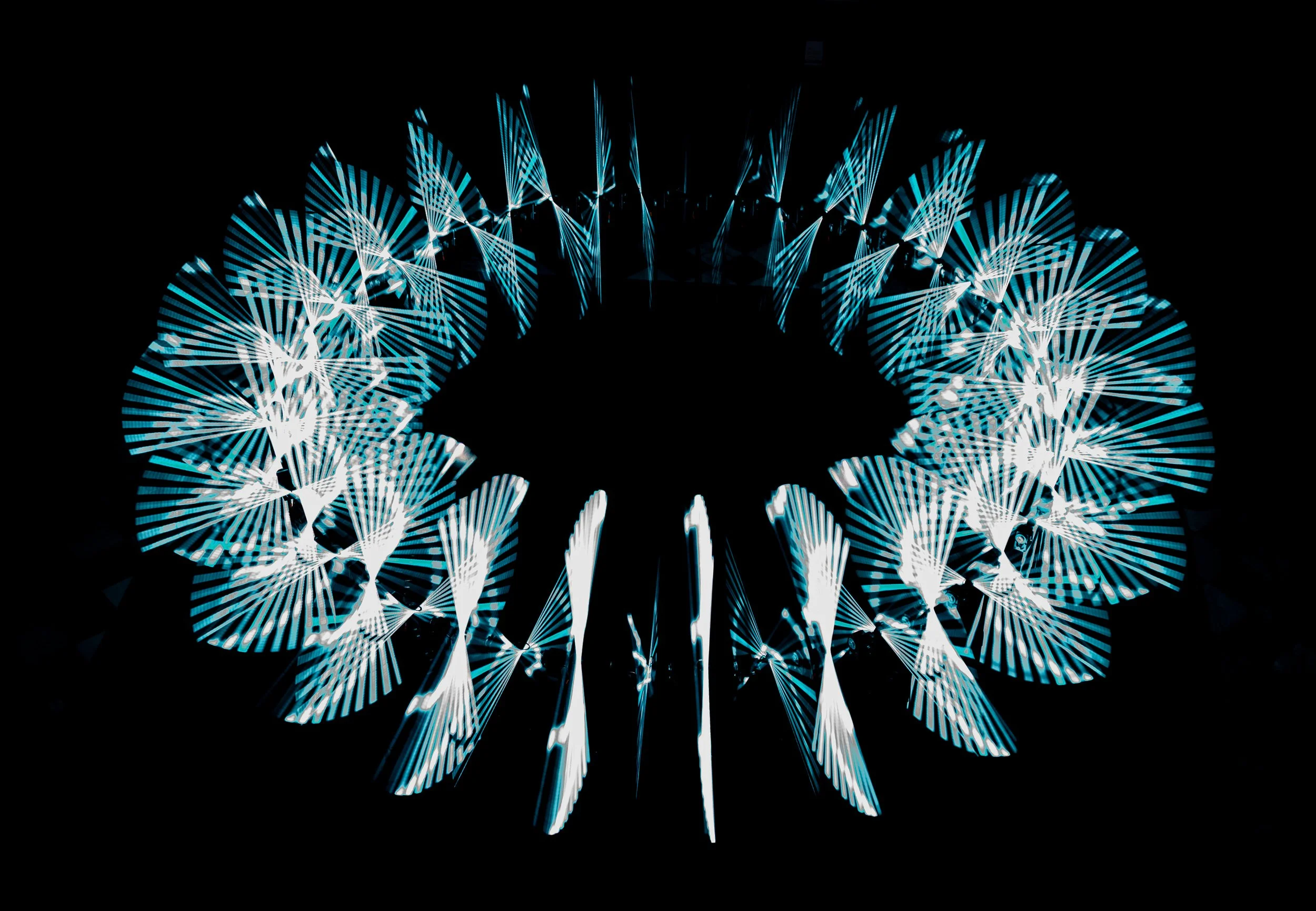
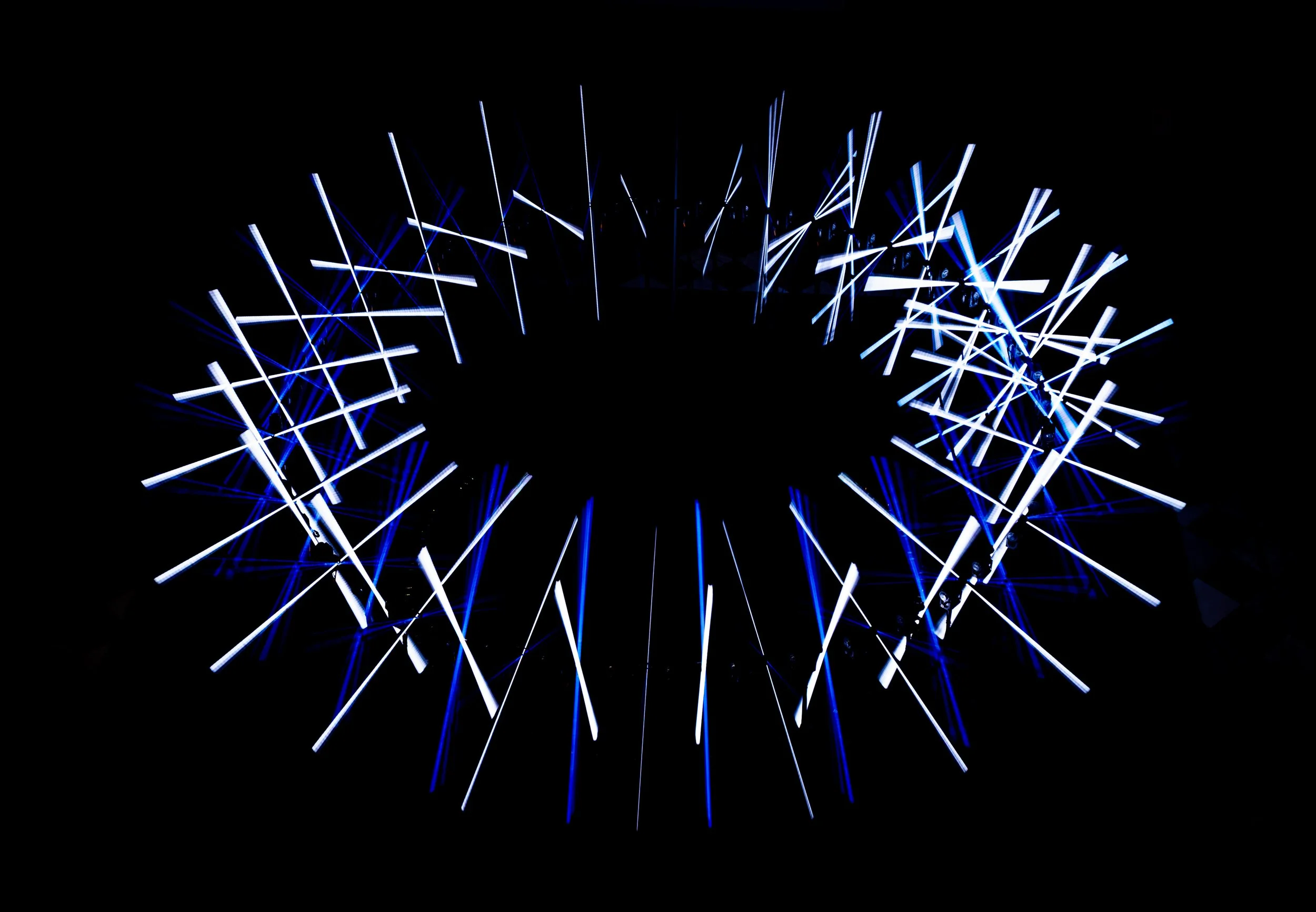
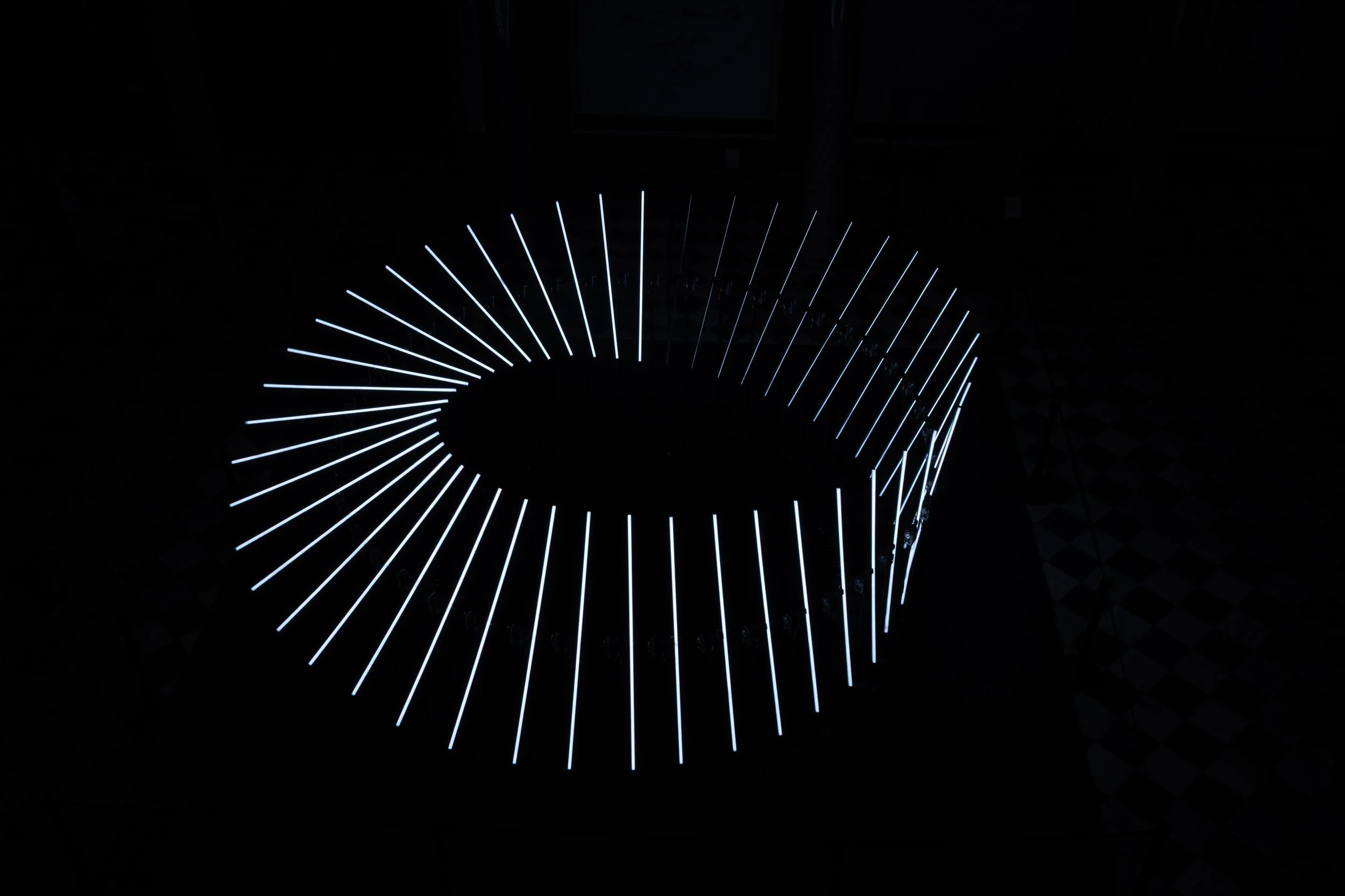
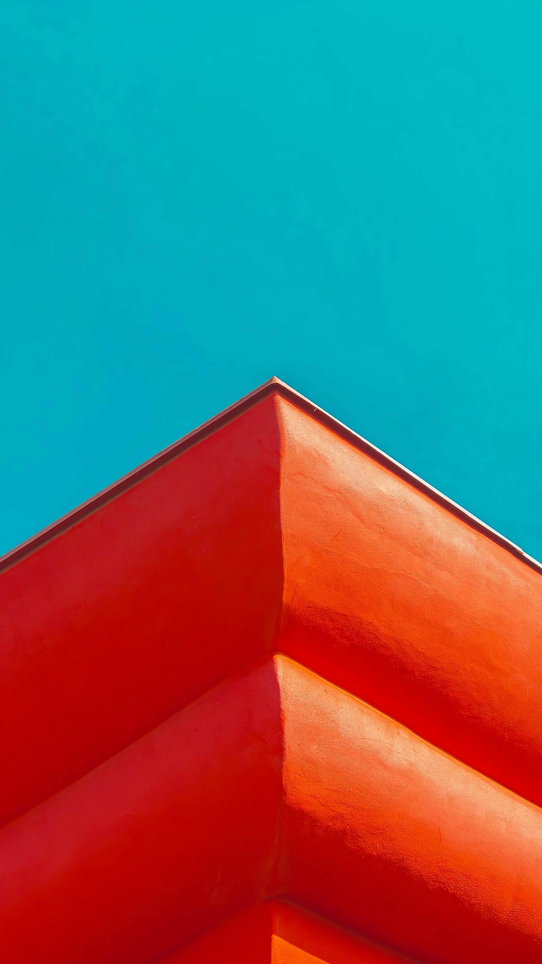
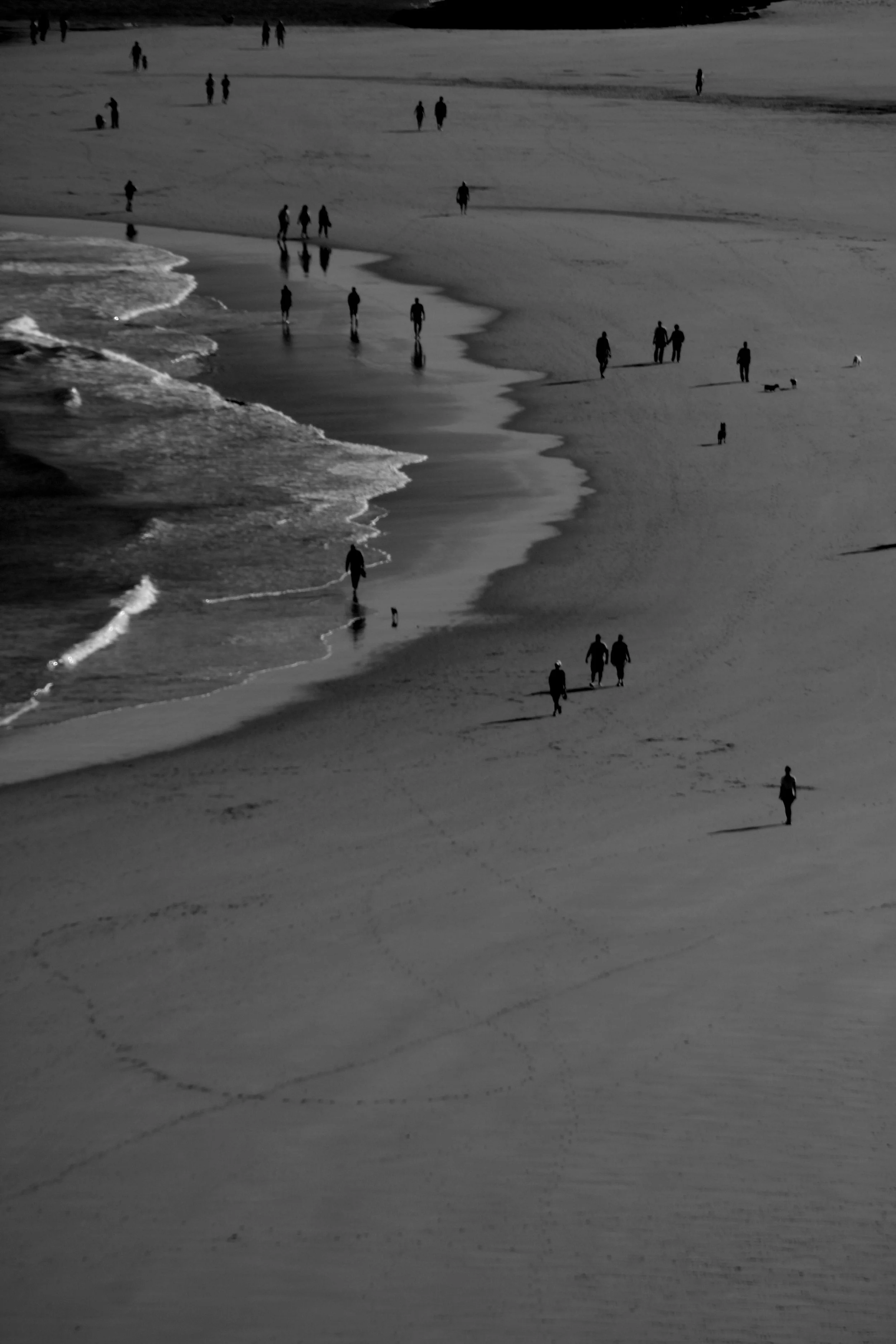
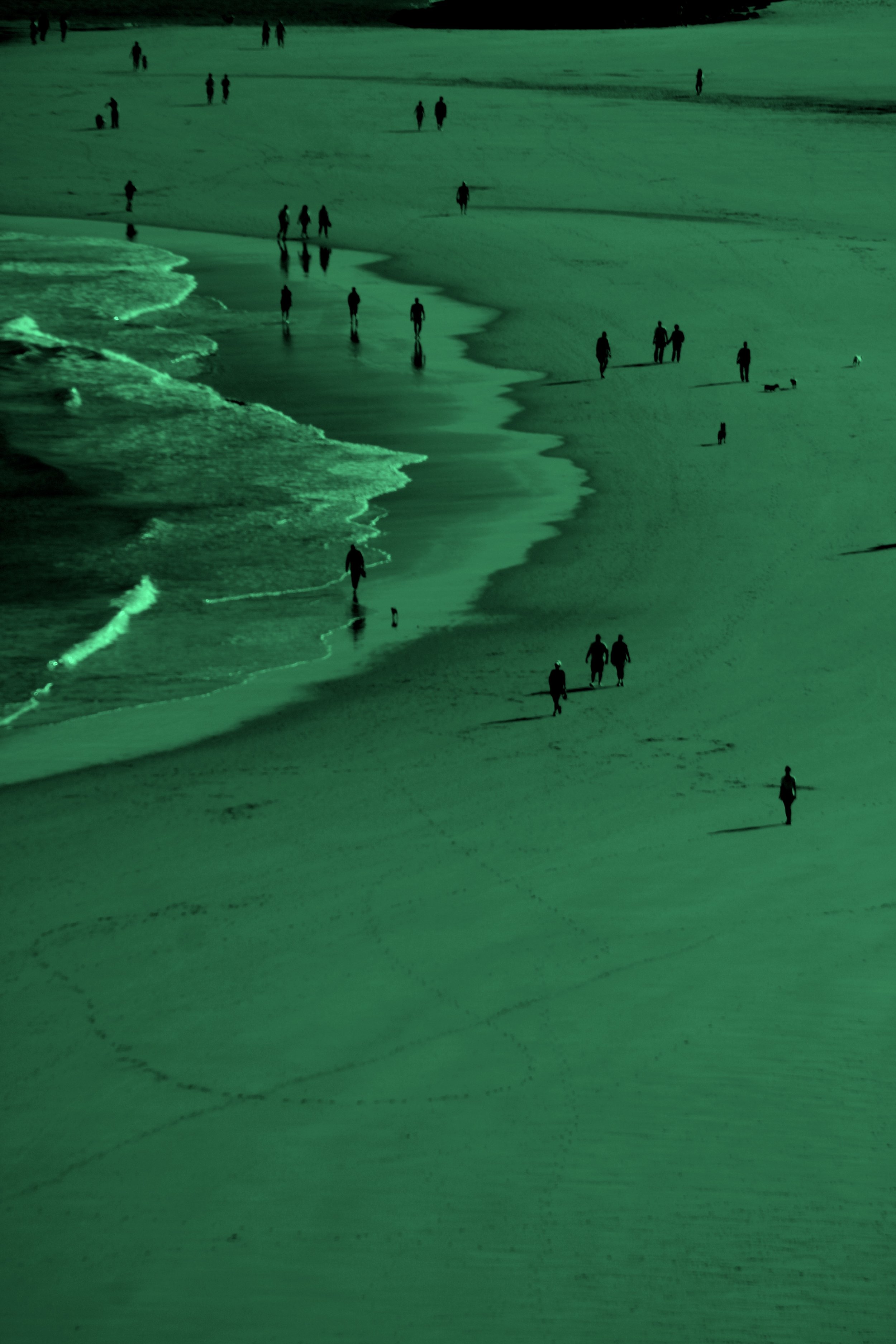
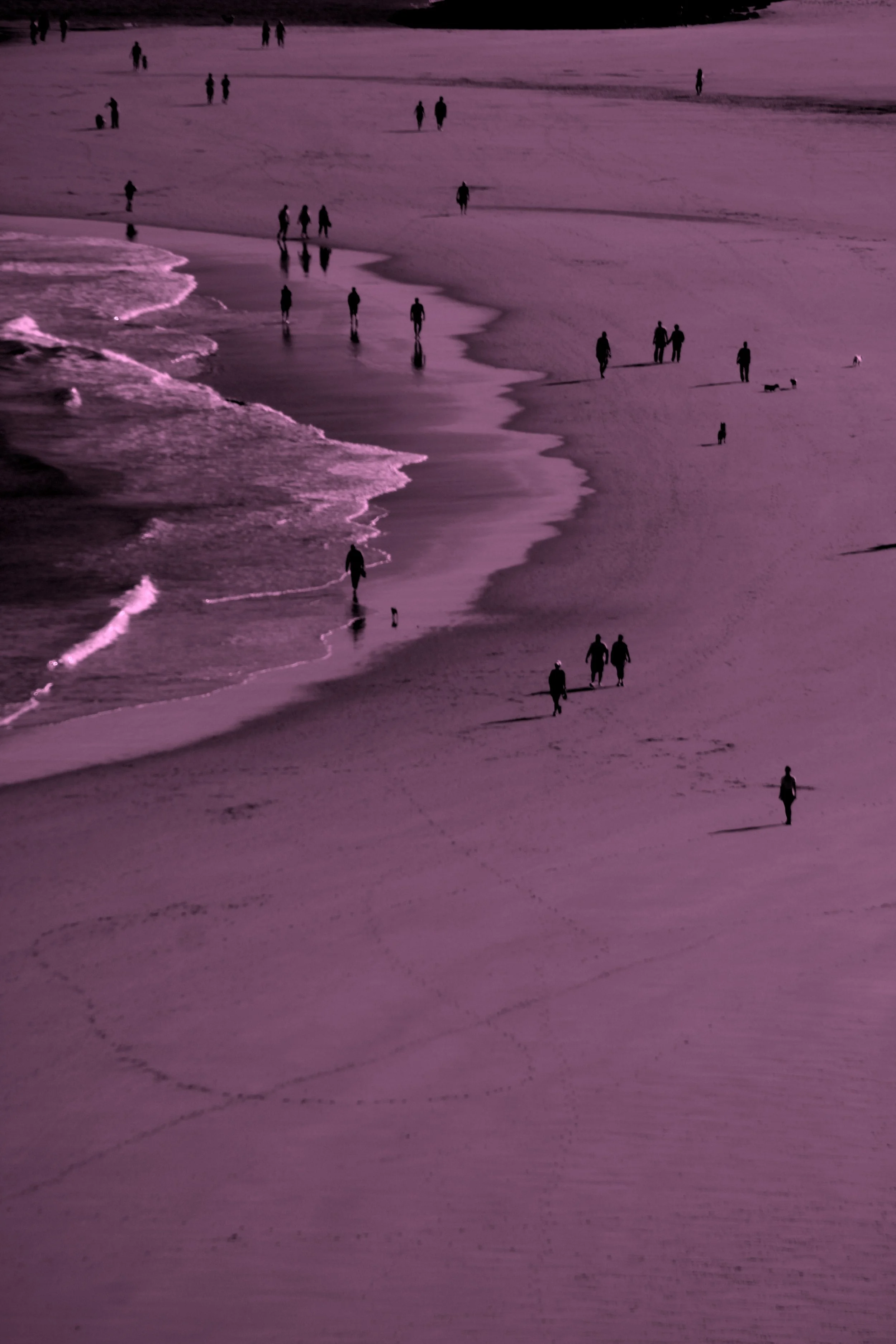
COLOR/Less
contemporary photography exhibition
featuring
a word from the curator
The average human eye is capable of perceiving up to 10 million colors. This overwhelming number hints at just how many approaches to color in photography can exist – from the complete absence of color to vivid hues; from natural tones to subtle variations within a single shade.
This exhibition brings together 26 artists exploring the full spectrum between color and its removal. Some works embrace color as a language in itself, while others move toward its absence, where monochrome becomes a space for clarity.
In preparing this exhibition, we were not interested in defining what color should be, but rather in exploring what it can be. We invite you to immerse yourself in this diversity of approaches and to experience how differently color can be seen, felt, and understood.
How to Experience This Exhibition at Its Best
As always, for the best experience, we recommend viewing this exhibition on a desktop device. While we understand the convenience of smartphones, the works reveal themselves more fully in their intended scale and layout when seen on a larger screen.
Some projects are accompanied by a short description. We encourage you to open and read the texts. They often function as small keys, helping you enter the artist’s world and perceive their ideas more clearly. While we value personal interpretations, some projects truly unfold only after engaging with the concept that forms the foundation of the photographic series. Take your time. Let the images and words unfold together.
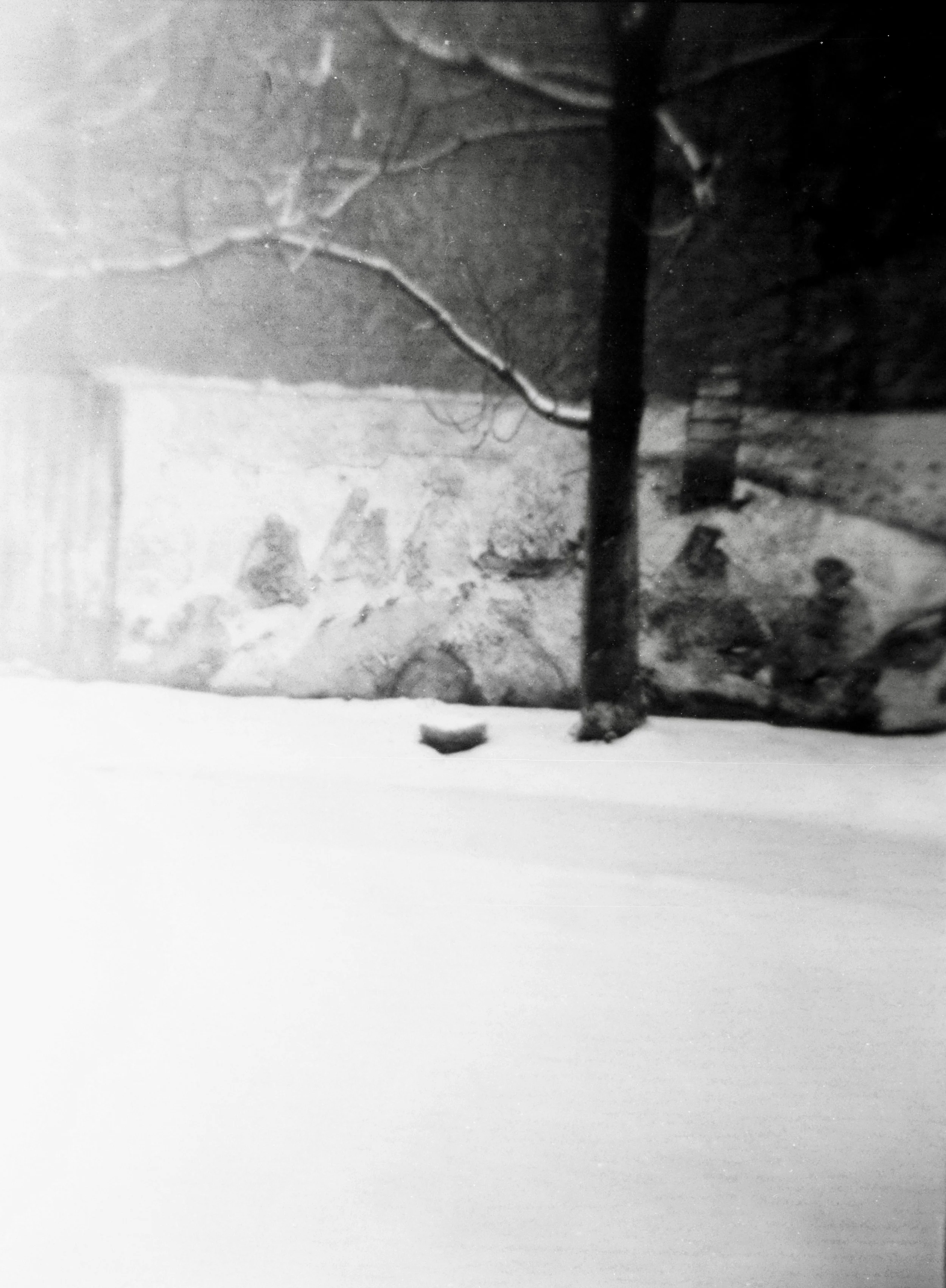
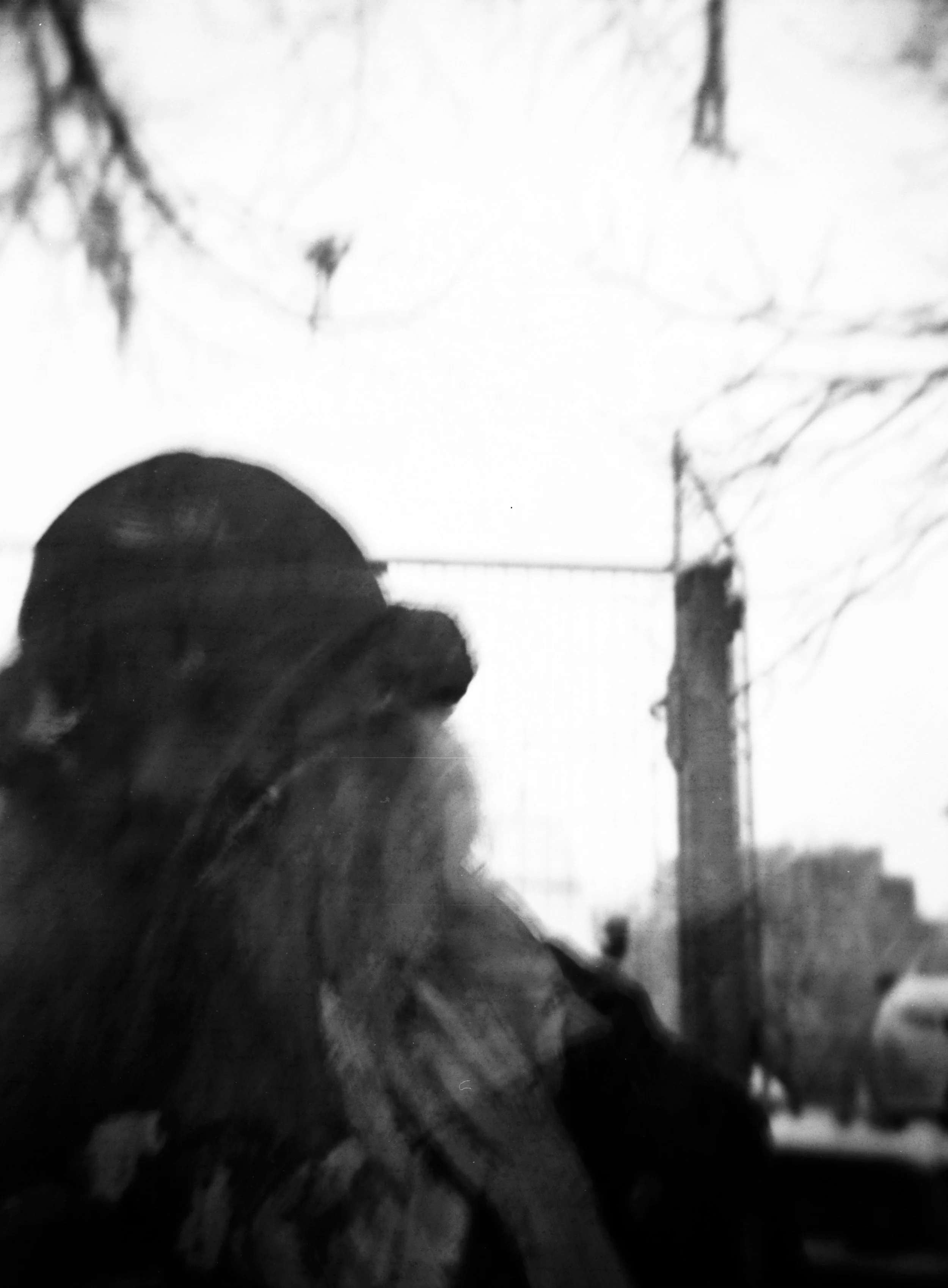
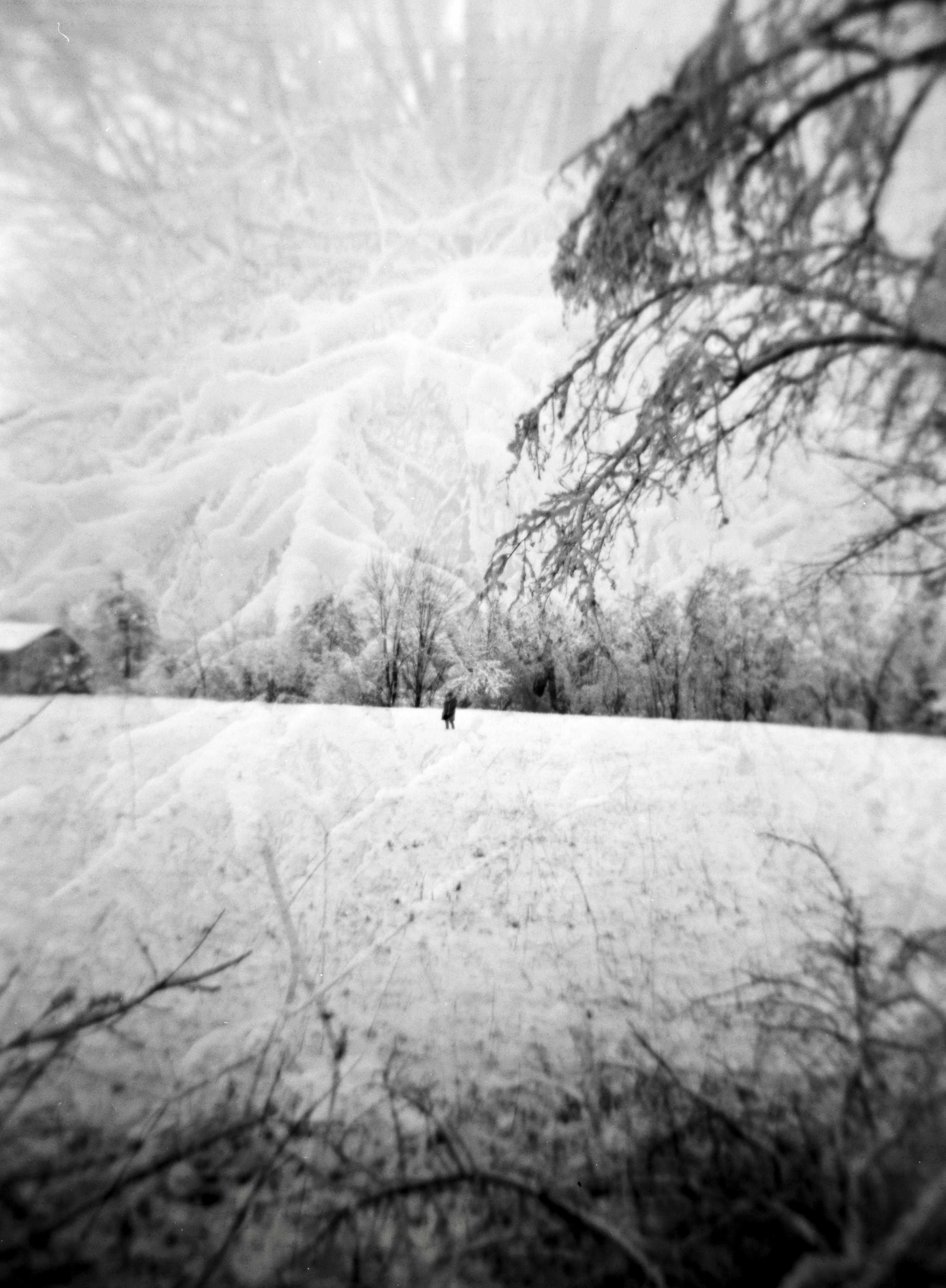
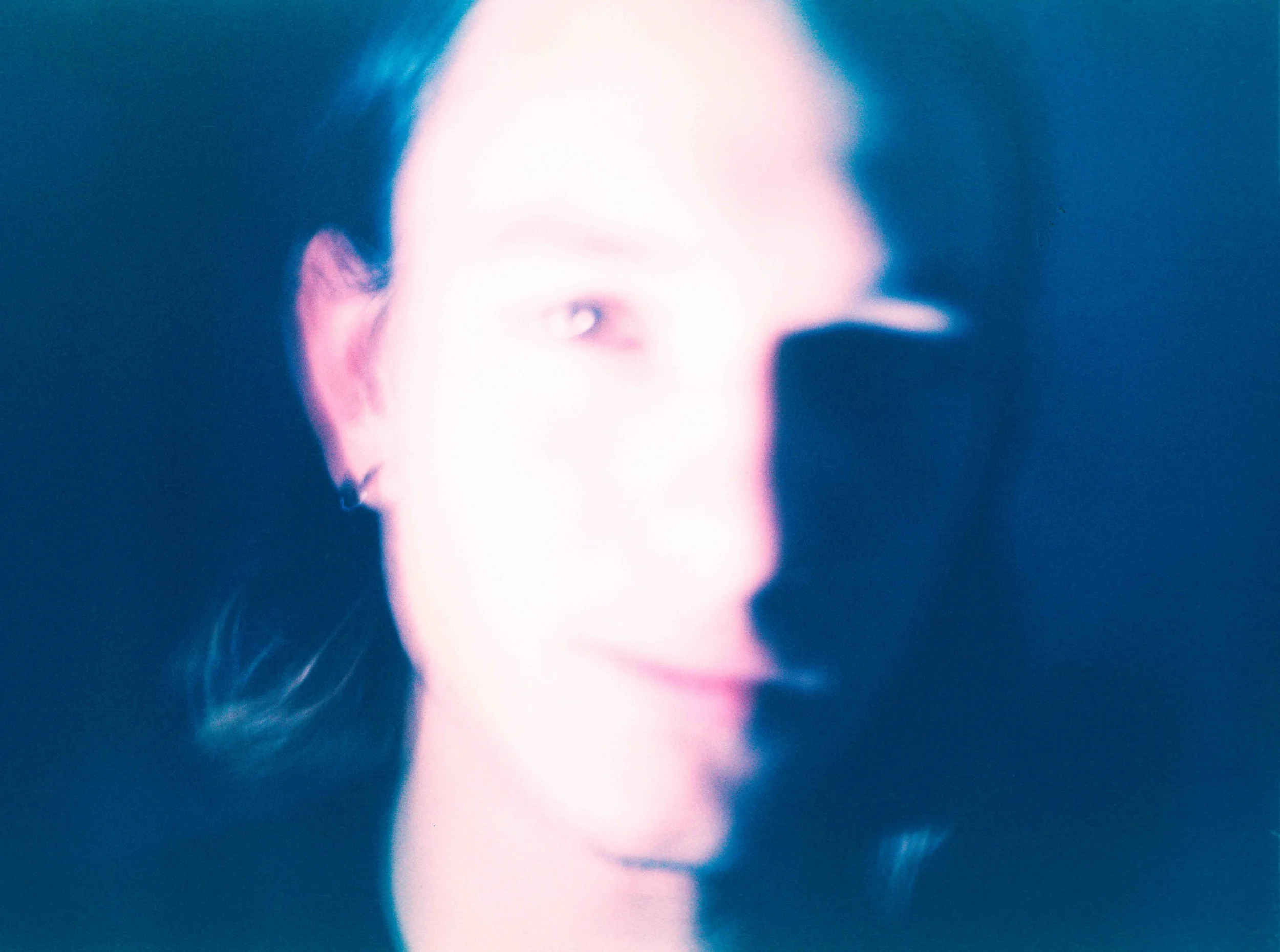
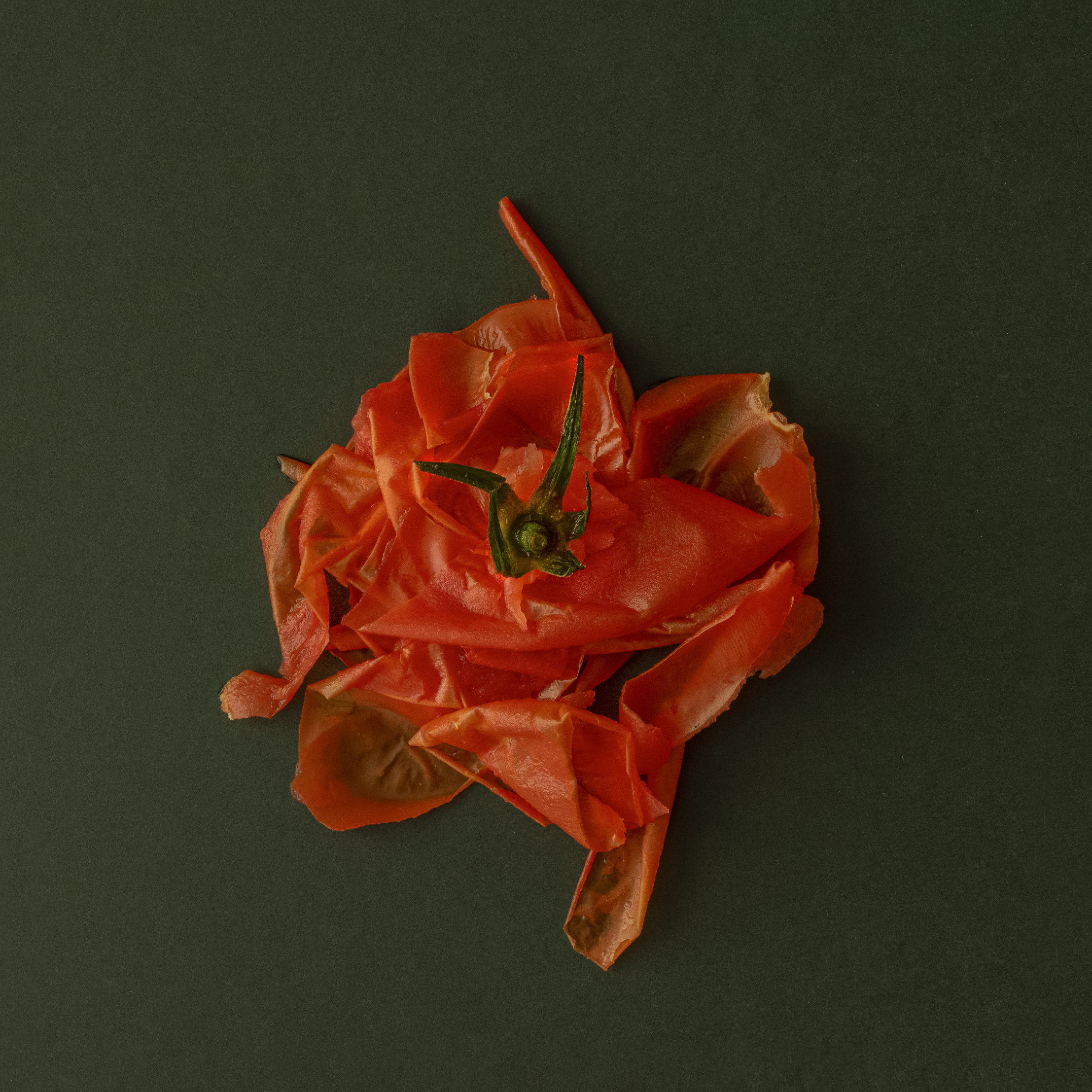
Puyi Guo
-
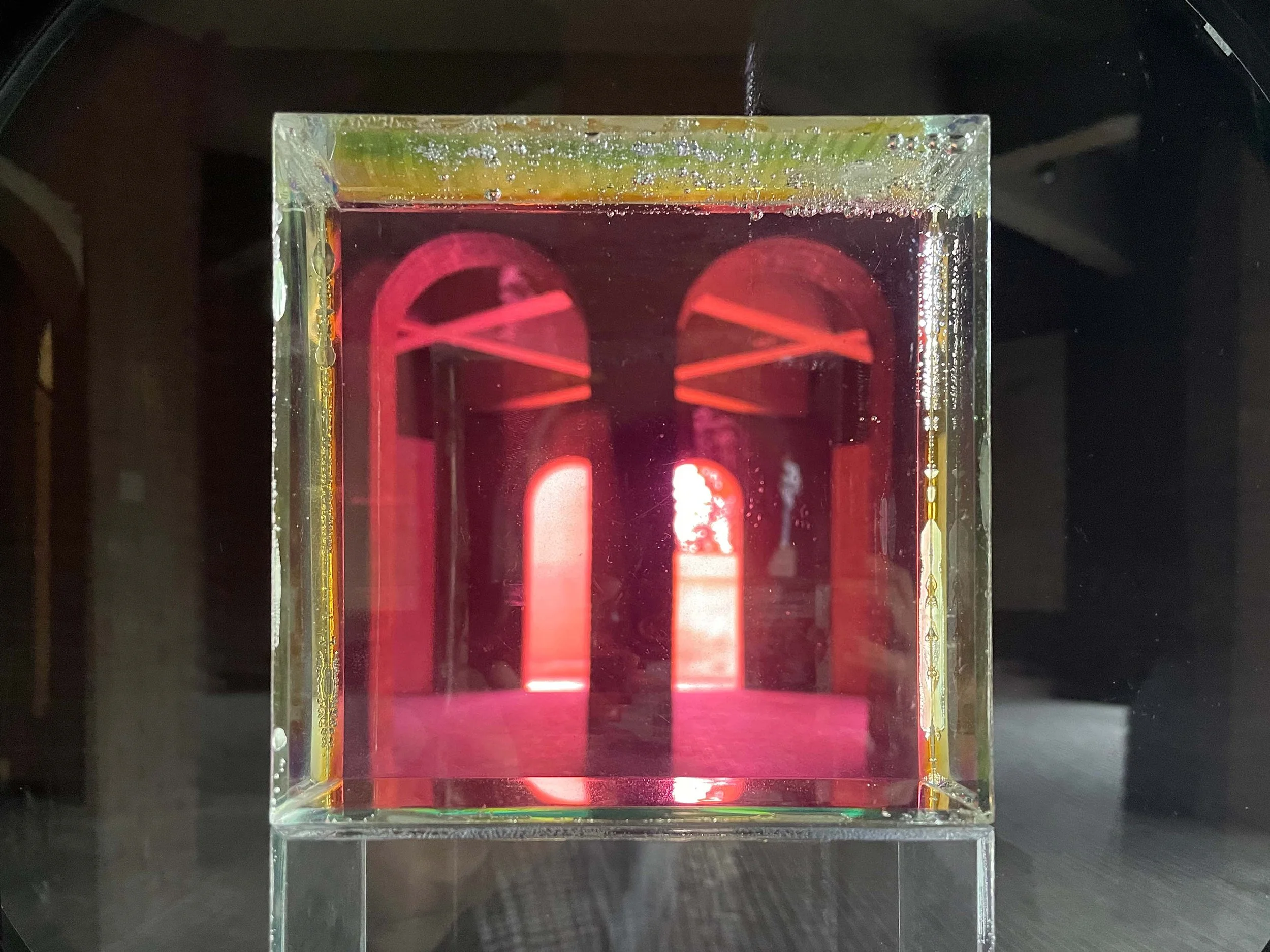
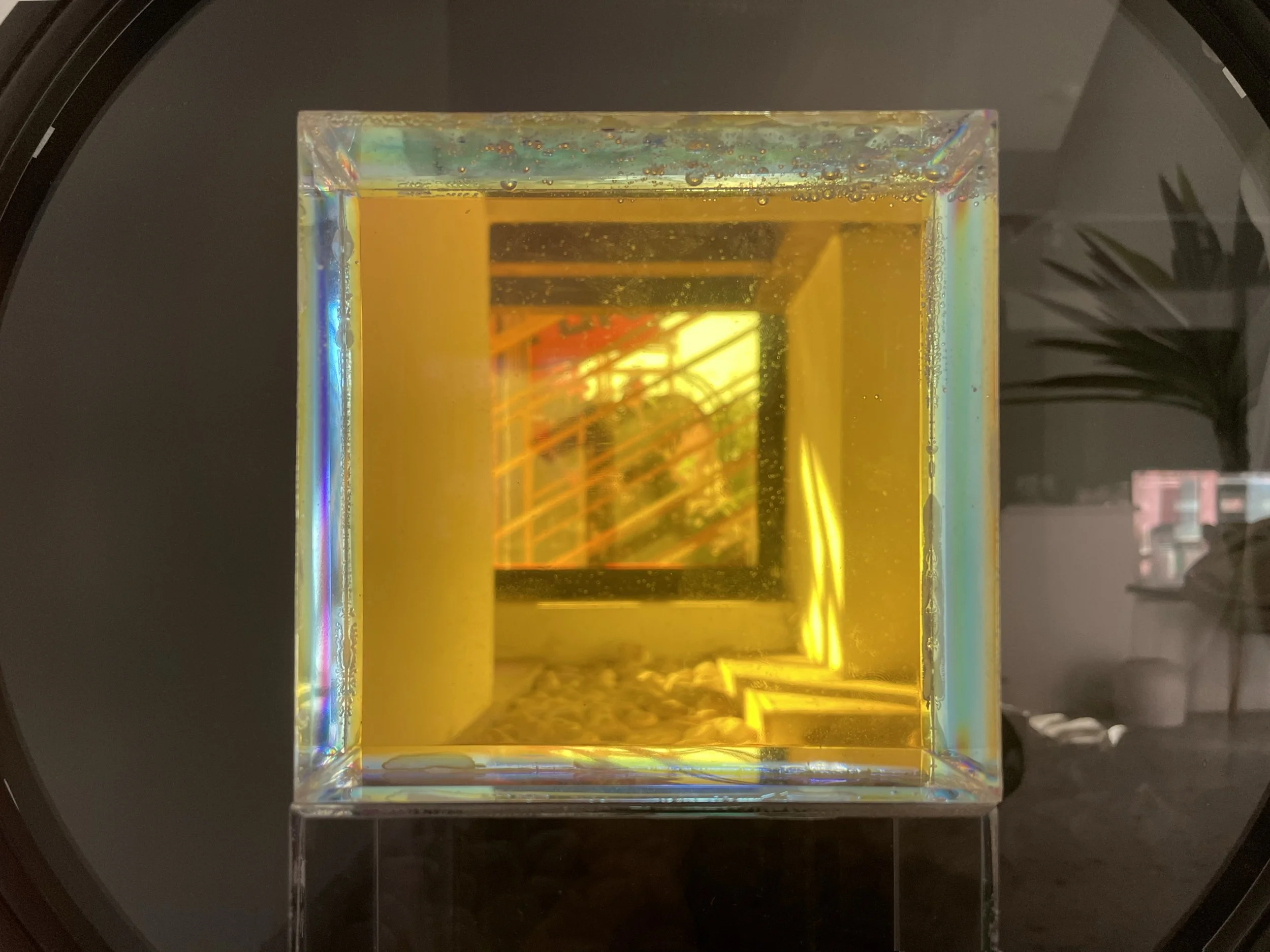
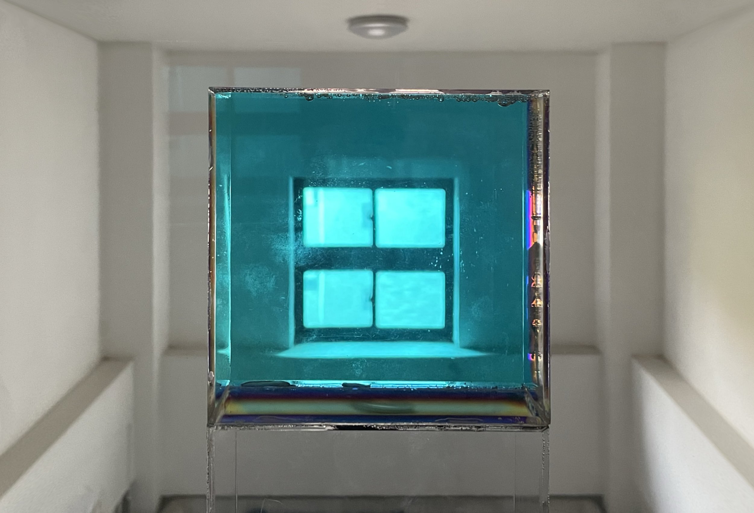
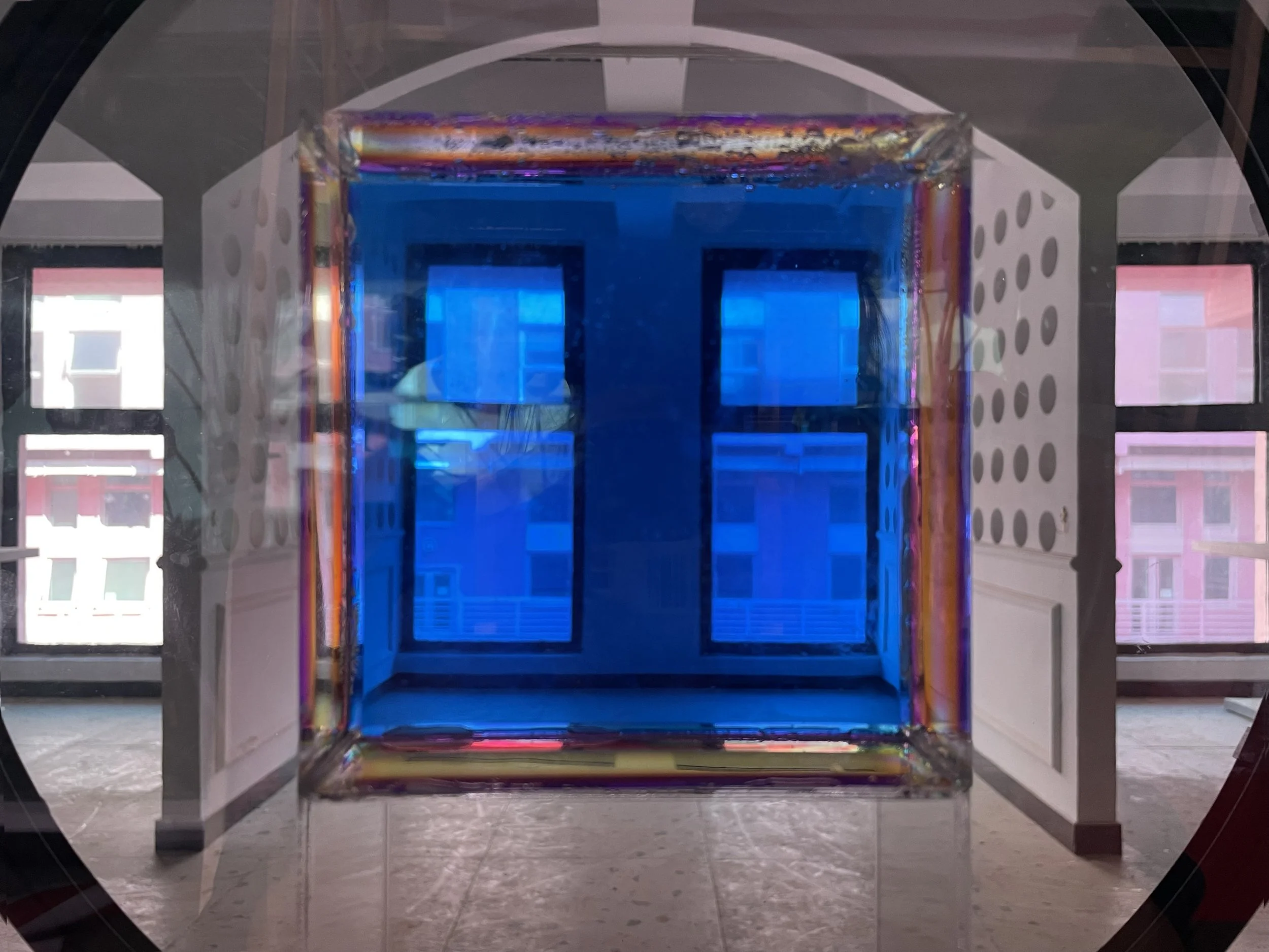
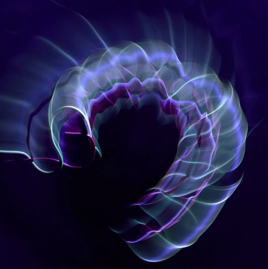
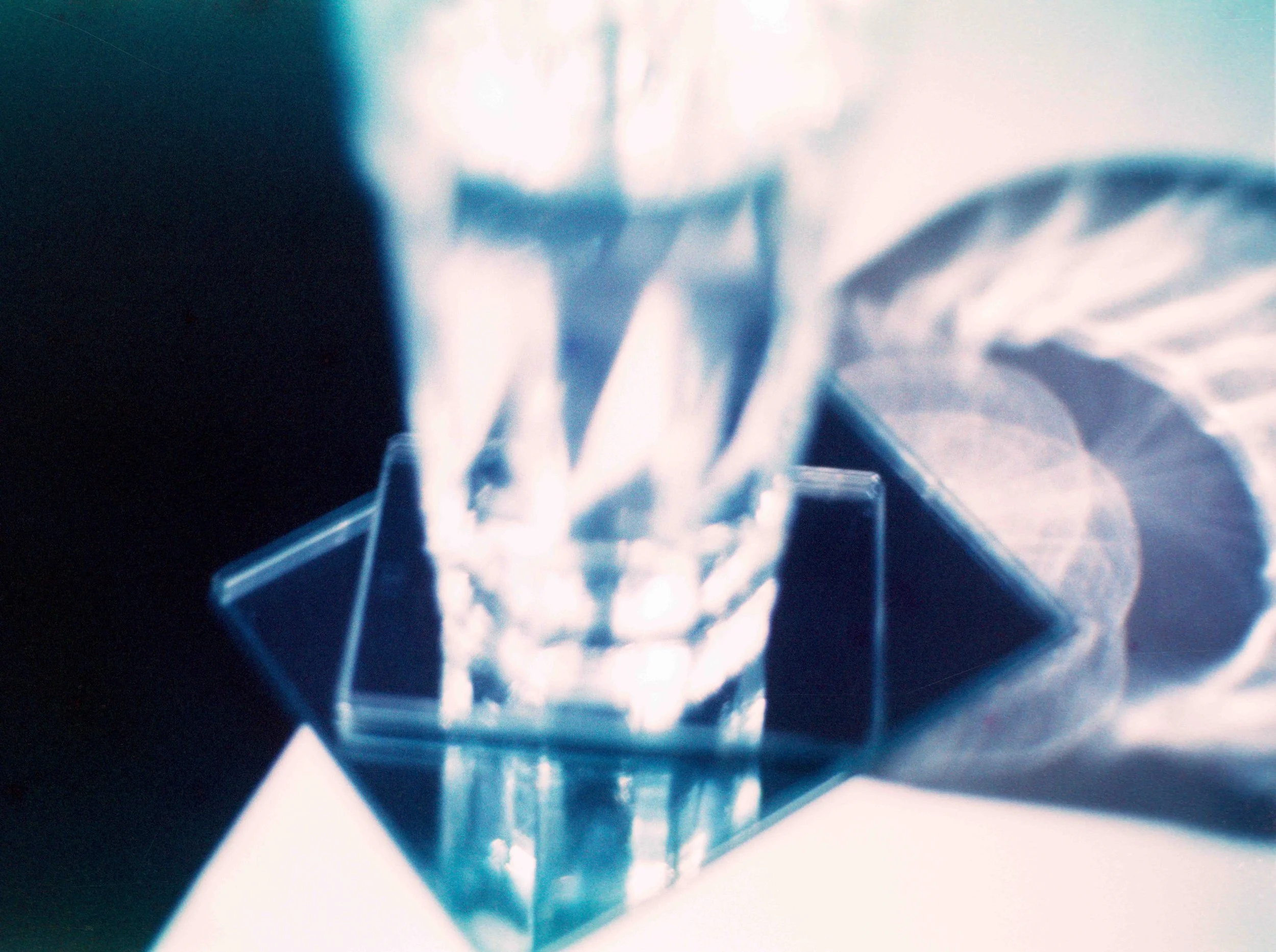
‘Presence of Absence’ is a series of moving images and photographs taken through a self-made filter. The filter is an installation in itself, consisting of a clear acrylic box filled with glucose syrup and supporting frames covered with polarizing films. Due to the polarizing effect, rotating the filter causes shifts in light, shadow, and colour within the syrup block and its surroundings. As the colour within the block constantly changes, and light from the outside converges and diffuses, viewers witness light and time interacting with space—as if seeing its breath—becoming aware of the eternal presence of space. The series is available in versions depicting different ‘liminal’ sites, such as a stairwell and a deserted restaurant.
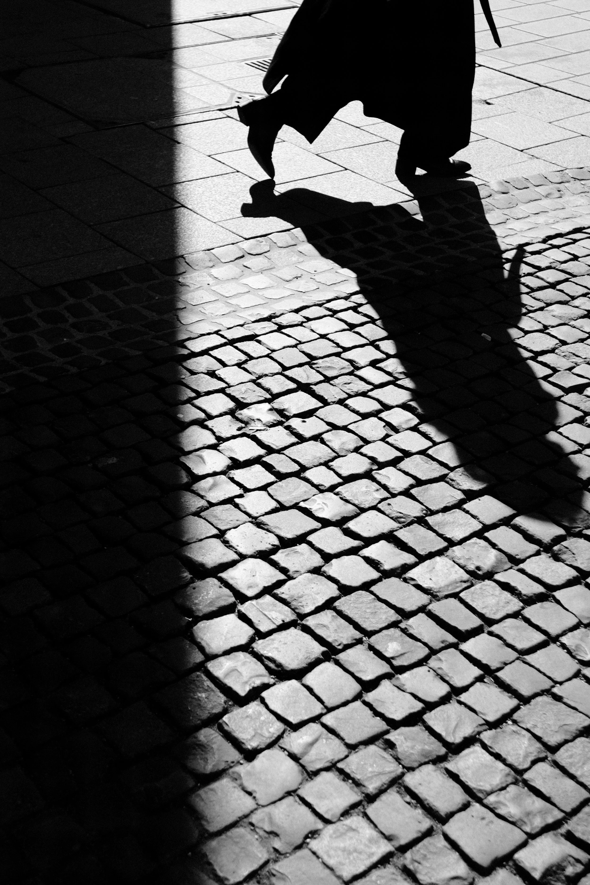
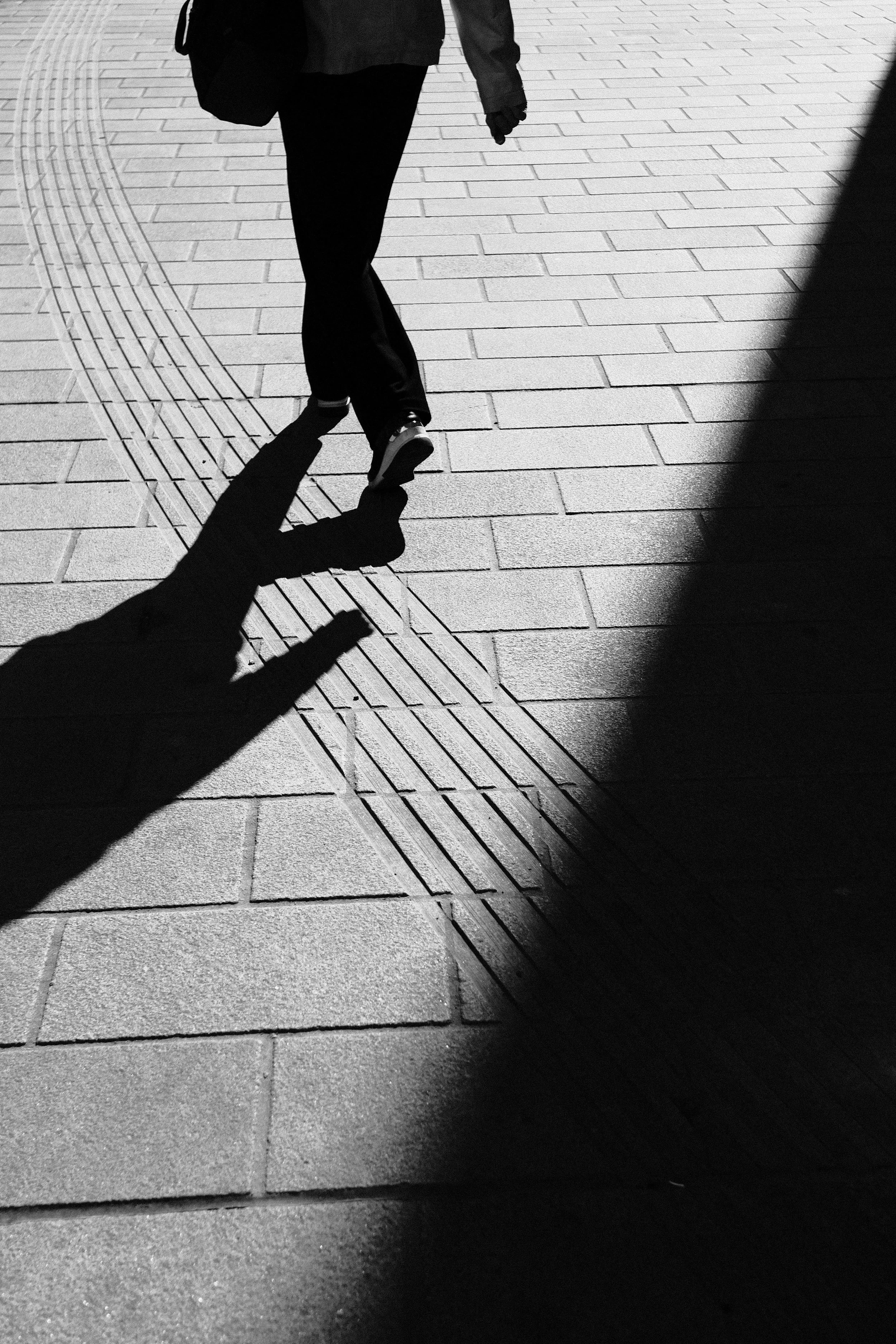
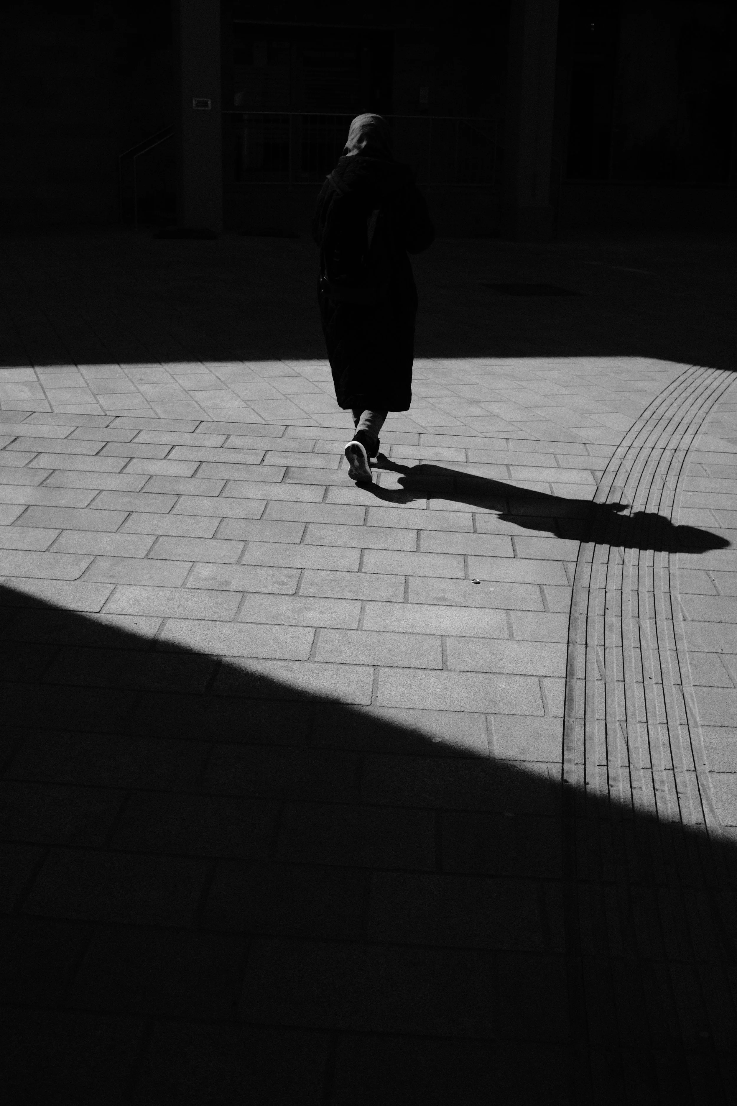
Jessica Leopold
Walking in the Shadow
Margaret Eagles
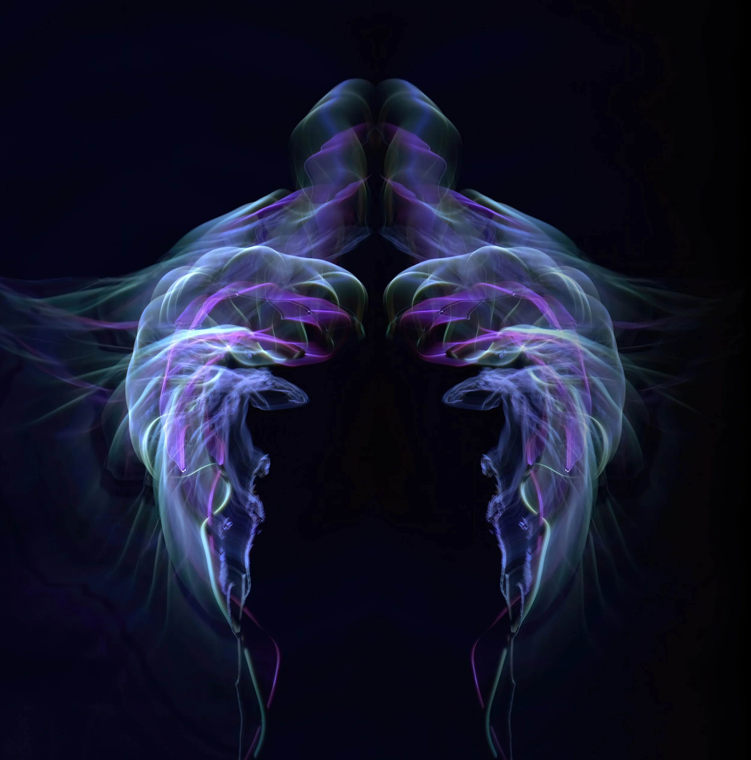
'Breathe'
'Chain of Salps'
Vlad Paulet
-
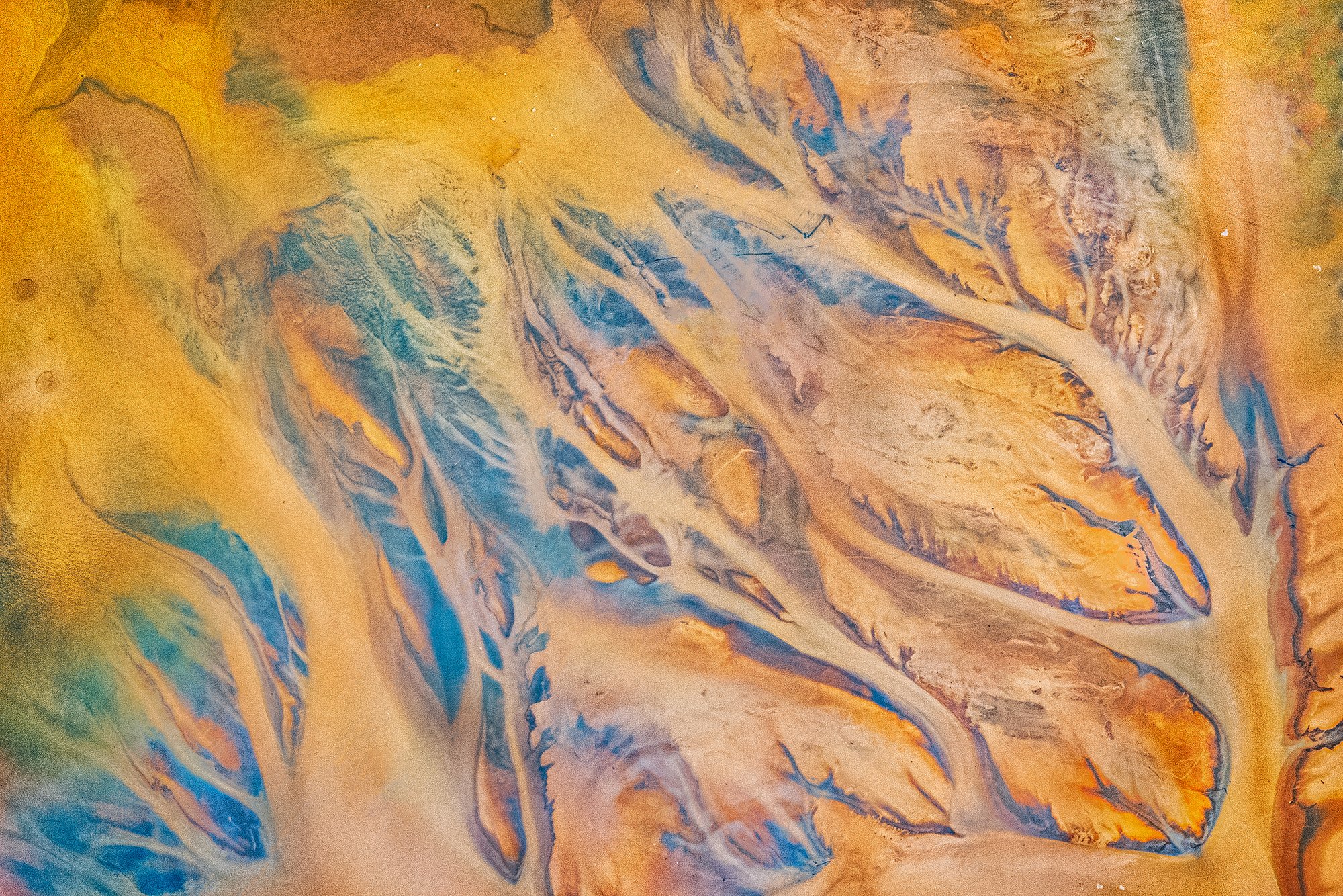
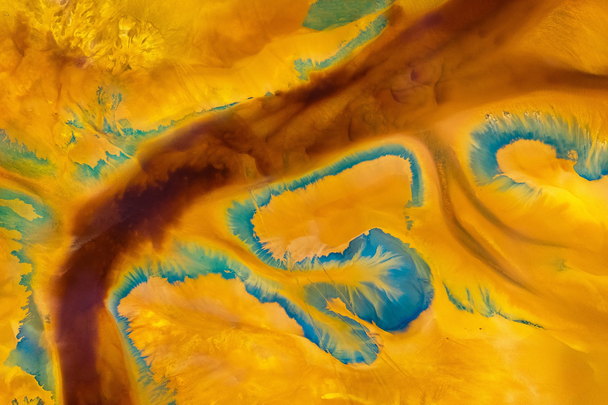
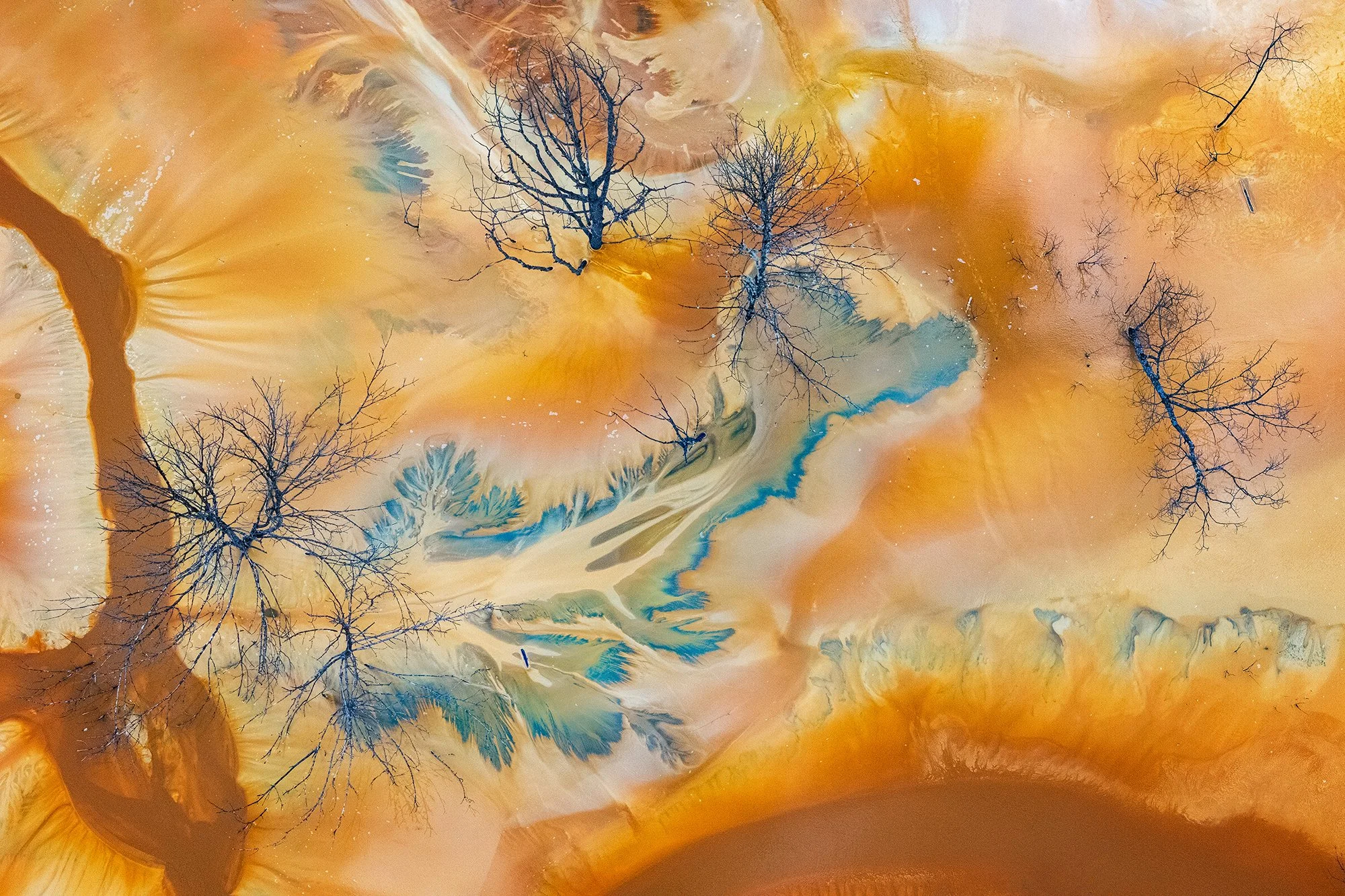
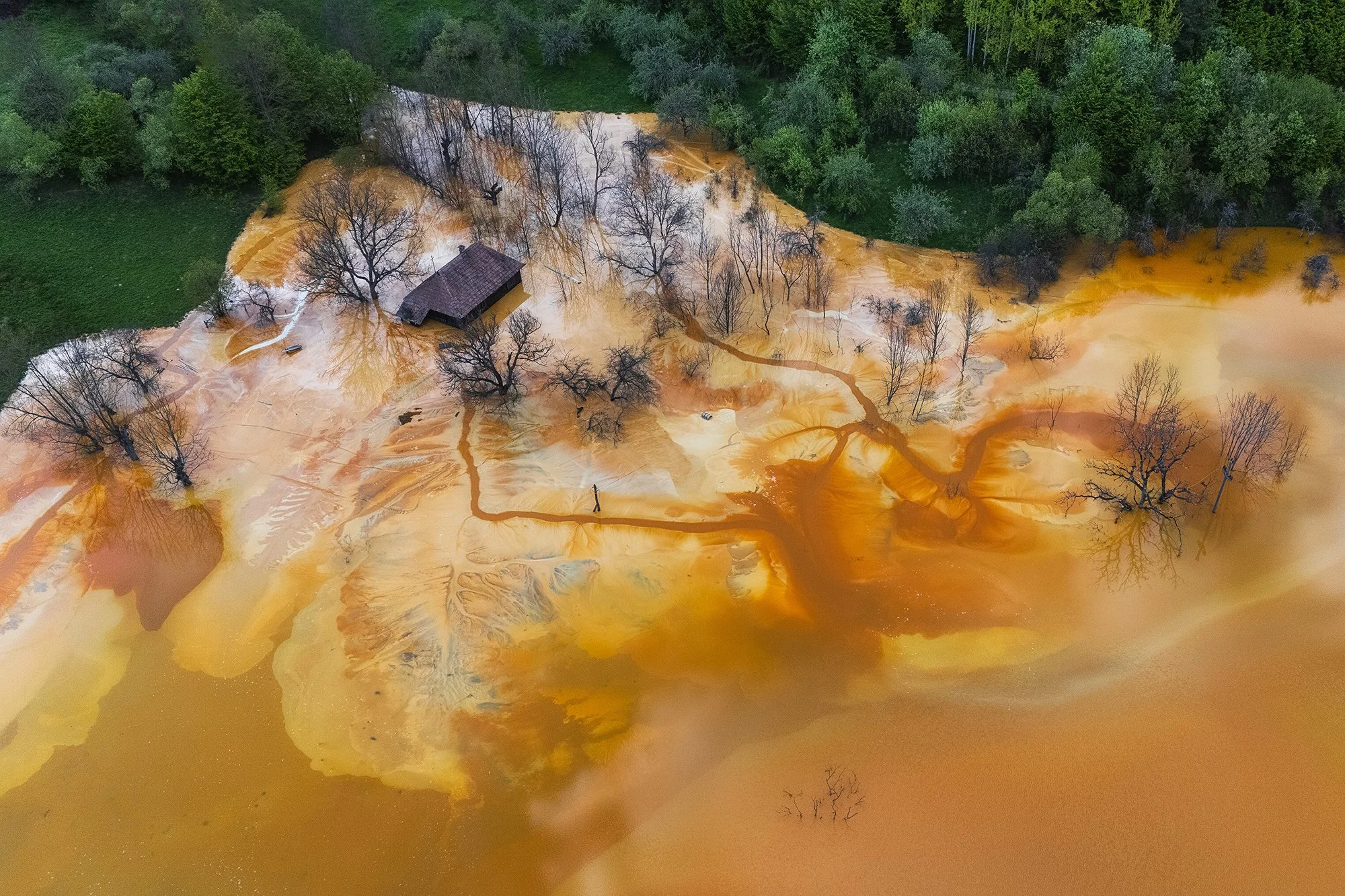
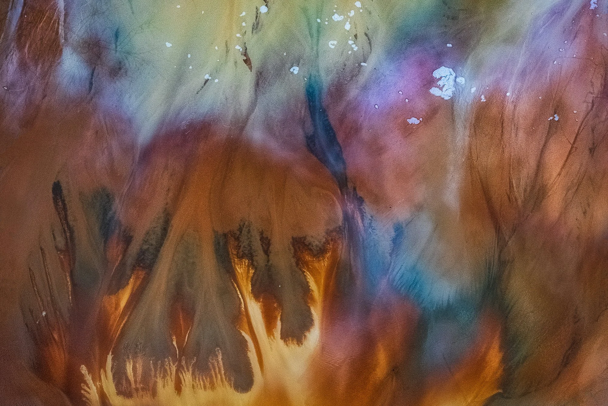
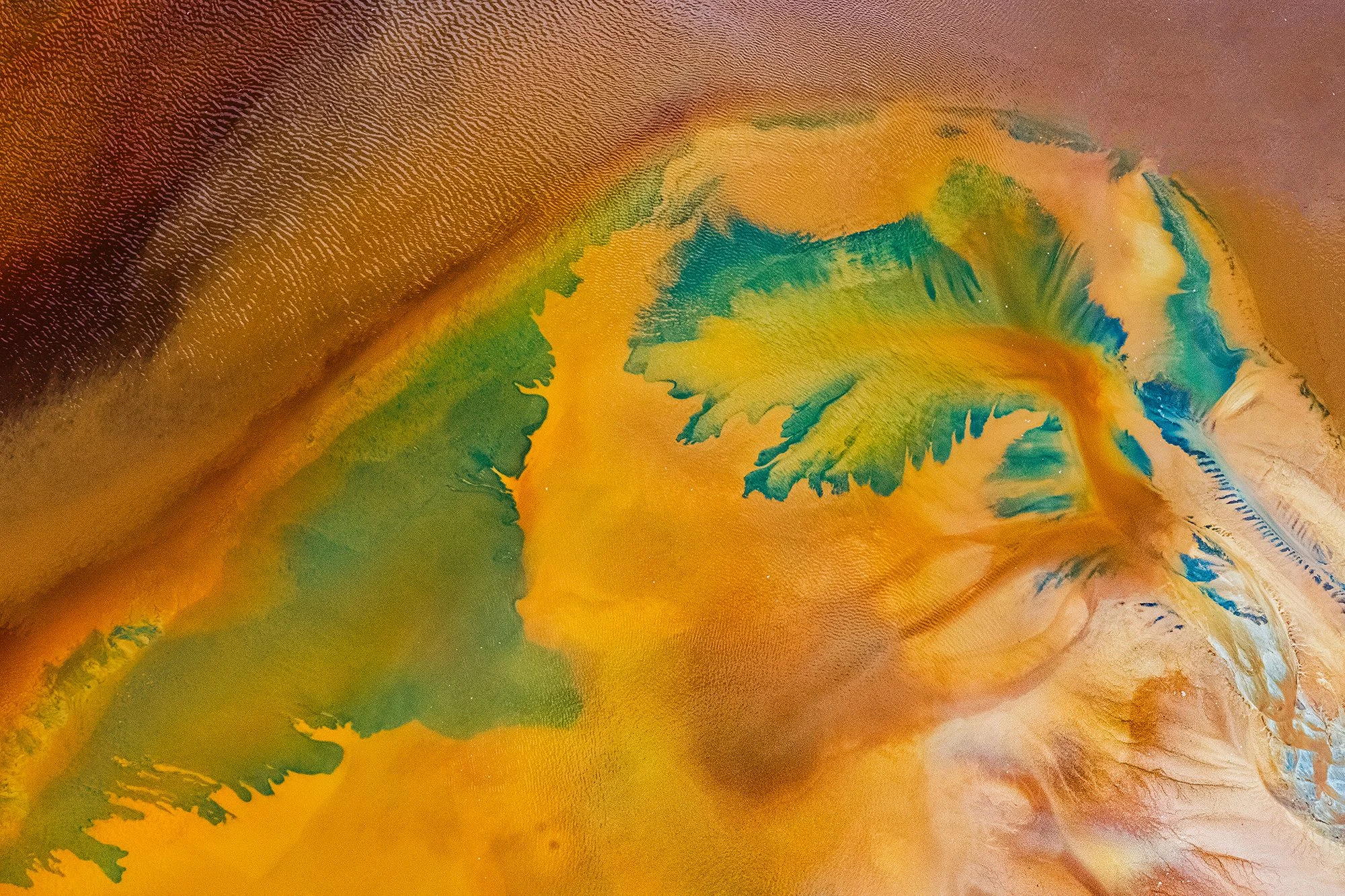
‘Vibrant Toxicity’ is documenting the worst ecological disaster in the history of Romania. It is called the Geamana Lake and it was once a peaceful and picturesque mountain village. In the communist regime, in 1978 a copper mine was built nearby and all the toxic waste from it was needed to be thrown somewhere. The valley in which the village was in, was chosen and the locals were forced to leave everything behind. All the houses, belongings, households, the cemetery and the church were swallowed by the toxic liquids. The mining has not stopped ever since and the level of the water is rising at an alarmingly fast pace, about two meters per year. The abstract patterns and the vibrant colors come from the cyanide and the heavy metals in the water. The color in my series expresses the effects of this ecological disaster and while everything was ruined, the traces left behind had a strange and unique beauty.
Laura Arce González
Fugacidad
Alison Elizabeth Manning
-
Three works by Alison Manning, connected by a shared theme.
'Repetition in colour' - Inspired by the bold visual language of pop art, this image uses repetition and colour to transform a simple shop mannequin into something more graphic and playful. The same face appears again and again, echoing ideas of mass production and manufactured beauty, while the vivid colours give the otherwise artificial figure a surprising sense of energy and life.
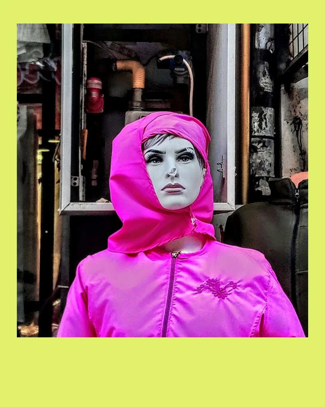
'Mannequin in pink' - Not quite human, but almost. Mannequins are artificial human forms, created simply to display and sell, rarely noticed beyond their function. They stand silently in shop windows and back rooms, anonymous and overlooked. In this series I wanted to give them a moment of presence concentrating on colour, pattern and texture to interrupt their usual neutrality. By playing with vivid tones against otherwise colourless surfaces, the mannequins shift from passive objects into strange, almost human characters. These images explore the thin line between the artificial and the familiar, allowing these overlooked figures a brief moment of individuality.
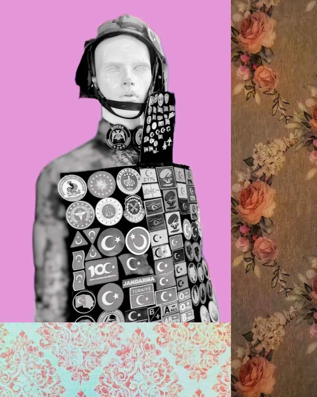
'Decorated Silence' - A mannequin stands rigidly in a small shop, its body covered with an array of Turkish badges and emblems. Stripped of colour, the figure becomes almost ghostlike, a silent carrier of symbols and identity. The surrounding floral patterns and colour soften the scene, adding an unexpected layer of ornament and nostalgia. Suspended between display object, human presence, colour and pattern the mannequin quietly reflects an untold story.
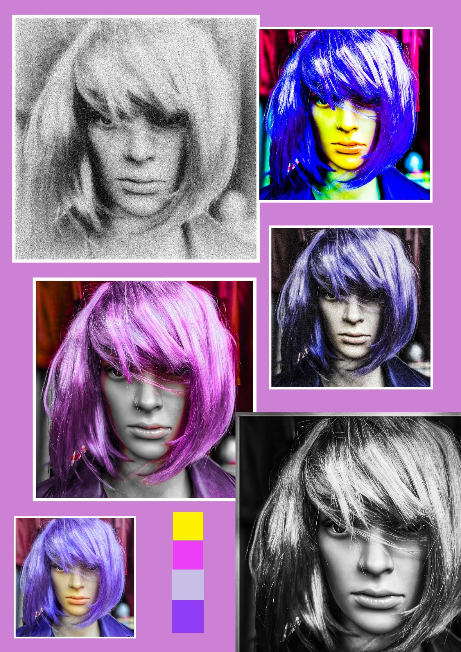
'Repetition in colour'
'Mannequin in pink'
'Decorated Silence'
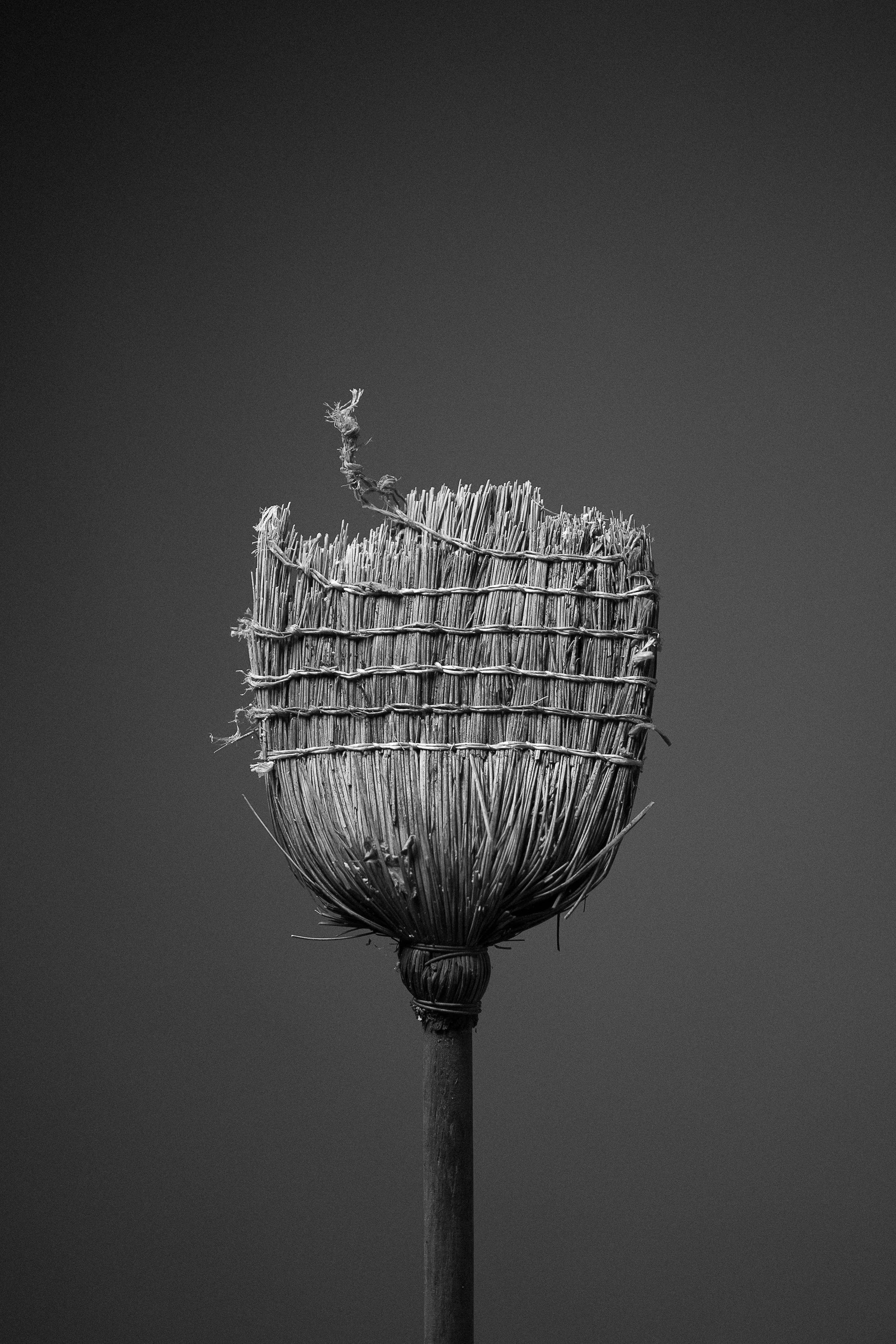
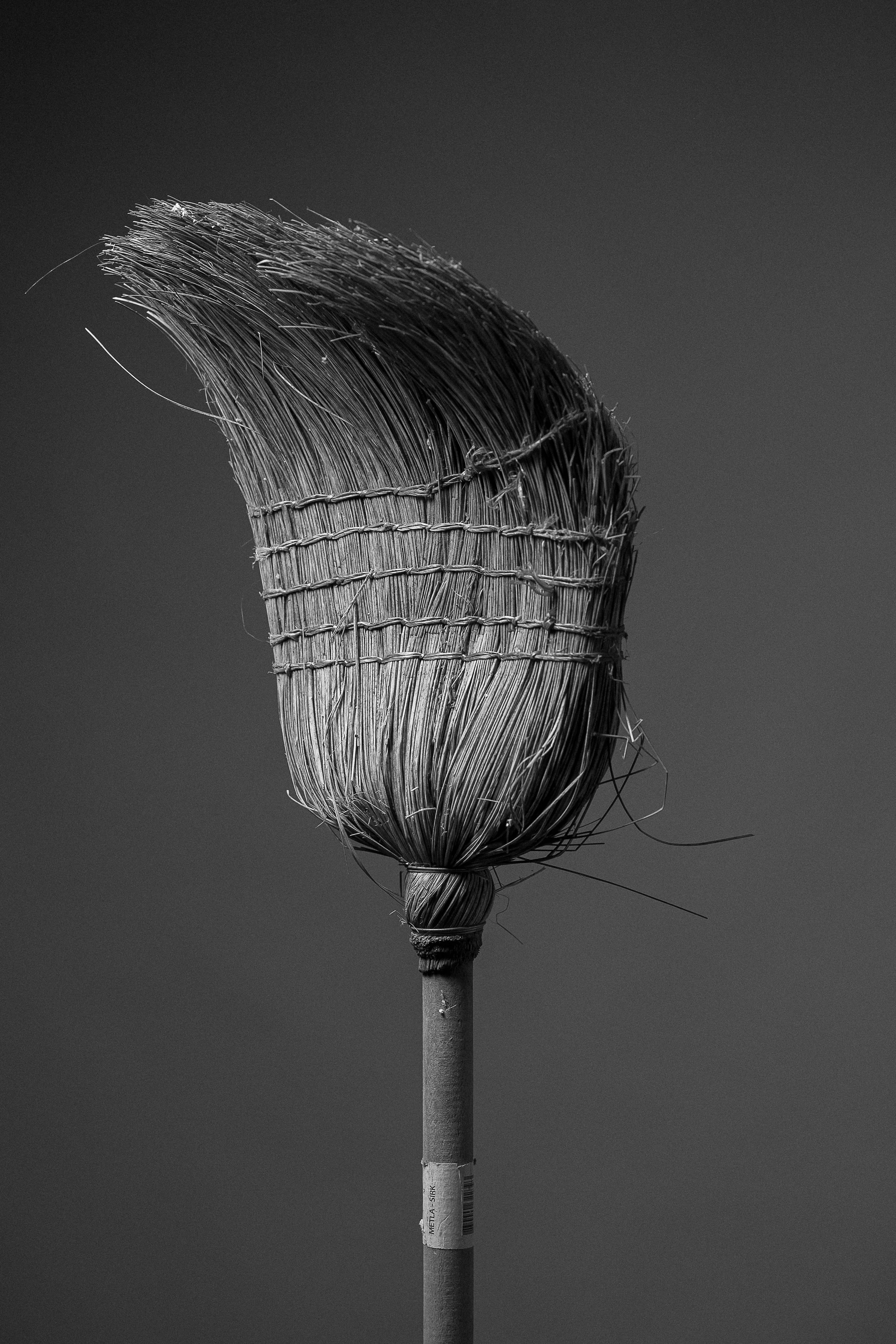
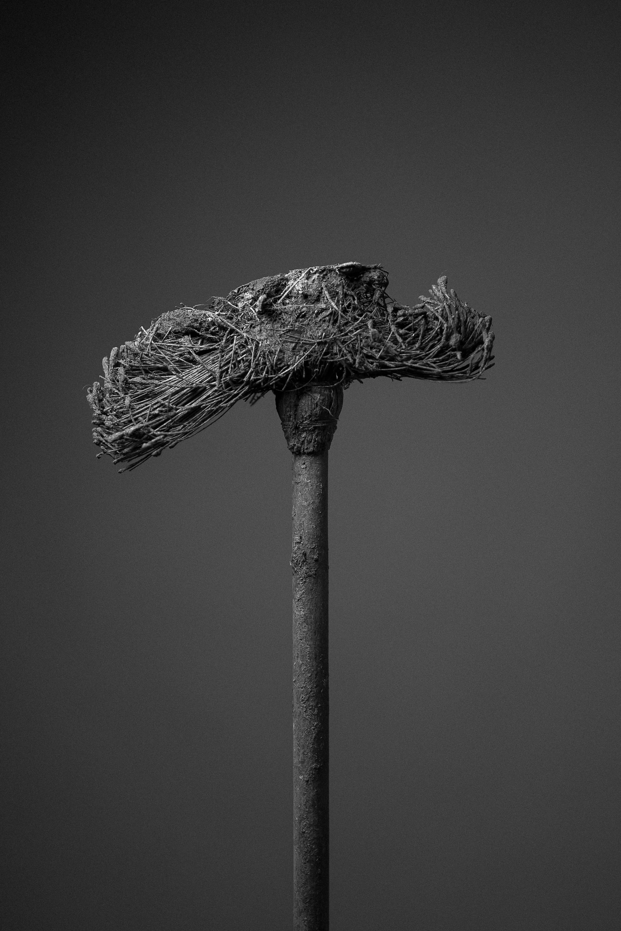
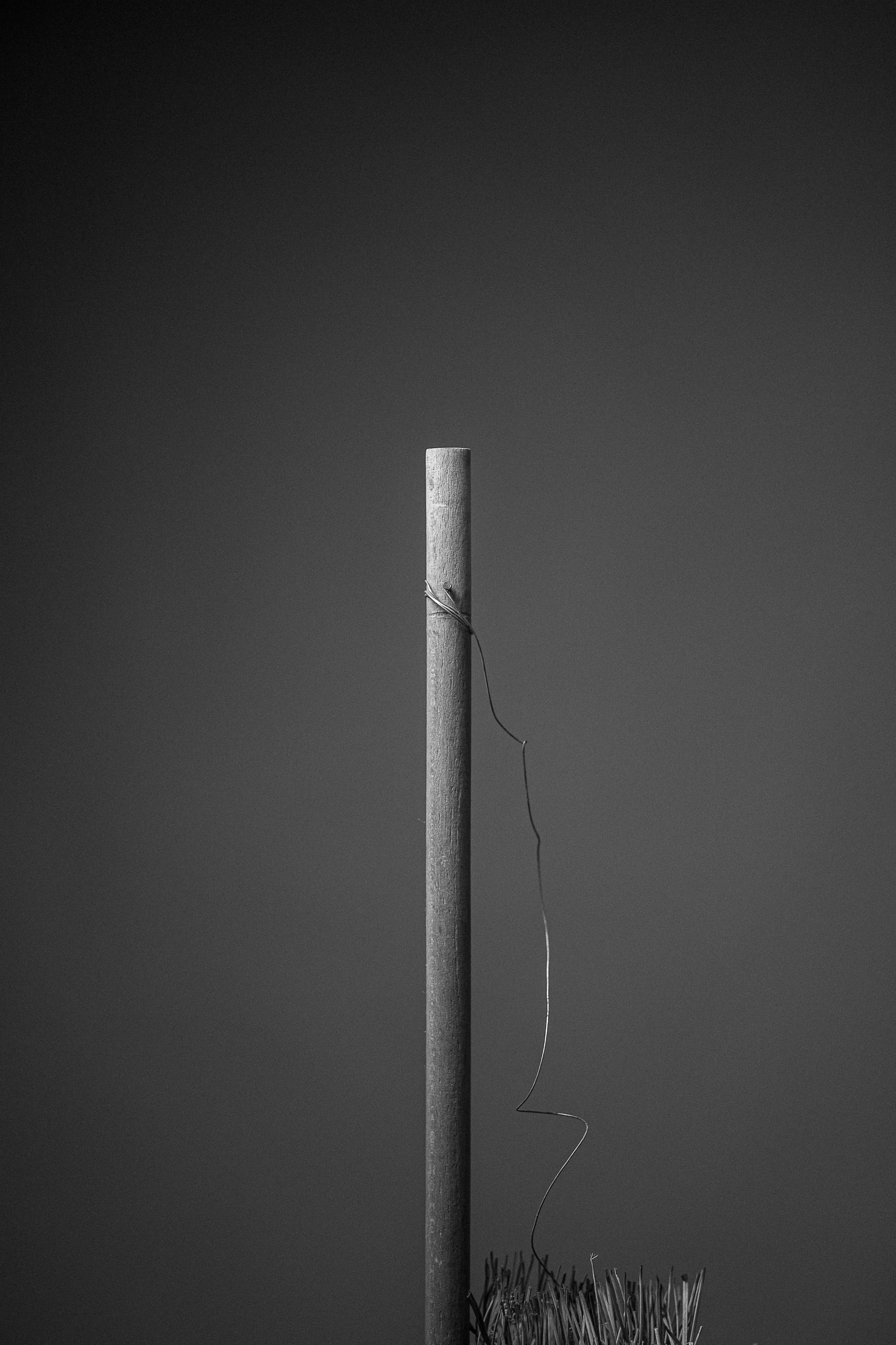
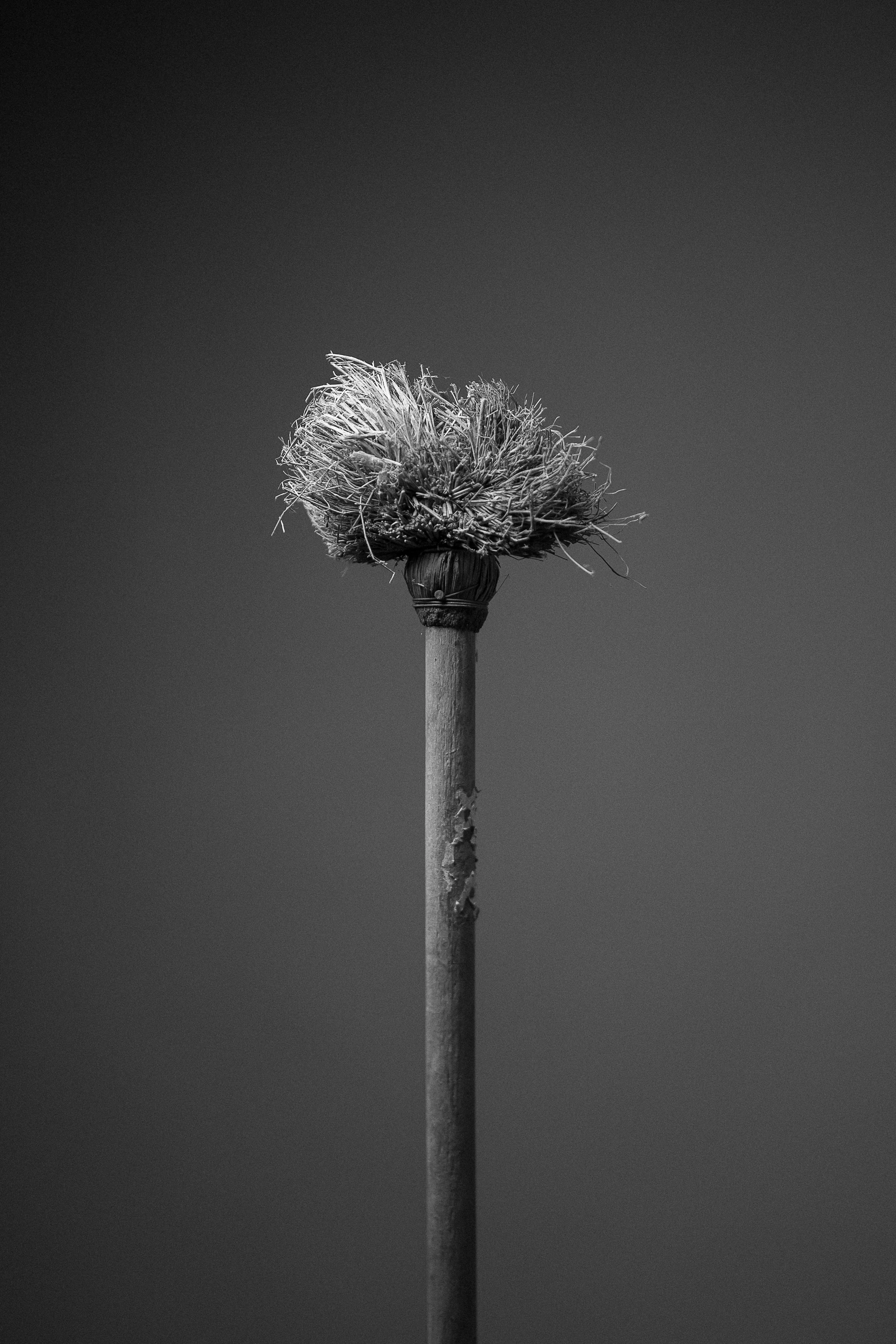
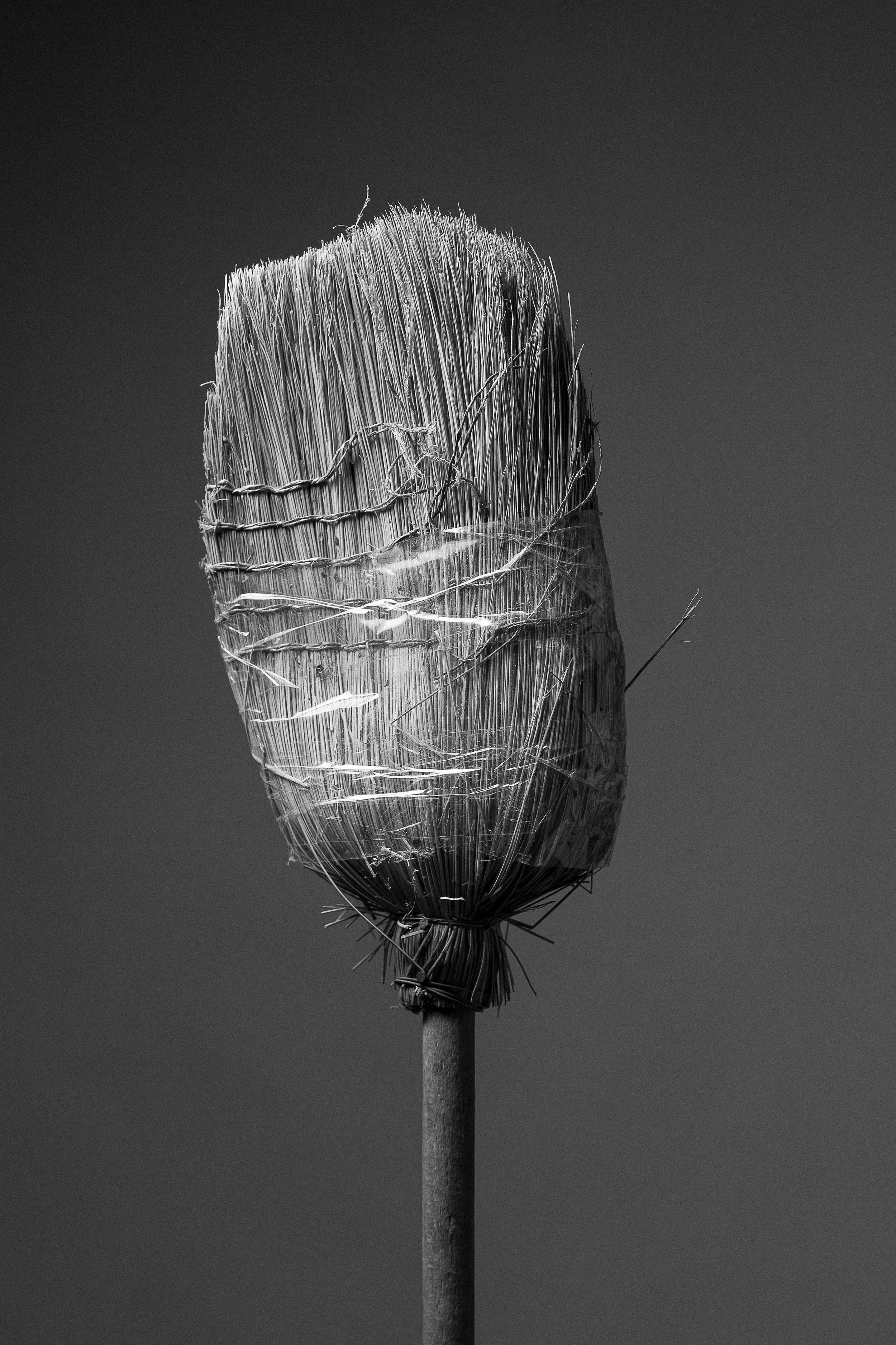
Roman Rus
-
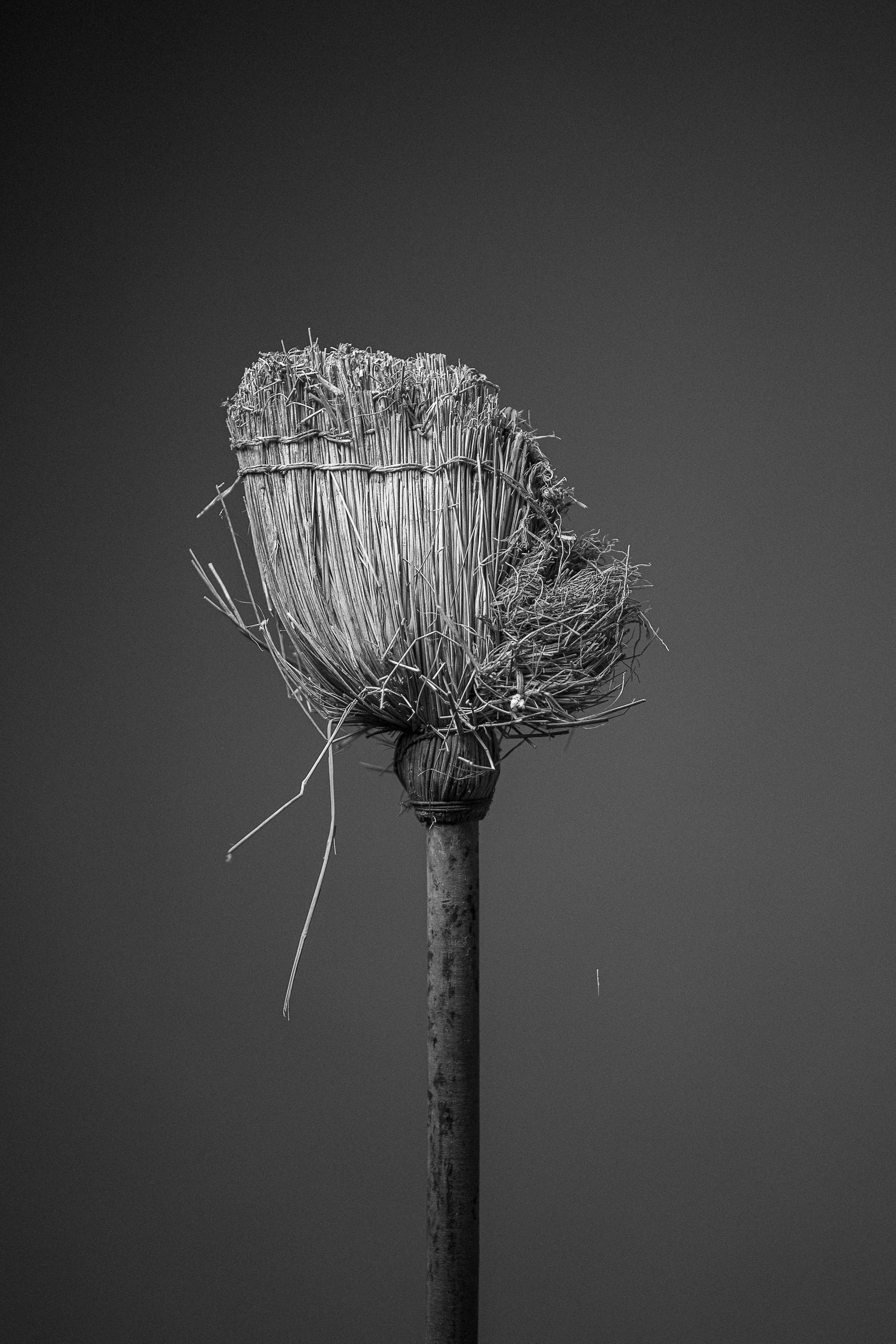
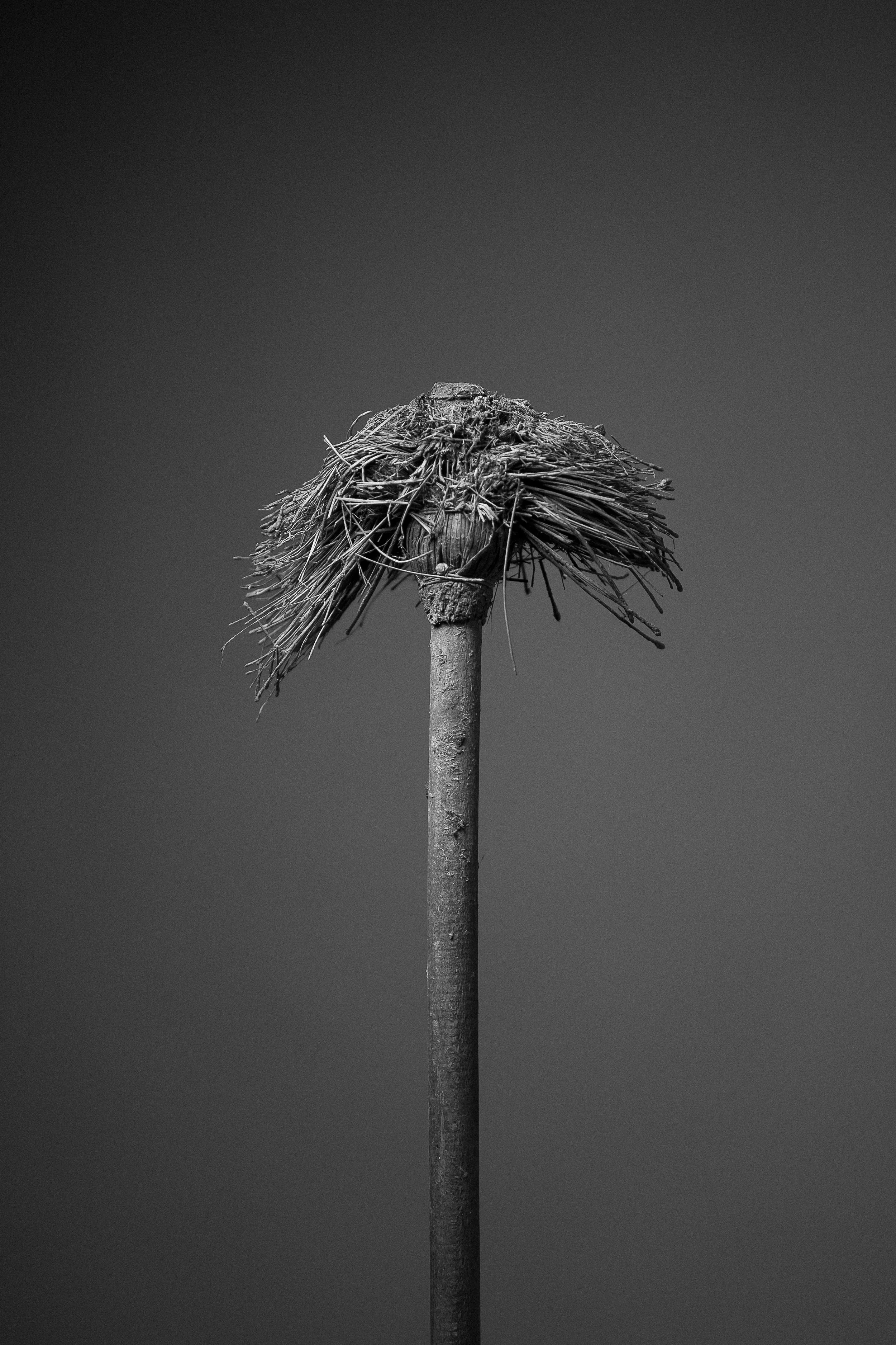
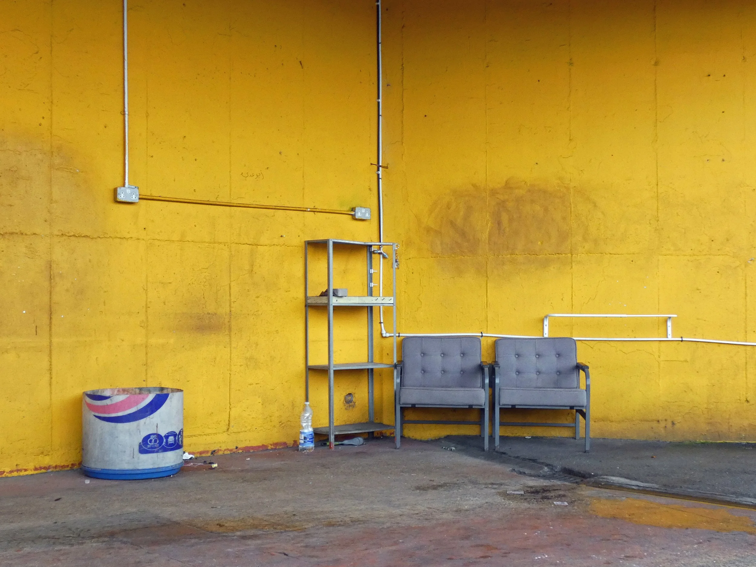
A broom is not just an everyday object, it is an extension of the person who uses it – the person who keeps things tidy. At the same time, it bears traces of wear and tear, a record of its use. Roman Rus transforms it from a mundane object into a portrait figure with its own identity, shaped by the way it is used. The photographic series unfolds as a visual study of wear and tear, as a subtle analysis of the traces imprinted on an everyday object. We use tools as we use people – as long as they serve us. When they fail, we replace them. This is not a project about objects, but about us: about bodies that bend under the weight of work, about relationships that wear out before we even recognize them as such. And about systems in which value is measured by usefulness, and exploitation becomes self-evident.
Joost van Kemenade
-
A collage of doors and facades in Santo Domingo, Dominican Republic. Each surface carries its own vivid color combination. While economic differences are visible throughout the streets, one constant remains: a shared language of color. In these homes, color becomes a form of expression reflecting the lively spirit, freedom, and pride of the people who inhabit them.
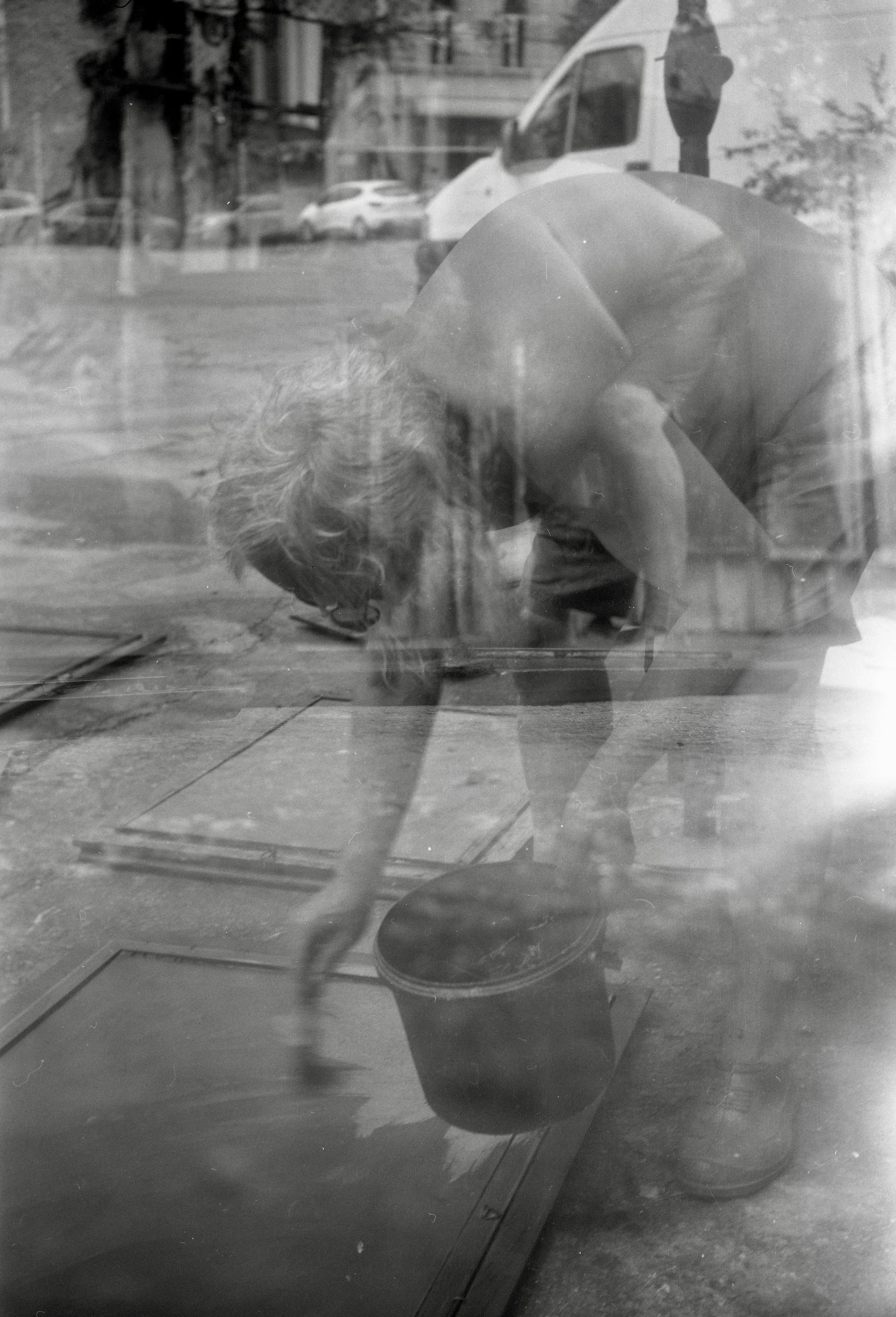
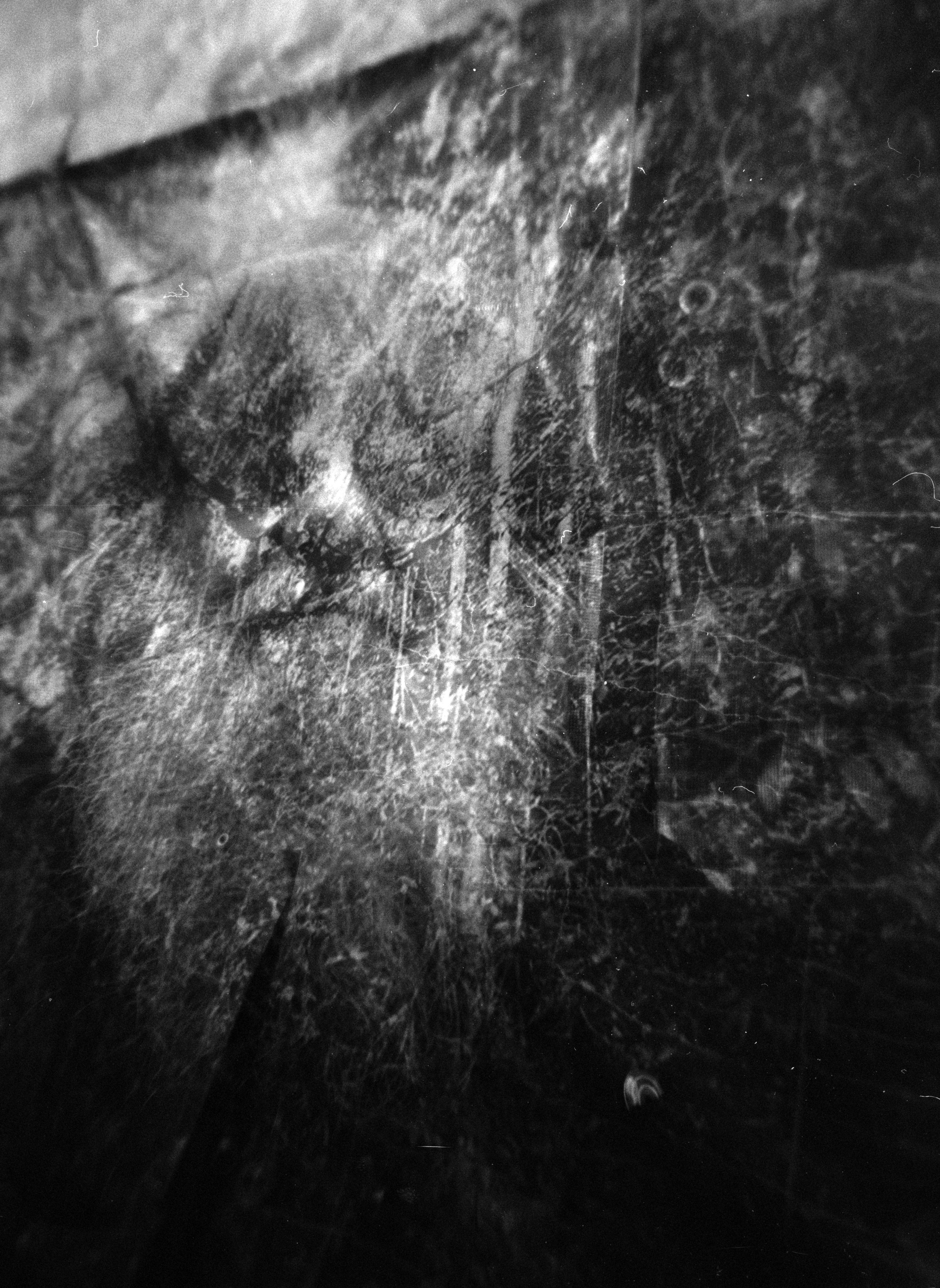
Laurentiu Manolescu
-
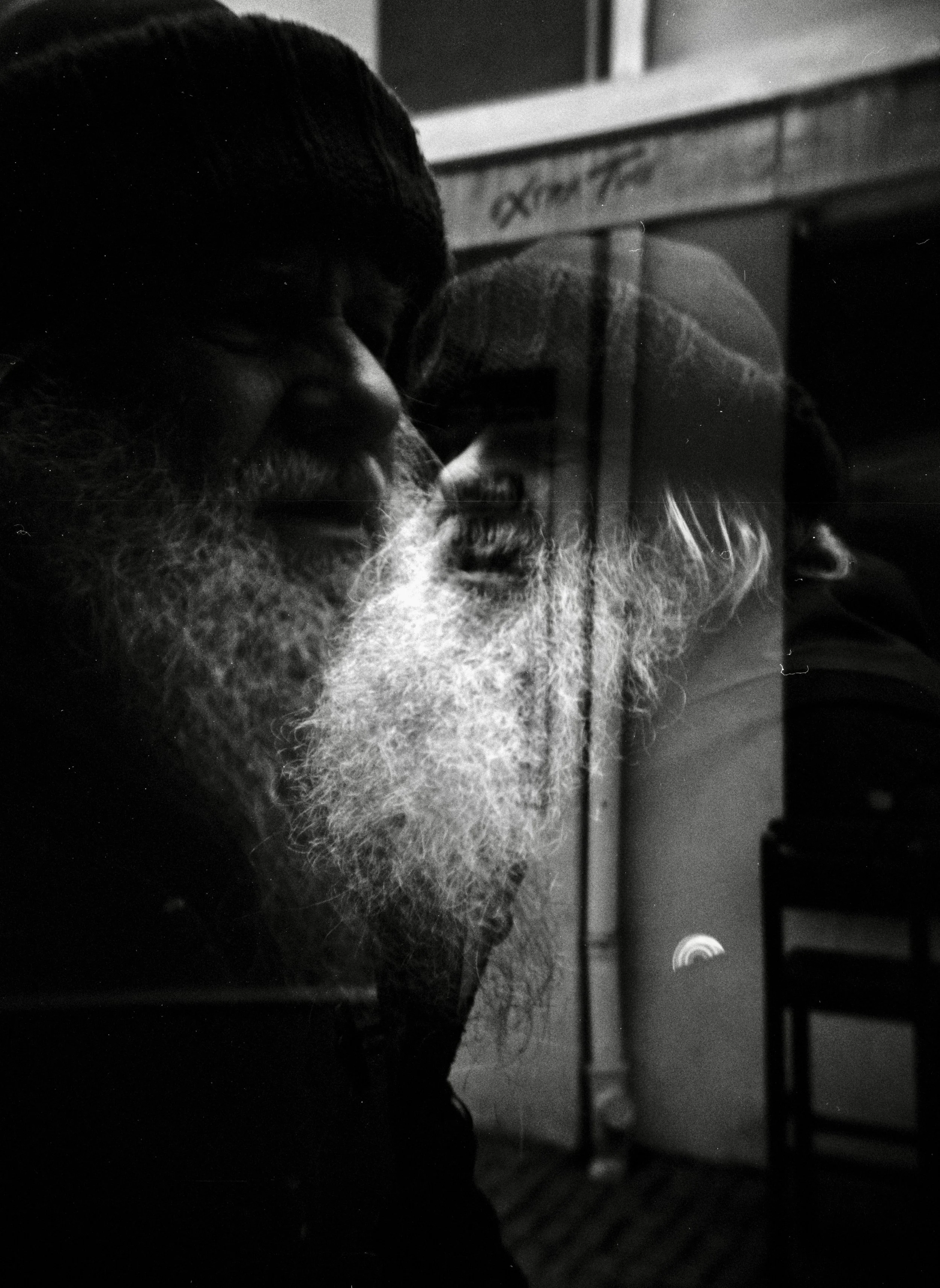
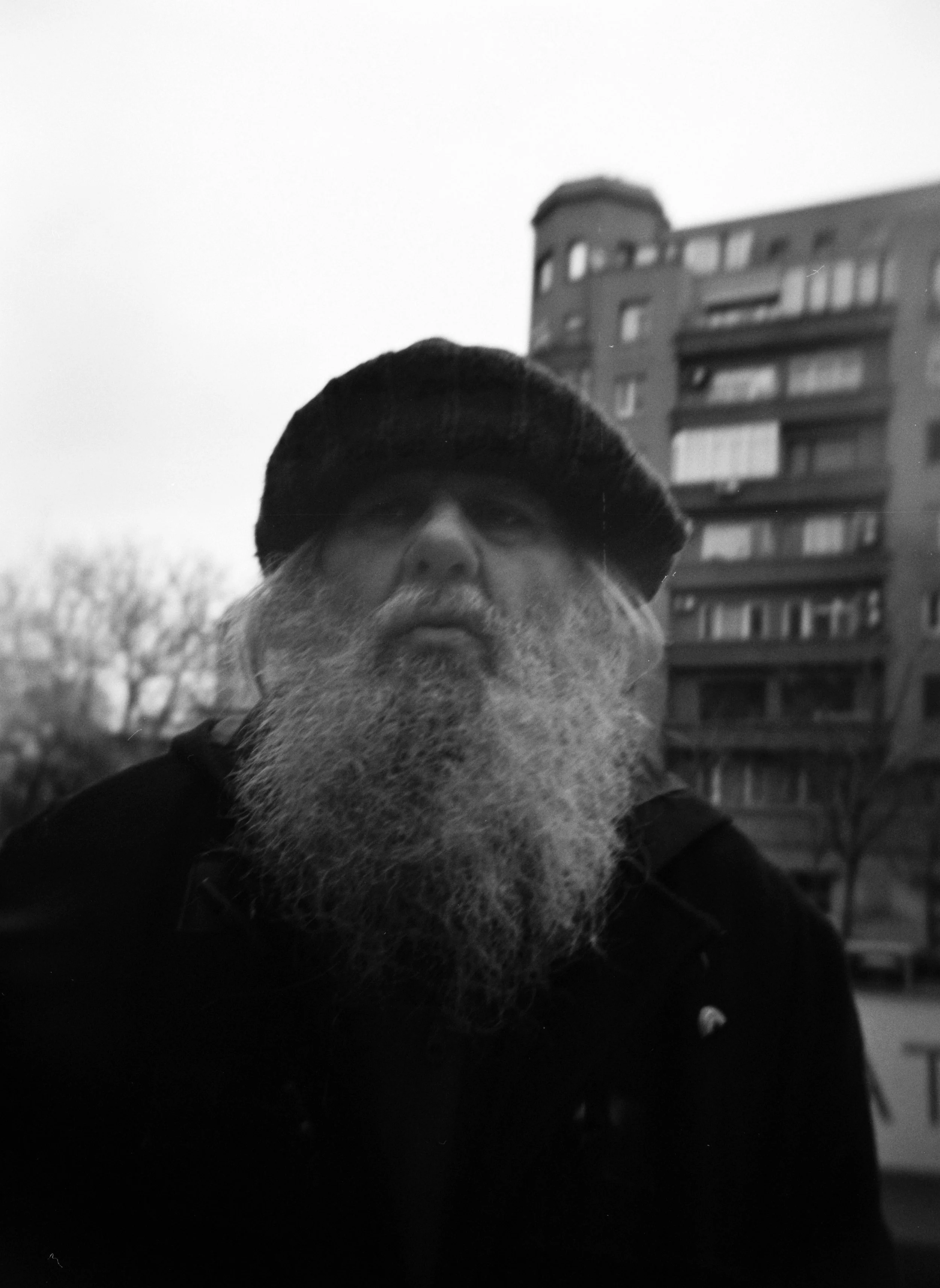
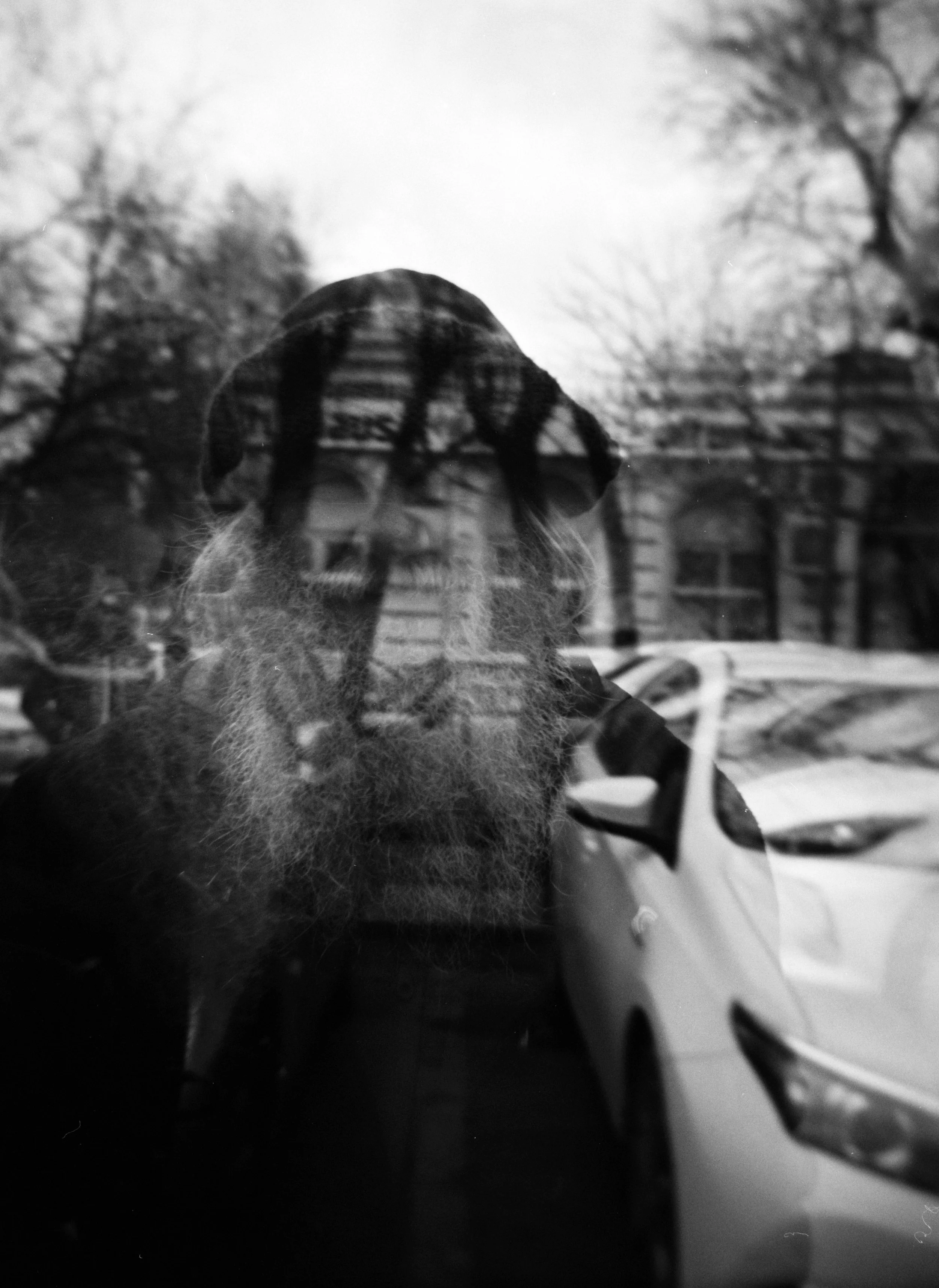
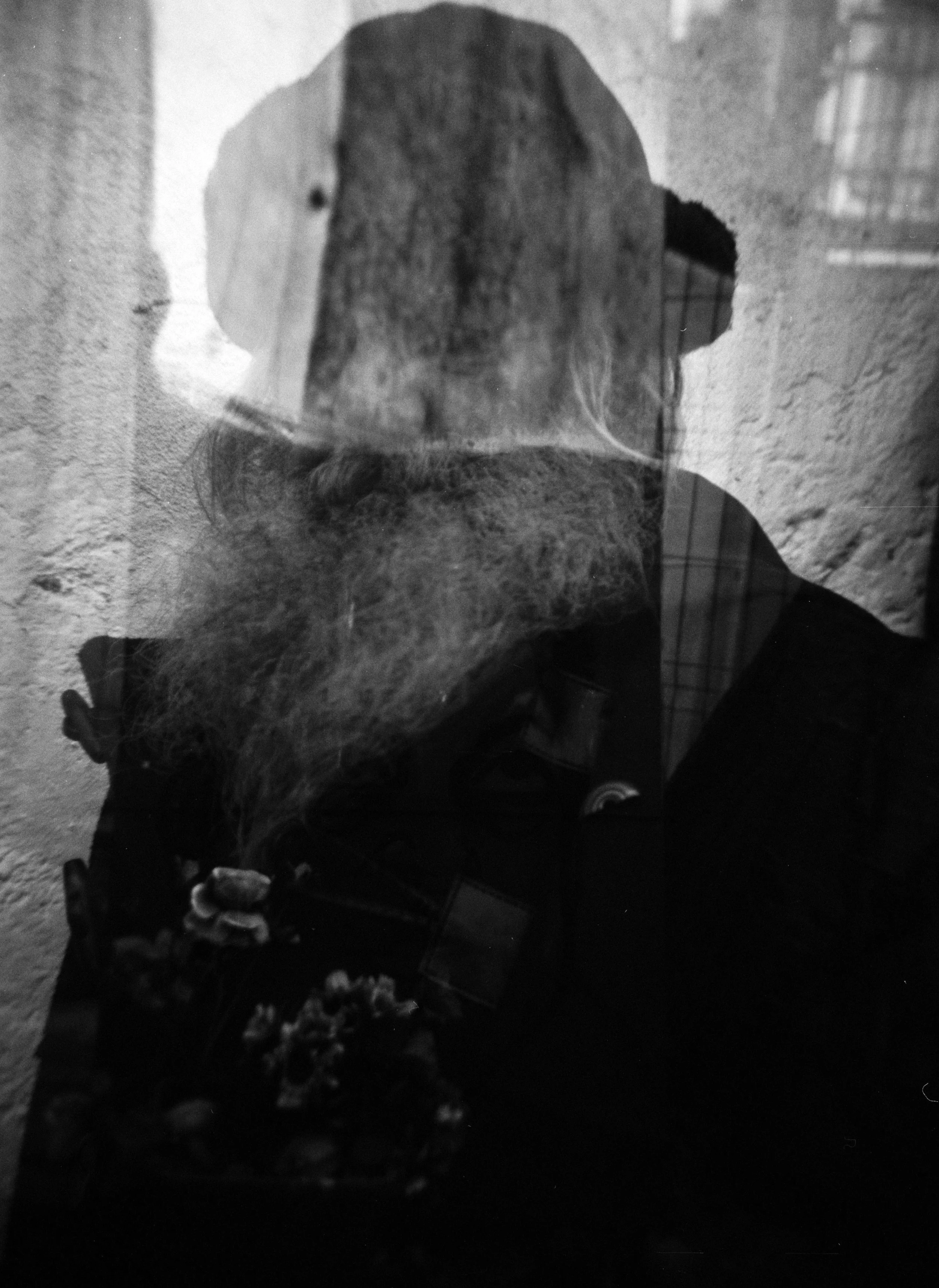
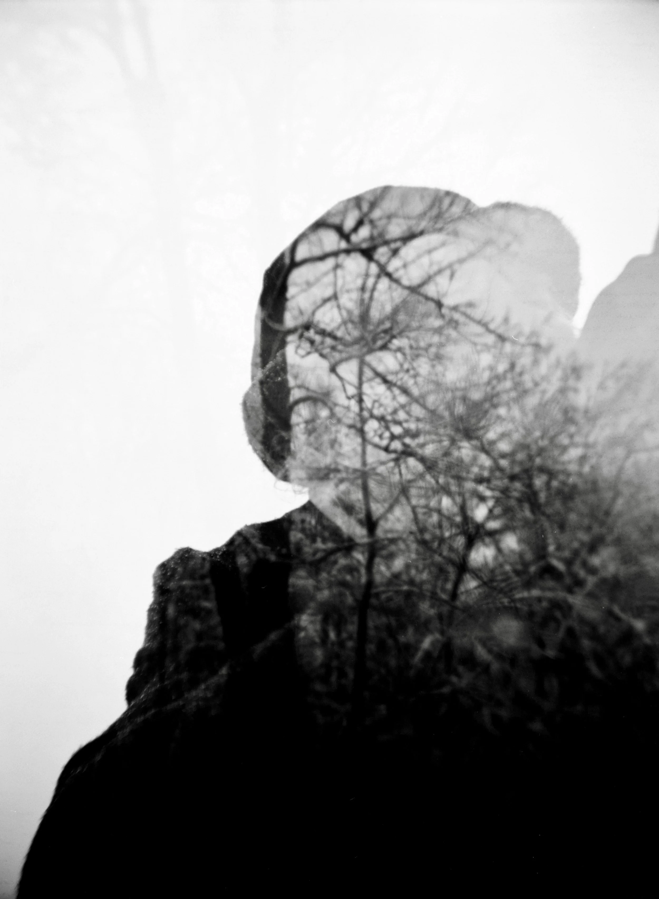
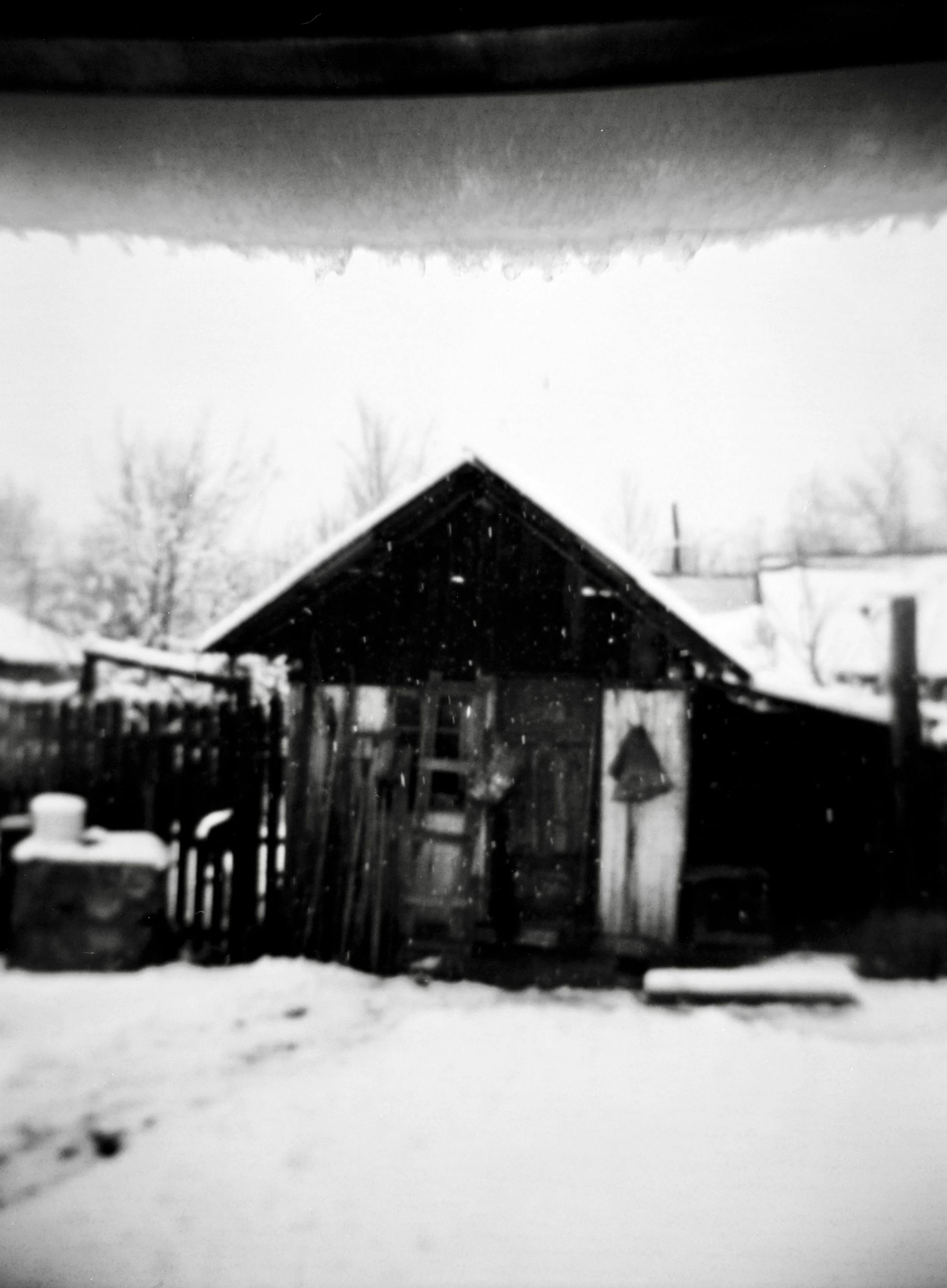
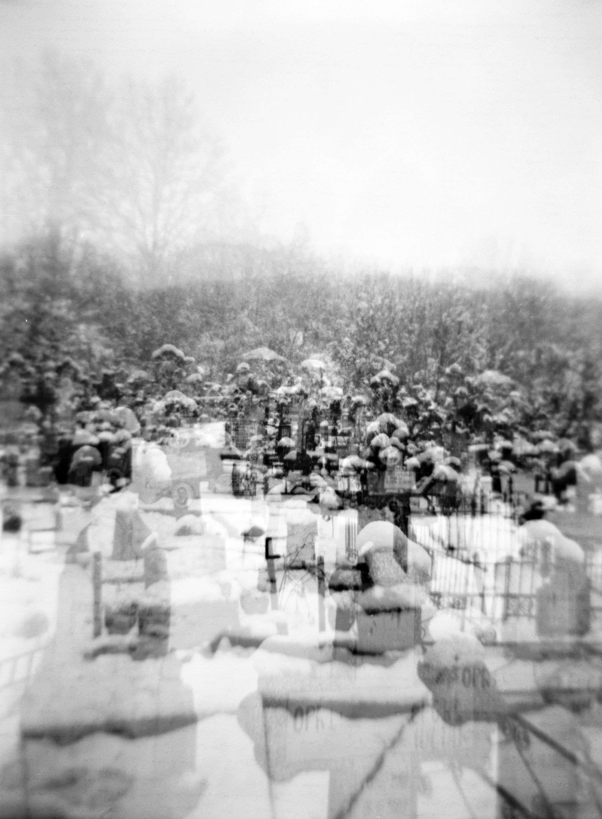
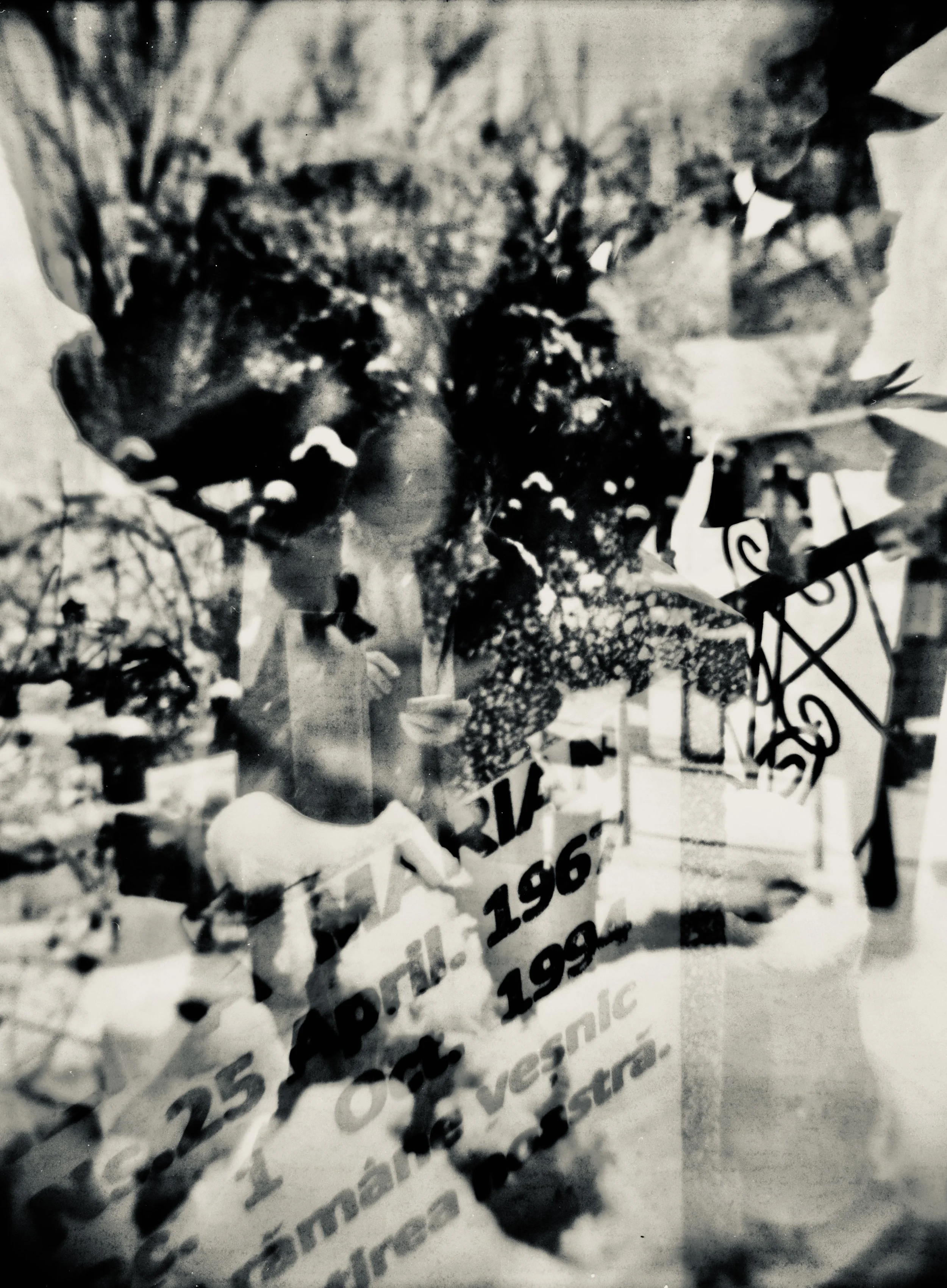
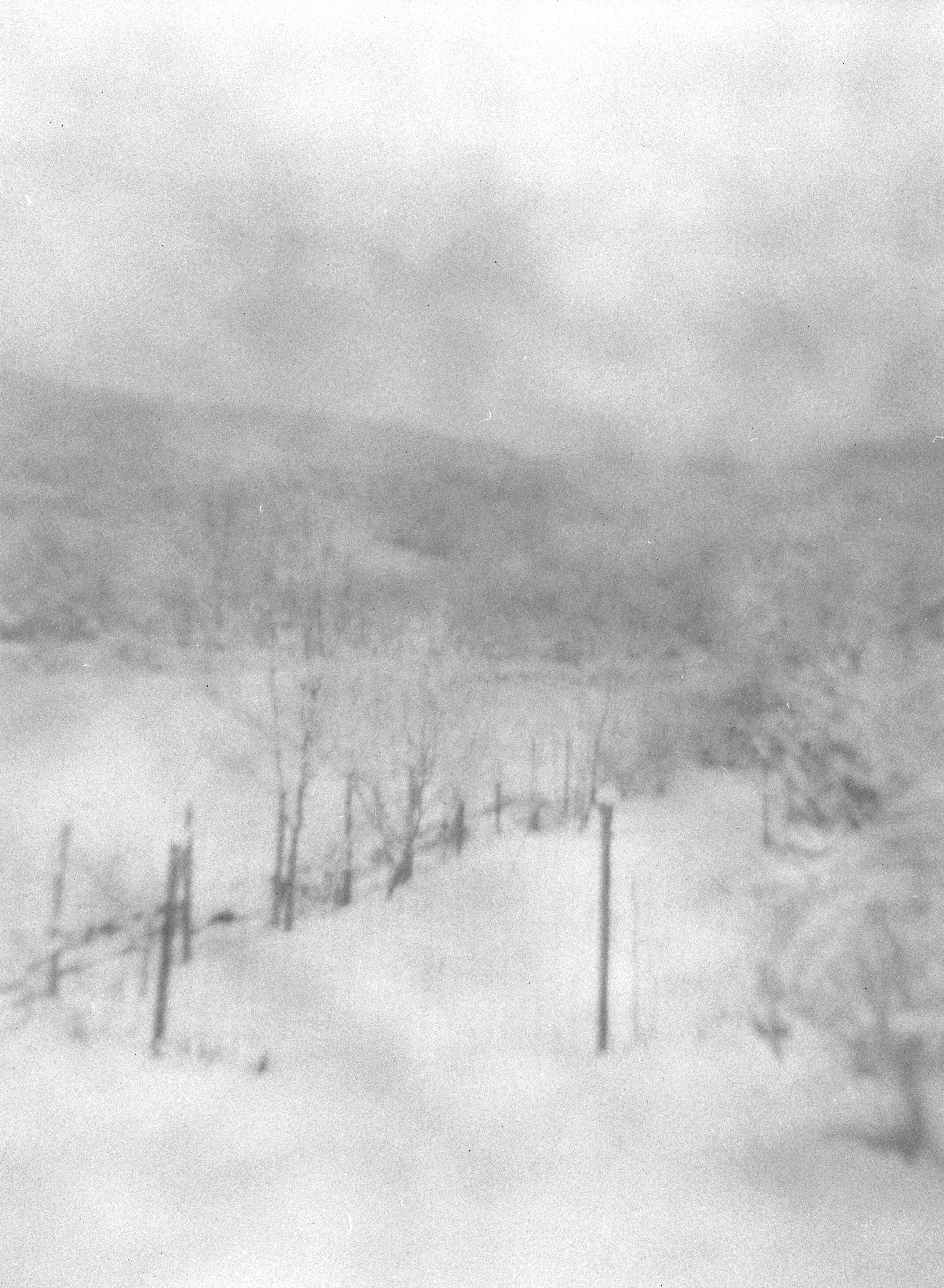
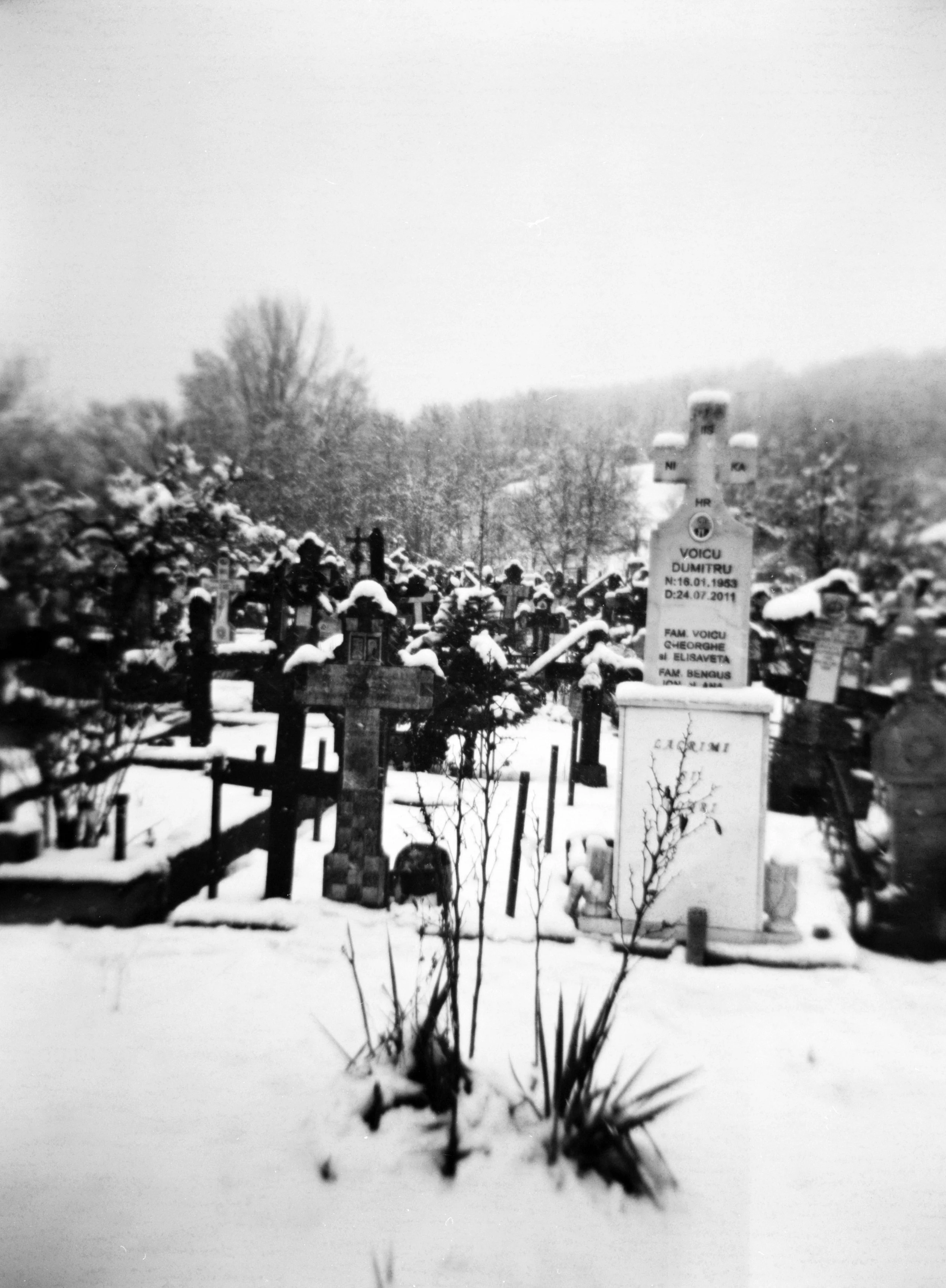
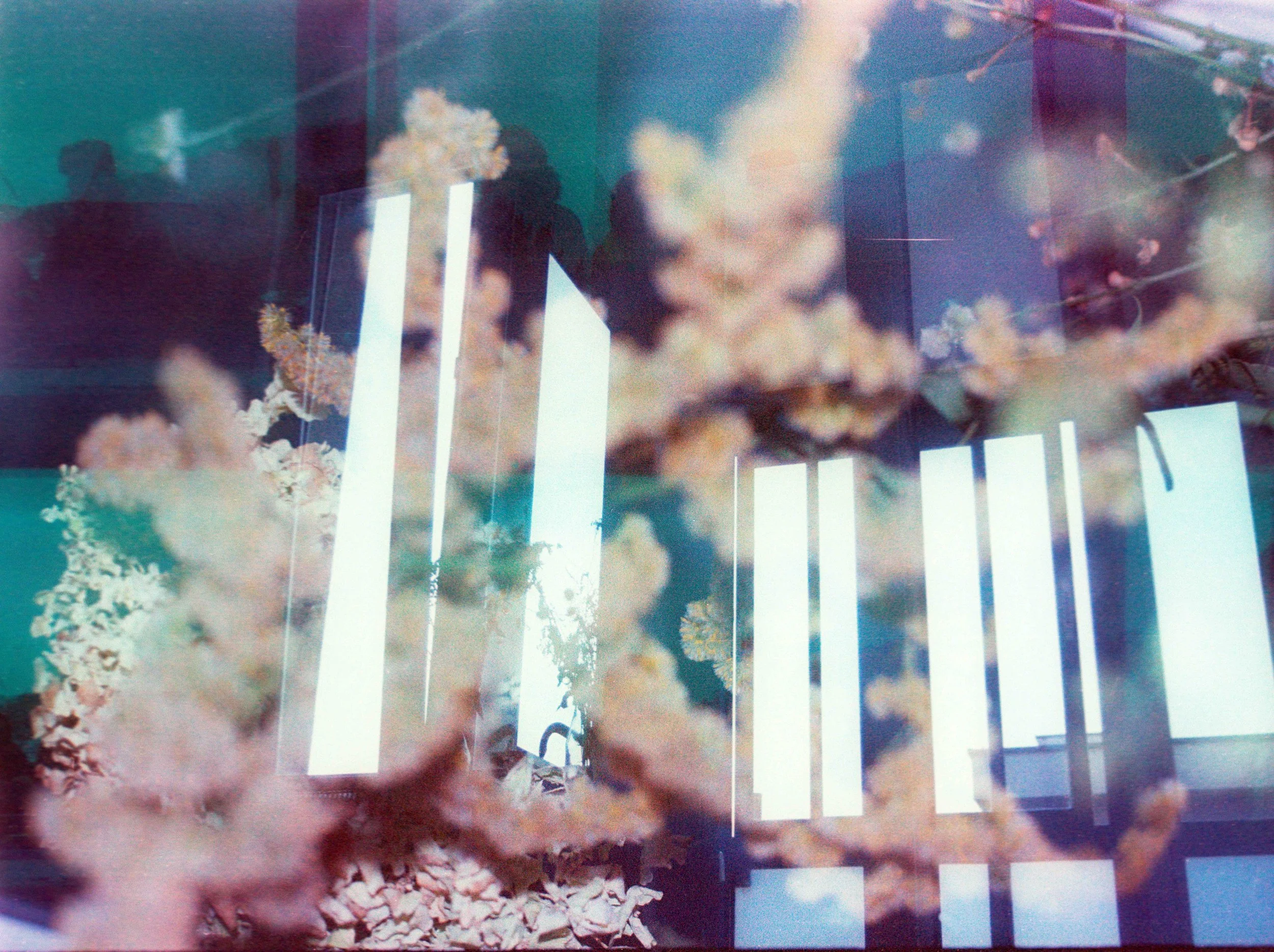
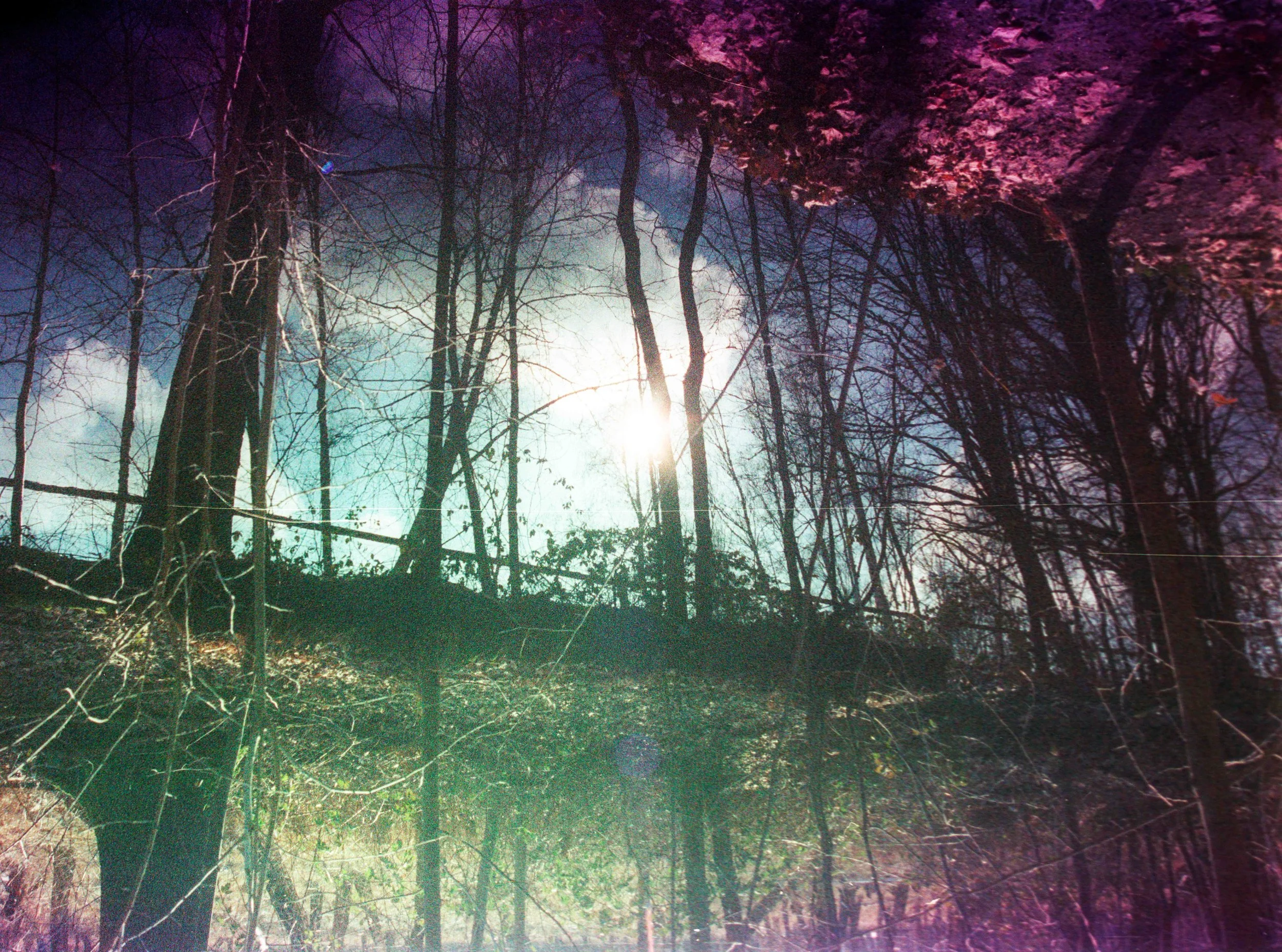
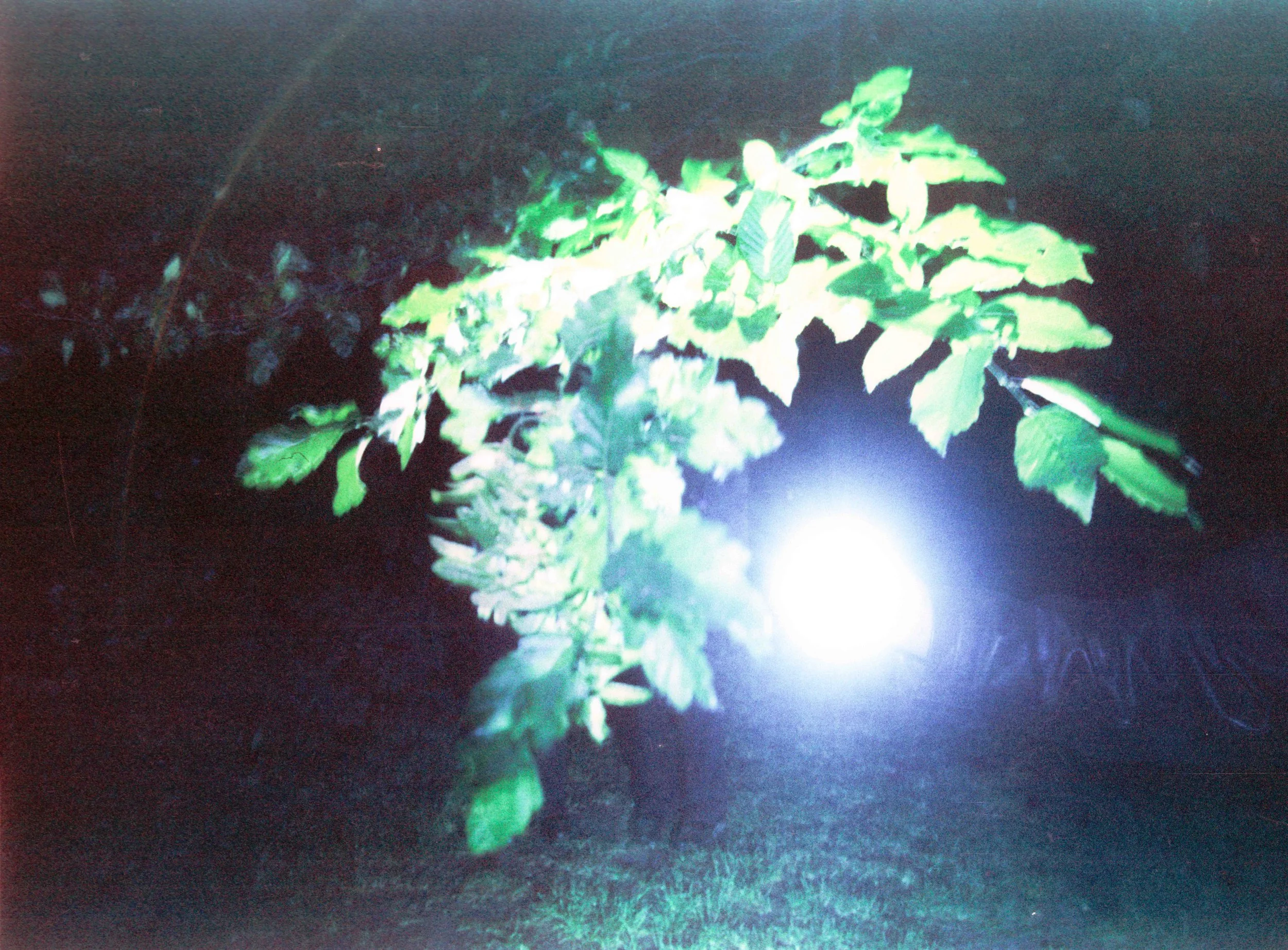
This body of work is part of an ongoing act of witnessing. For the past five years, I have followed the fragile and burning trace of the painter Murivale, in the village of Măgura—where Marian Voicu, his beloved, is buried. What unfolds is not simply a story of loss, but a slow transformation of grief into image, into gesture, into matter.
Shot on black and white film, these photographs resist clarity. They refuse to function as documents. Instead, they drift toward something more unstable—closer to memory than to evidence. The images layer, fracture, and dissolve, as if the act of seeing itself were uncertain. What emerges is not a fixed reality, but a shifting interior landscape, where presence and absence coexist.
The visual language is built through accumulation. Double exposures, textures, fragments, and interruptions become a way of thinking. The image behaves like a palimpsest—rewritten over time, never fully erased, never fully revealed. Faces merge with landscapes, bodies dissolve into branches, surfaces carry traces of decay. The human figure is no longer separate from its surroundings; it becomes inhabited by them. In this sense, the work reflects a world where mourning does not signify disappearance, but a redistribution of being.
There is a material dimension to this process. The film itself becomes a witness. Scratches, burns, light leaks, and grain are not imperfections, but inscriptions—marks of time acting directly on the image. What is captured is not only what stood before the lens, but also what happened to the image as it came into existence. The photograph carries both the outside world and its own erosion.
This approach exists somewhere between cinema and photography, between document and dream. It is guided by the belief that truth is not always visible, but can be felt through distortion. Black and white becomes a form of reduction—stripping away distraction and leaving only contrast, tension, and silence. Grain becomes breath. Blur becomes duration. The image does not describe; it evokes.
This is not a biography of Murivale. It is an attempt to inhabit the space that remains after loss. To understand how love persists when it no longer has a body. The village, the trees, the air—these are no longer just elements of a place, but carriers of presence, extensions of memory.
These images do not offer answers.
They remain as traces—of a life, of a love, of a continuous becoming.My name is Laurențiu Manolescu.
I am a film director and director of photography, working at the intersection of cinema and visual art, where narrative dissolves into atmosphere and image becomes a form of thinking.
For the past five years, my work has been closely intertwined with the life and practice of the painter Murivale, whose artistic universe I have been observing, documenting, and, in many ways, inhabiting. Our relationship is not built on traditional documentation, but on a shared sensibility—an understanding that art is not a representation of life, but a continuation of it.
Murivale’s work is deeply marked by the loss of his beloved, Marian Voicu, who is buried in the village of Măgura. This absence is not treated as an end, but as a force that reshapes perception, gesture, and material. His paintings carry this tension between disappearance and persistence, between intimacy and fragmentation. In response, my images do not attempt to explain his work, but to resonate with it.
What connects us is a common search: how to translate an inner state into form without reducing its complexity. His medium is painting; mine is light, time, and film. Where his gestures leave traces on canvas, mine unfold through duration, layering, and the physicality of analog film. We meet in this space of transformation—where memory becomes texture, and emotion takes on a material presence. Our collaboration exists in a fluid zone between observation and participation. I am not an external witness, but neither am I fully inside the work. The camera becomes a mediator—absorbing, distorting, and reconfiguring what unfolds. The resulting images are not portraits in the conventional sense; they are fragments of a shared process, echoes of a dialogue that continues beyond language.
This ongoing project is not about defining Murivale, nor about constructing a fixed narrative. It is about staying with the uncertainty of his world, allowing it to unfold over time, and finding a visual language that can hold its contradictions—between absence and presence, loss and continuity, silence and expression. In this sense, our artistic relationship is less a collaboration in the traditional sense, and more a convergence: two practices moving alongside each other, shaped by the same question.
Matthew Garbutt
Daria Maistrenko
-
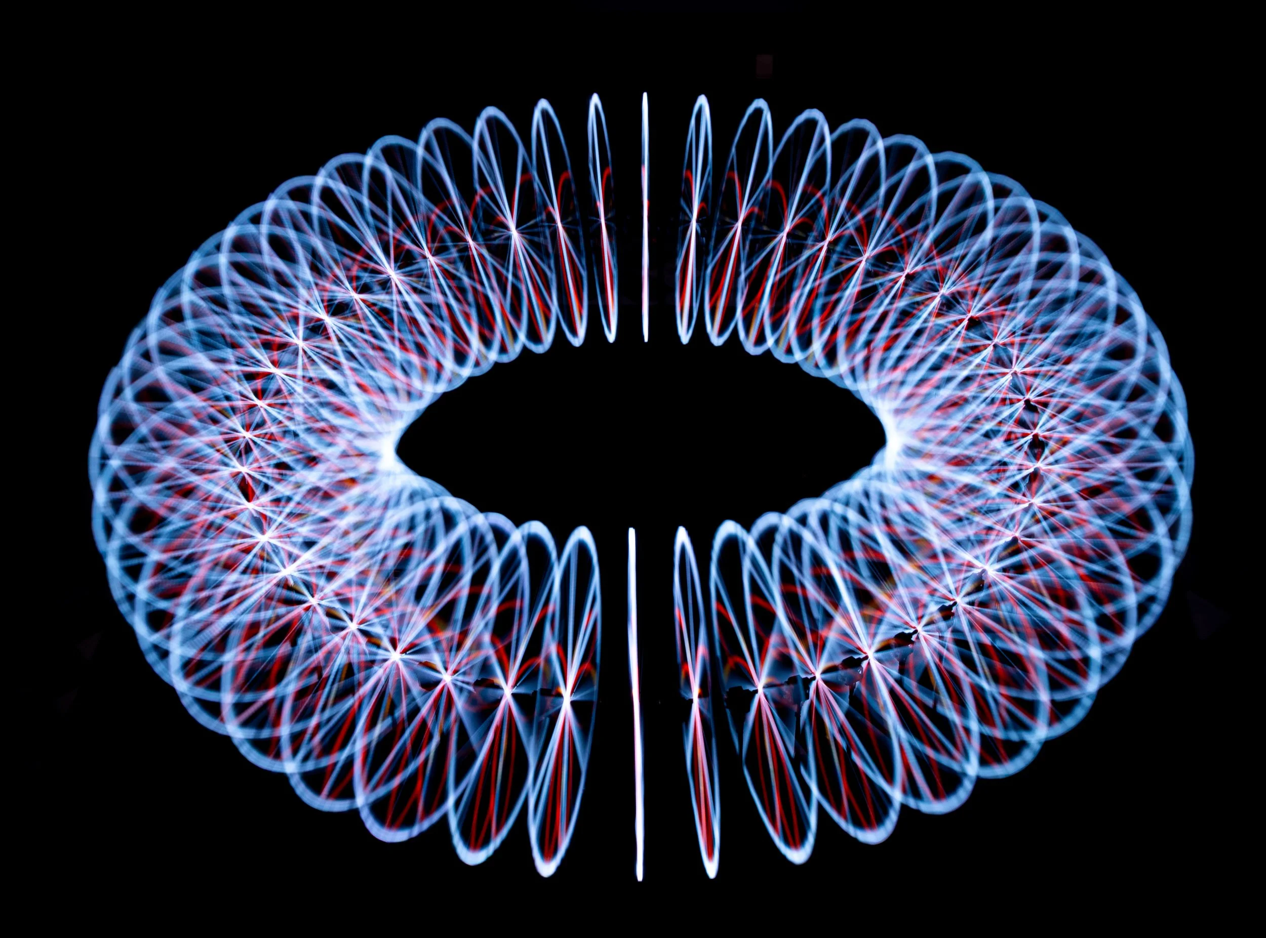
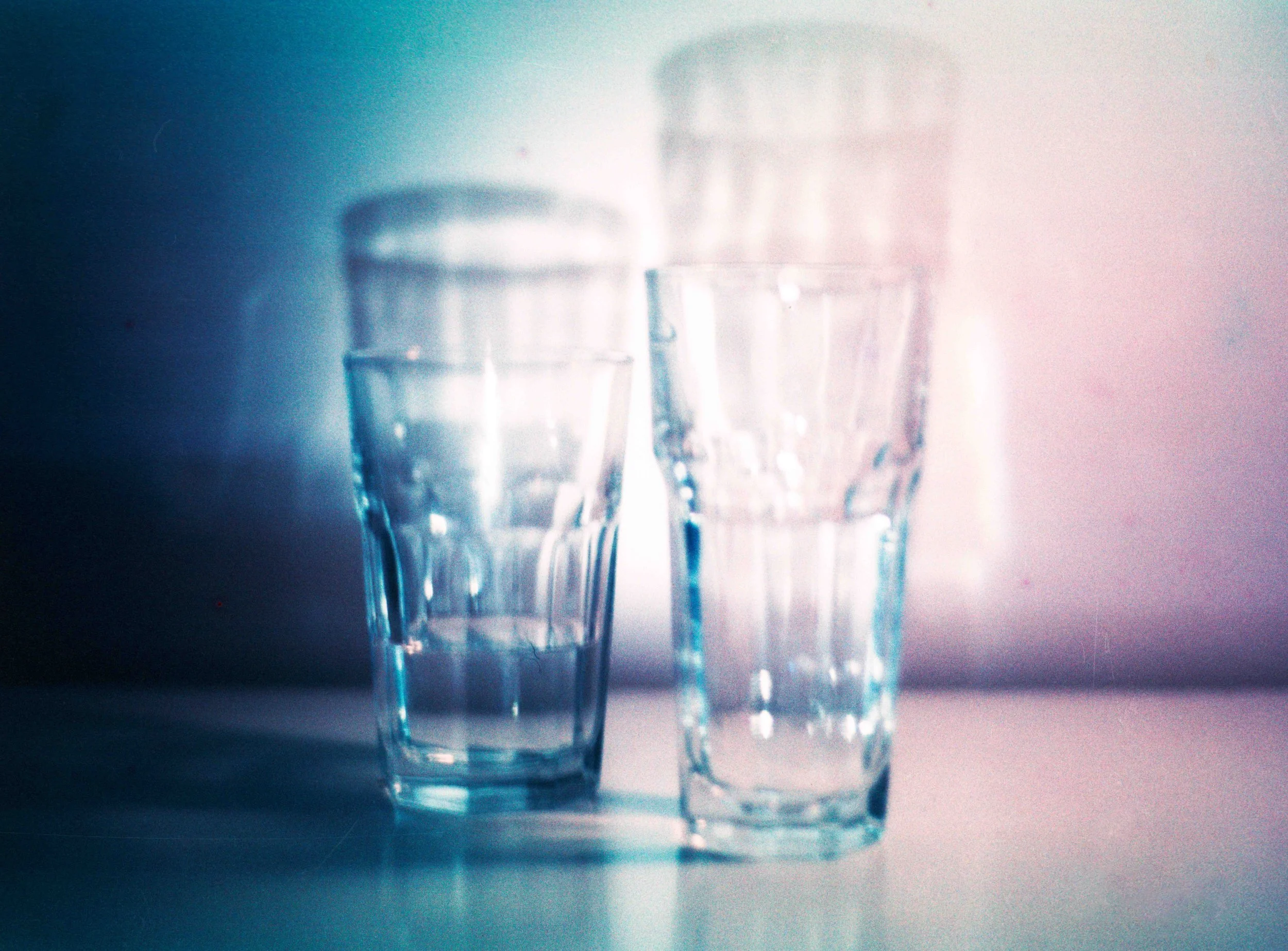
This series explores light as both presence and absence. Through repetition and cyclical movement, the images reduce visual information to its essential elements — color, glow, and fading traces.
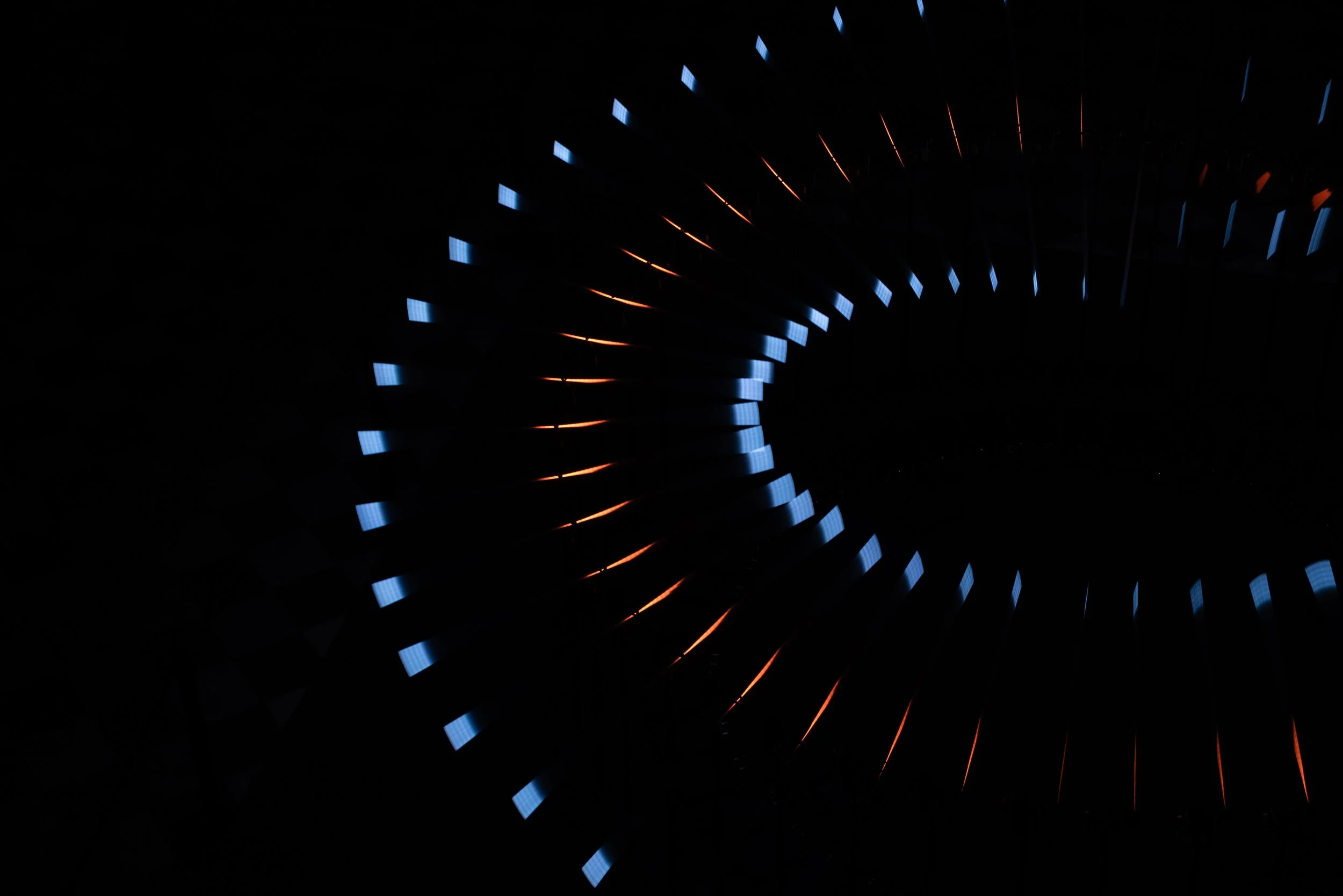
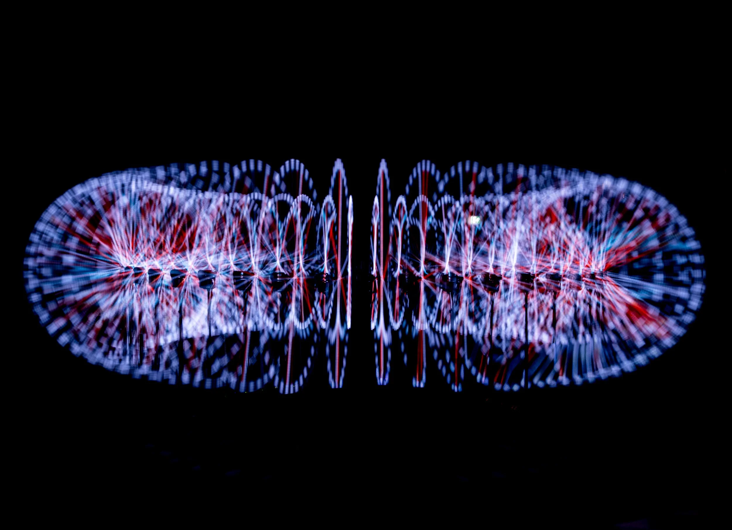
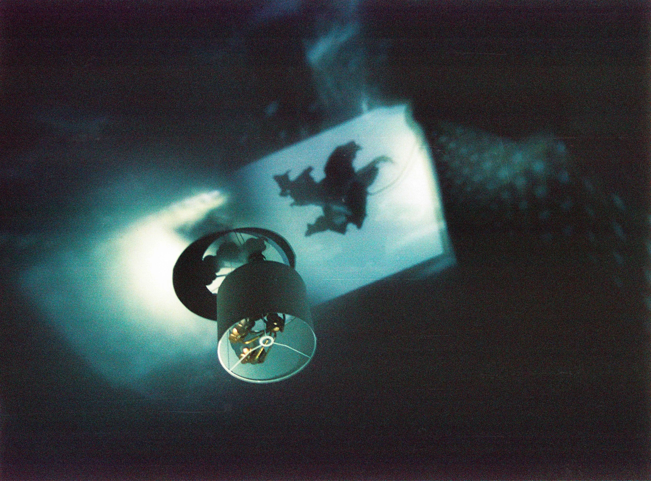
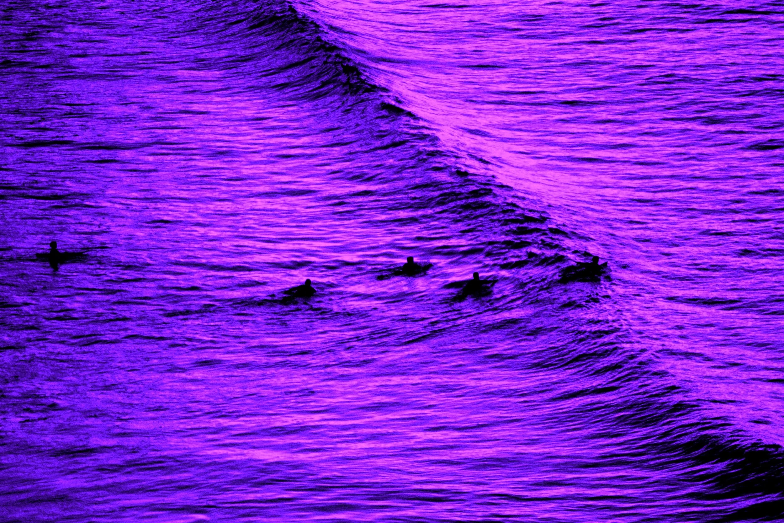
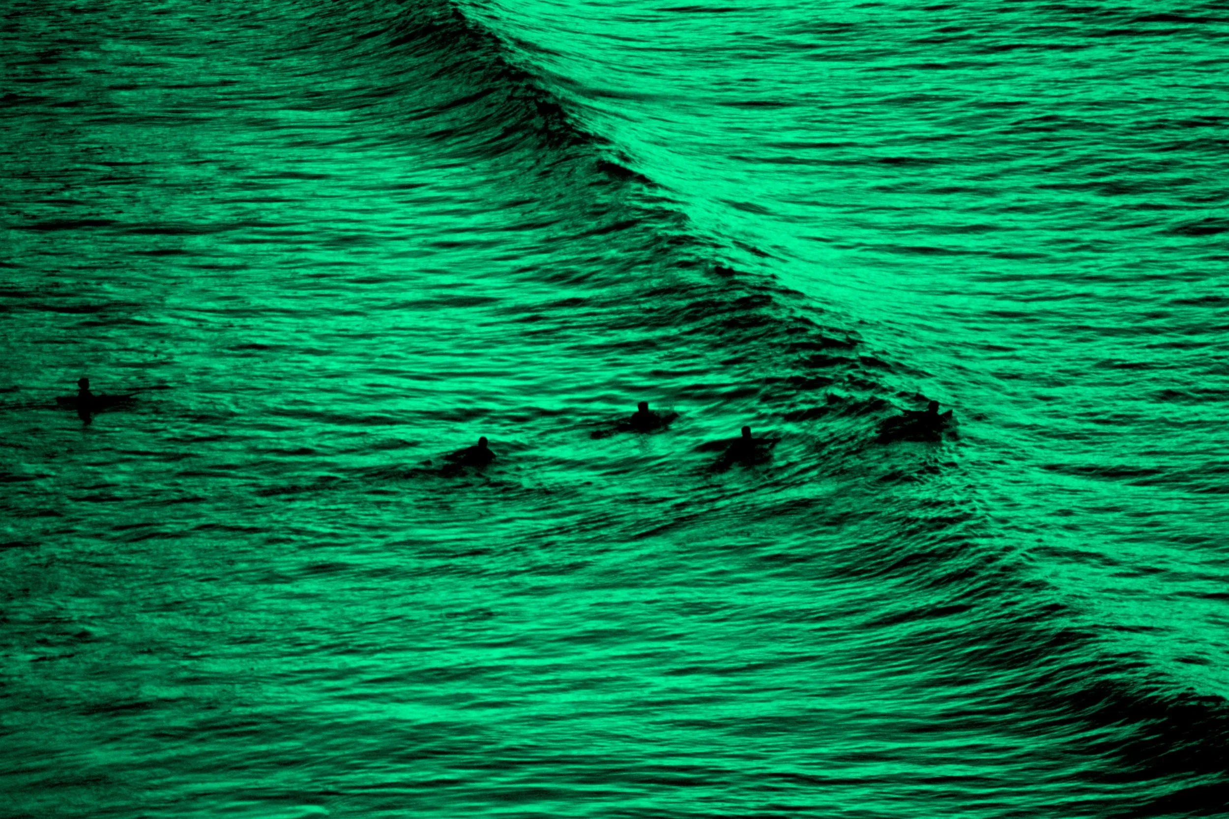
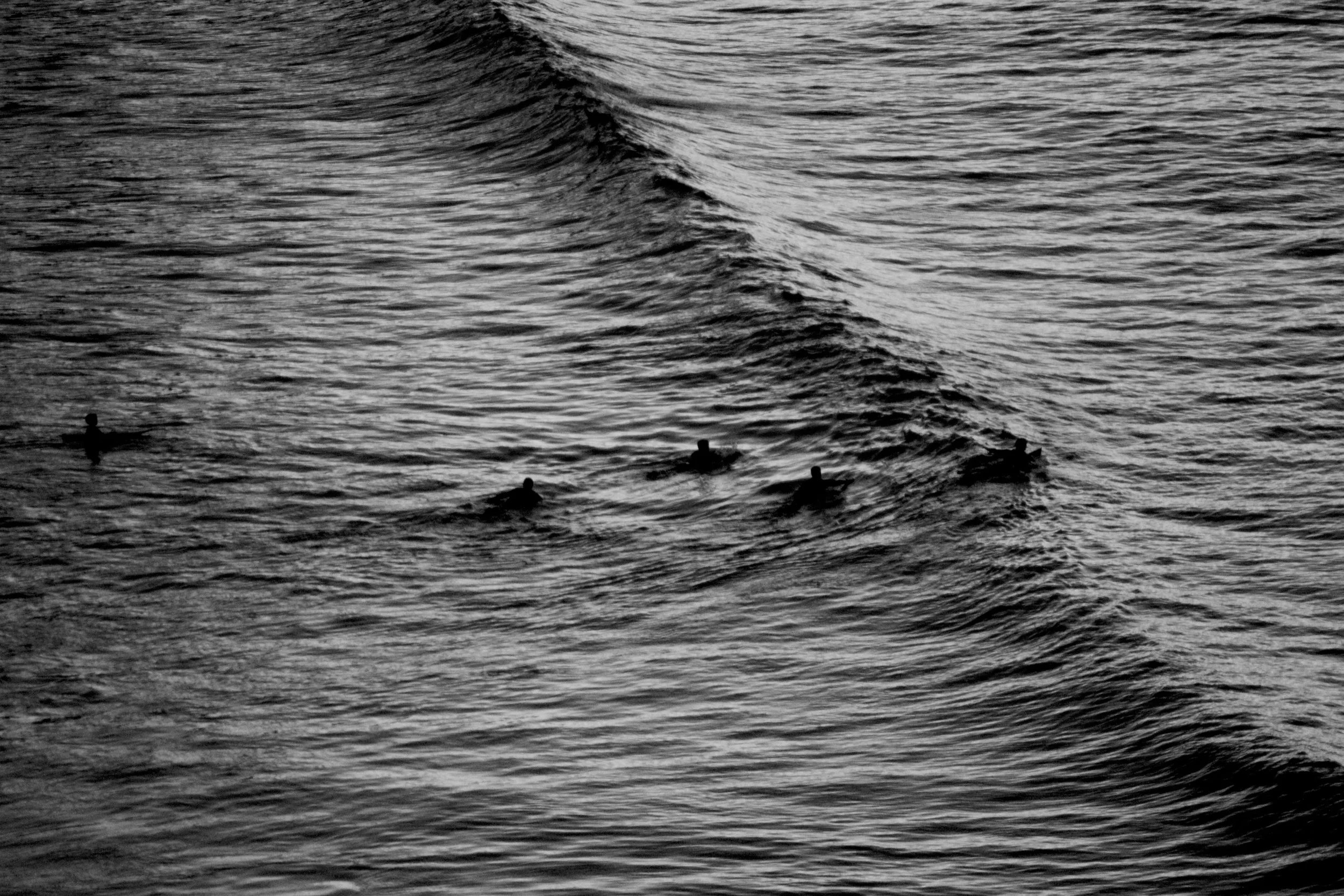
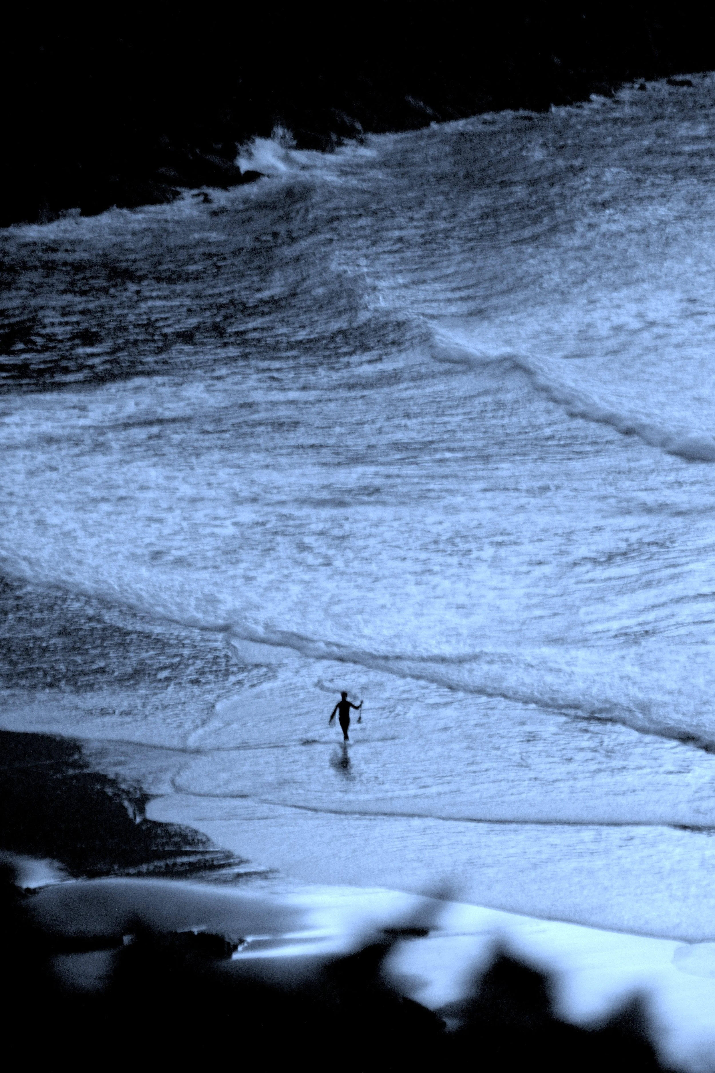
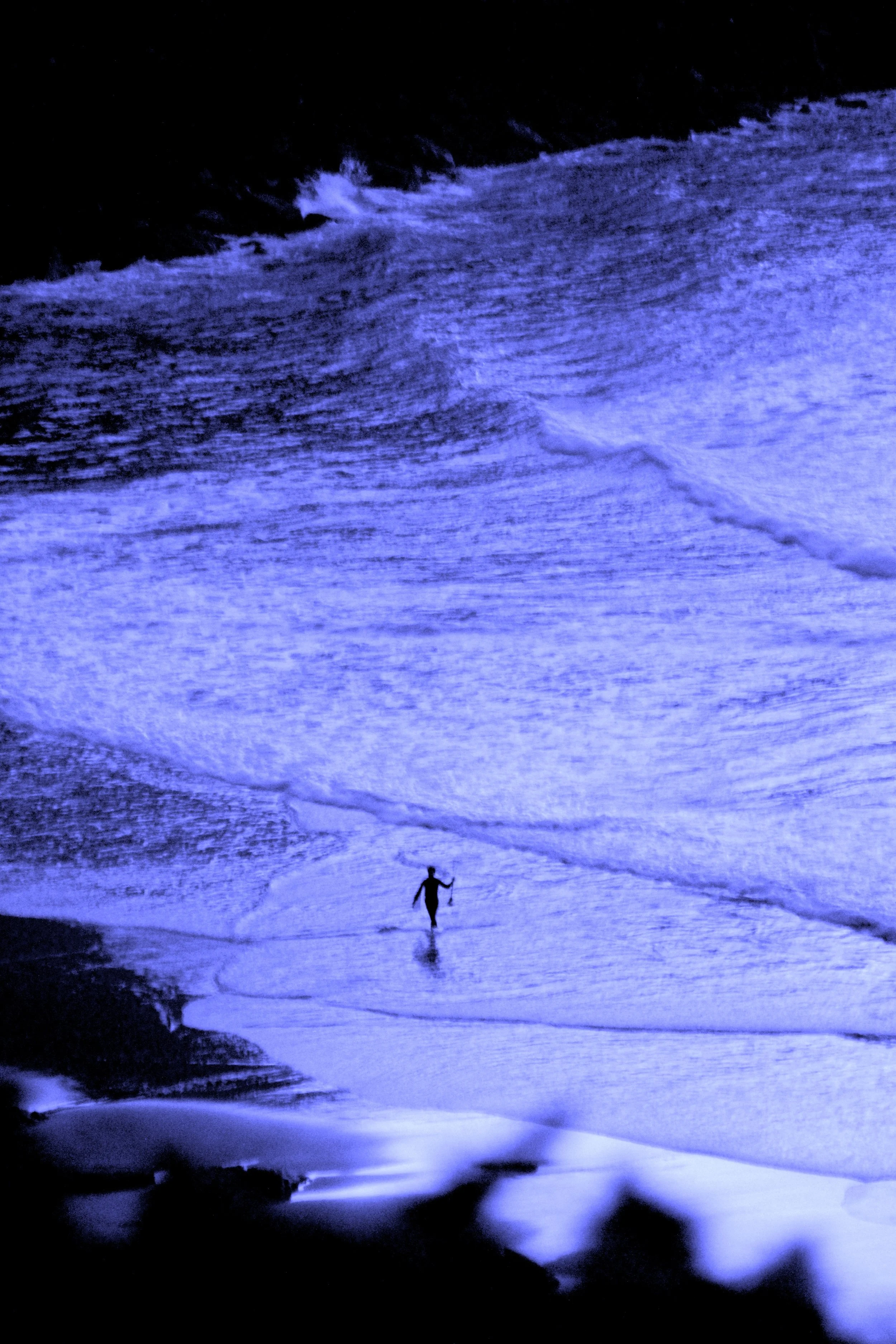
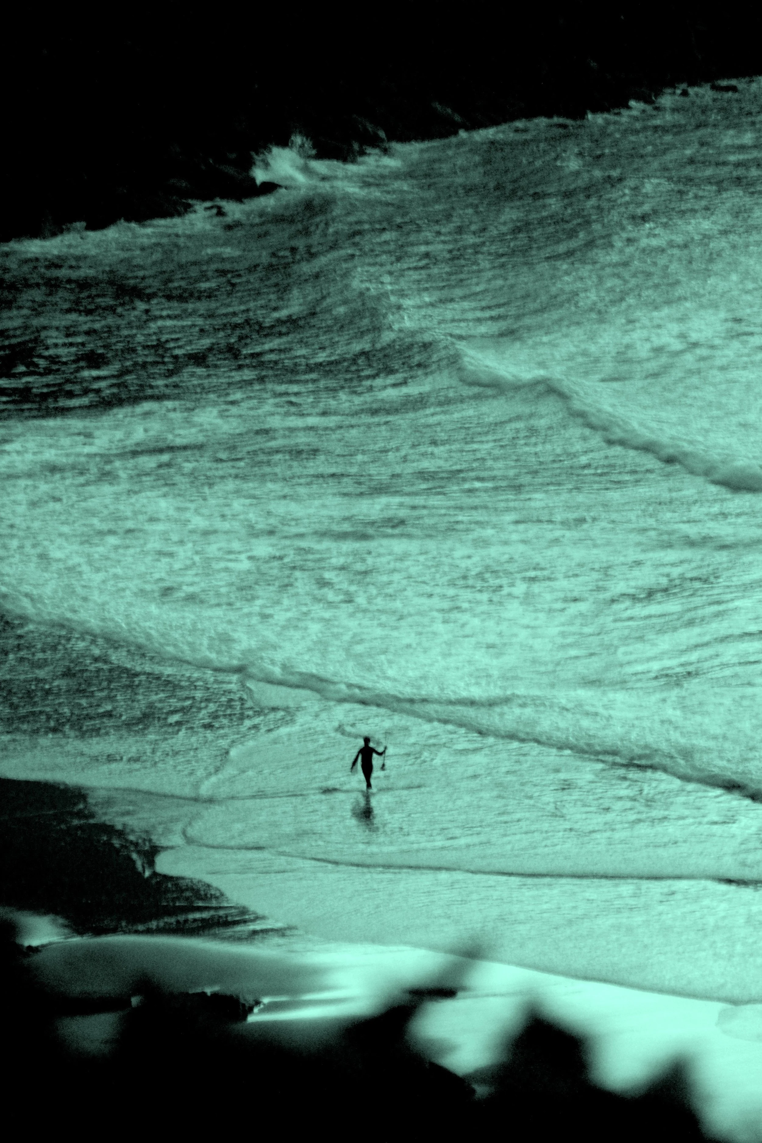
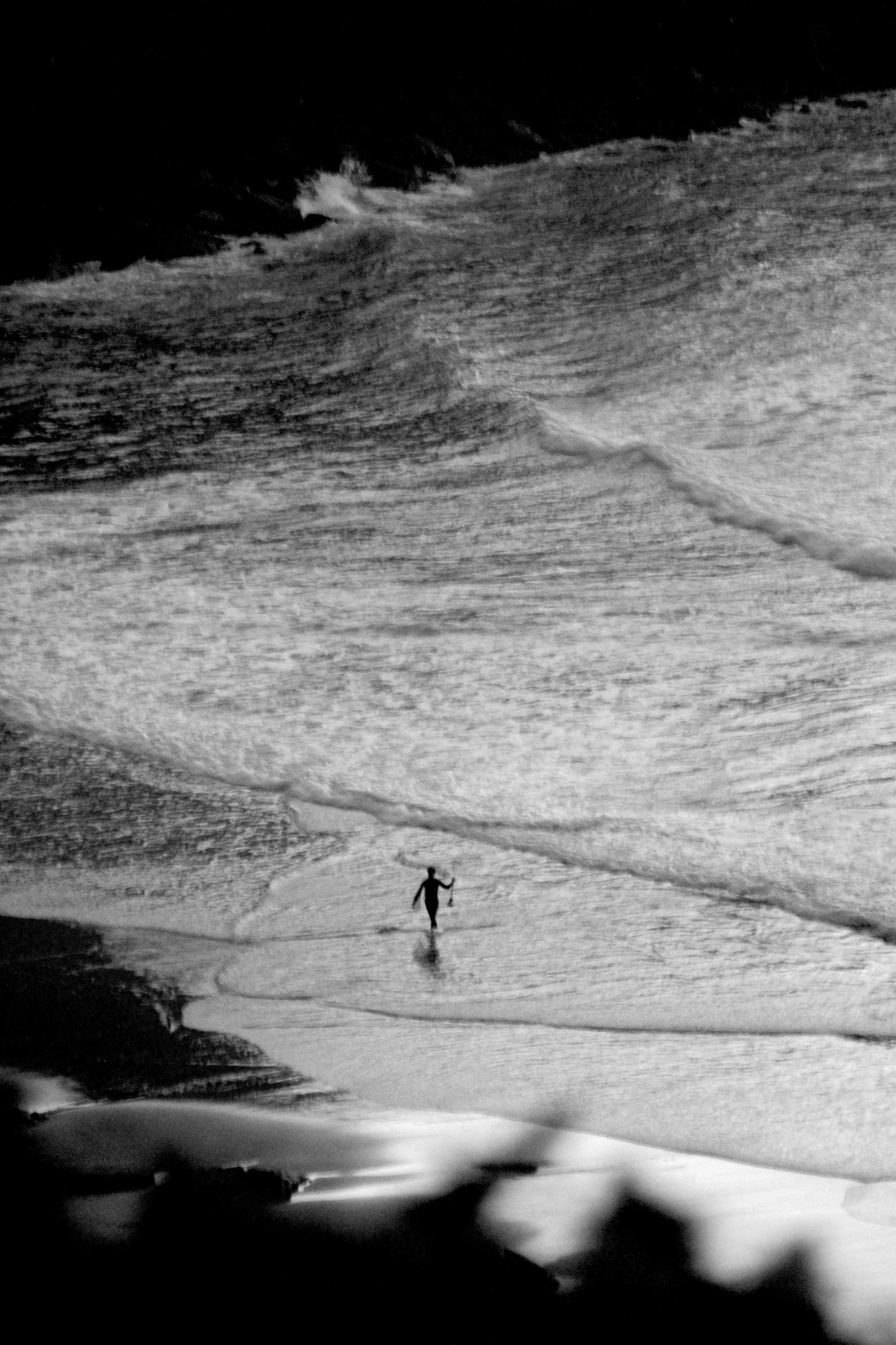
Herbert Neuwirth
-
‘Star Shads’ is a photographic series that explores how light, shadow, and reduced visual information of one and the same object can create tension, narrative, playfulness and emotional resonance. Through silhouettes and minimal compositions, the works investigate color as both presence and absence — sometimes as a subtle atmospheric force, sometimes through near-monochrome restraint.
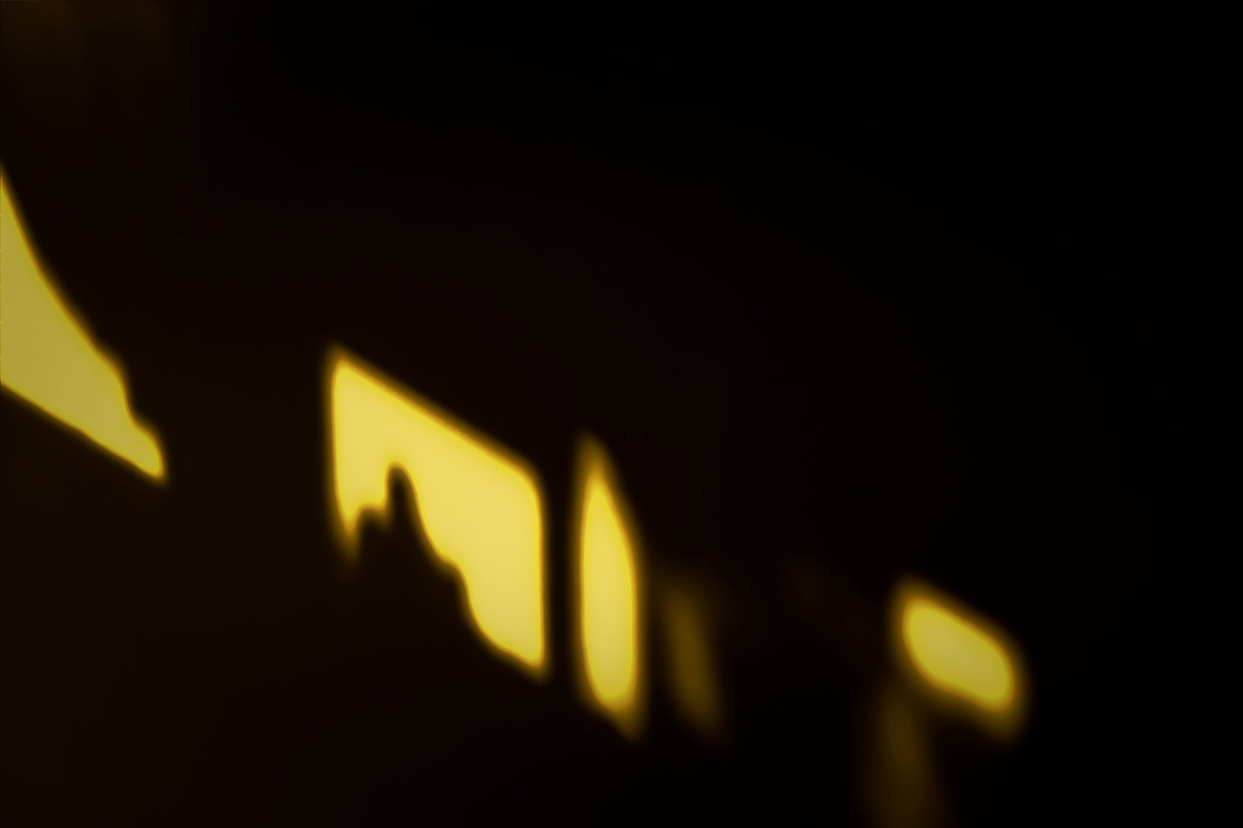
'The Tube'
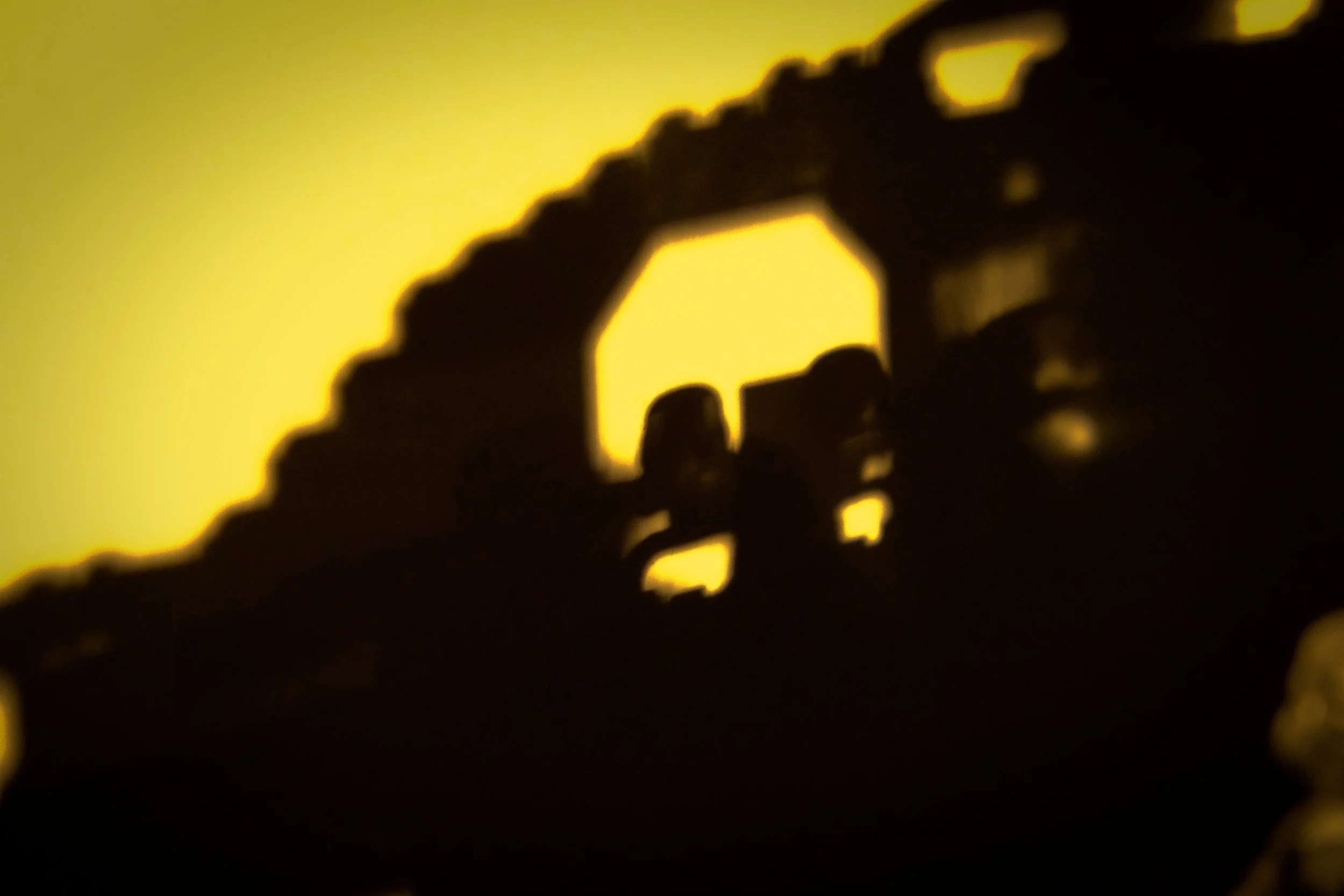
'Cockpit'
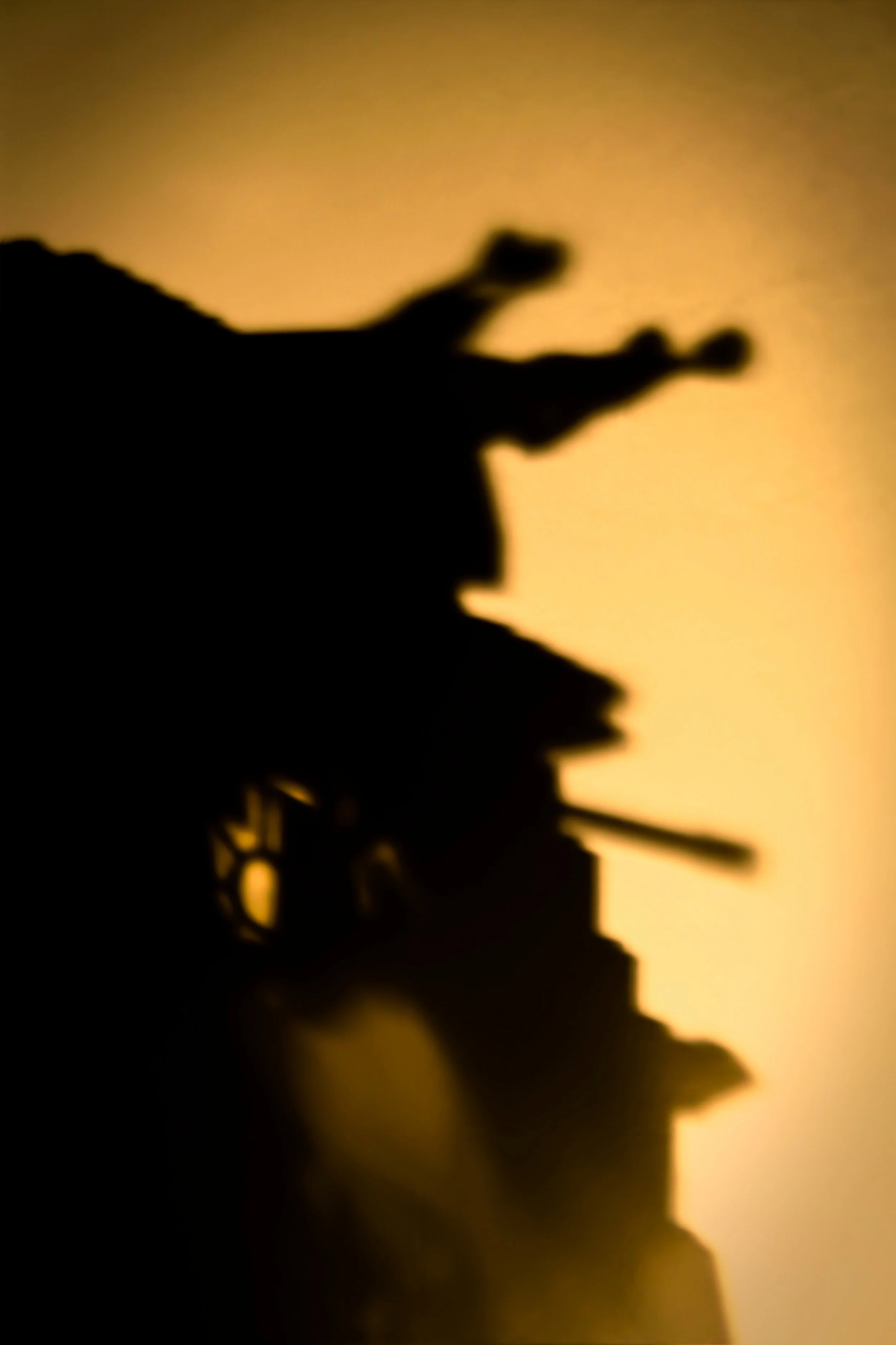
'Devil of Defense'
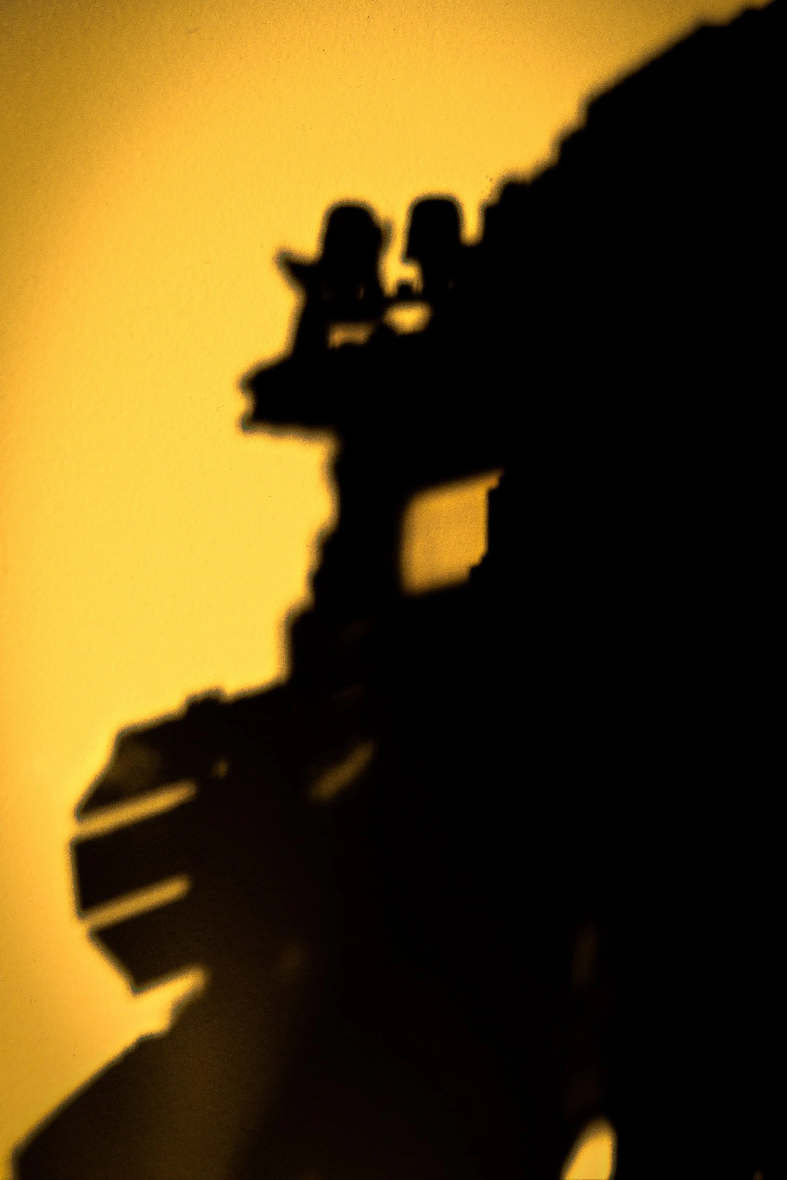
'Gas Mask'
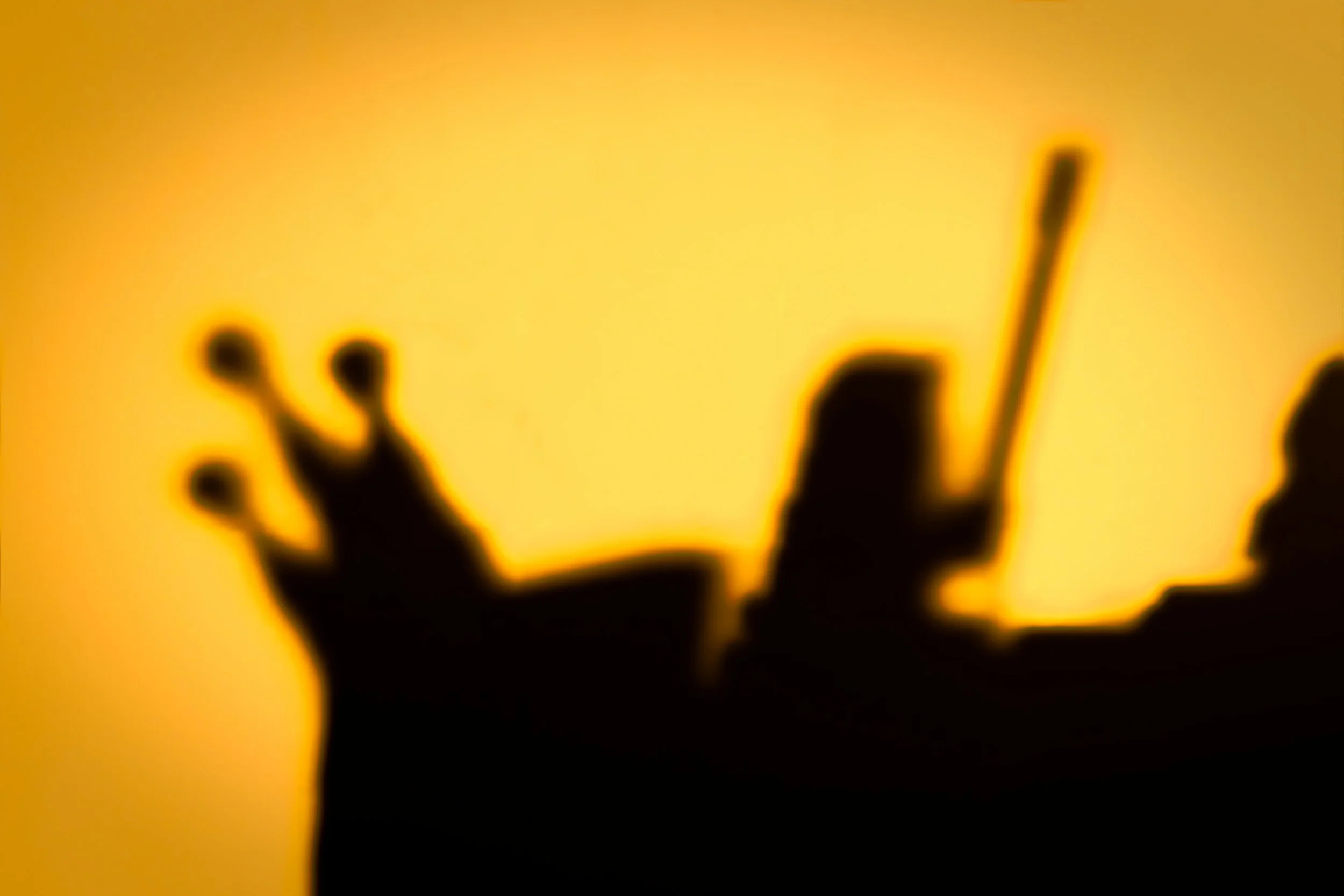
'The Frog Prince'
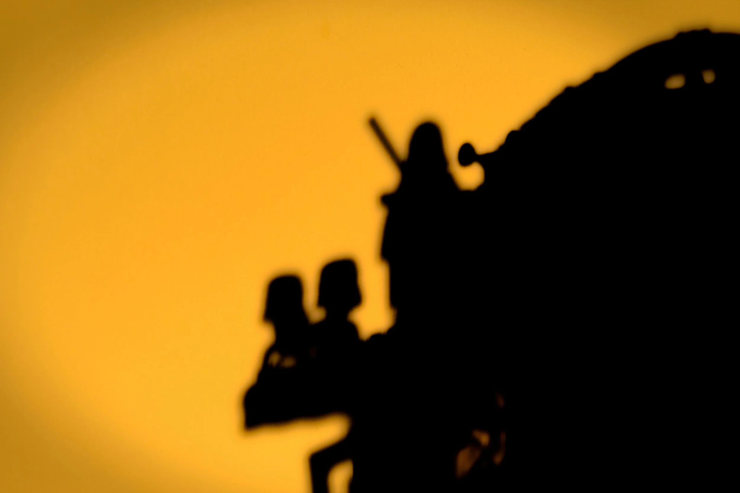
'Kindergarden'
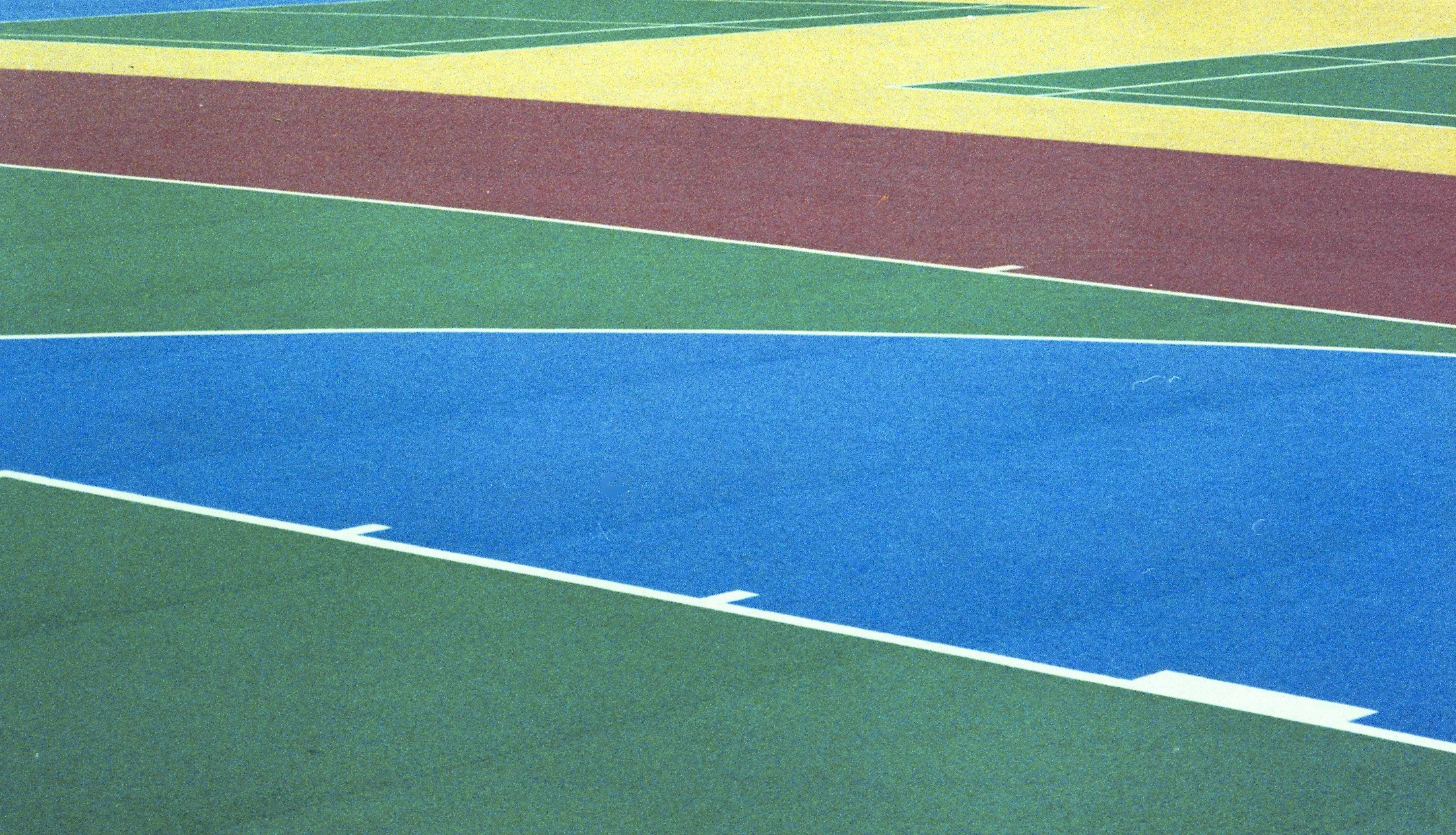
Aurelie Crisetig
-
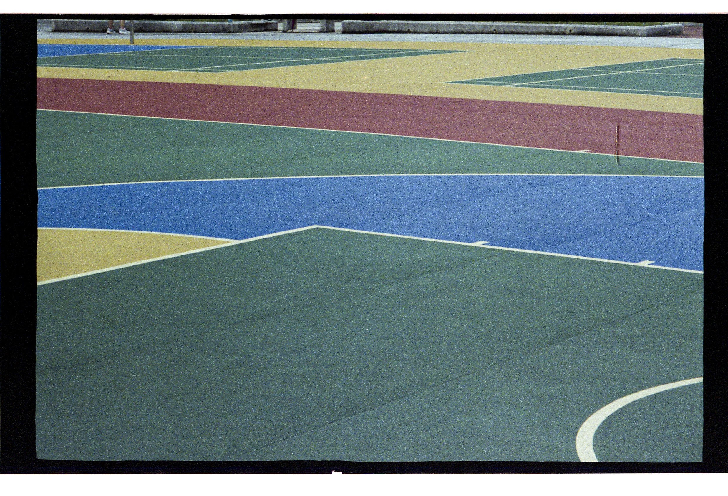
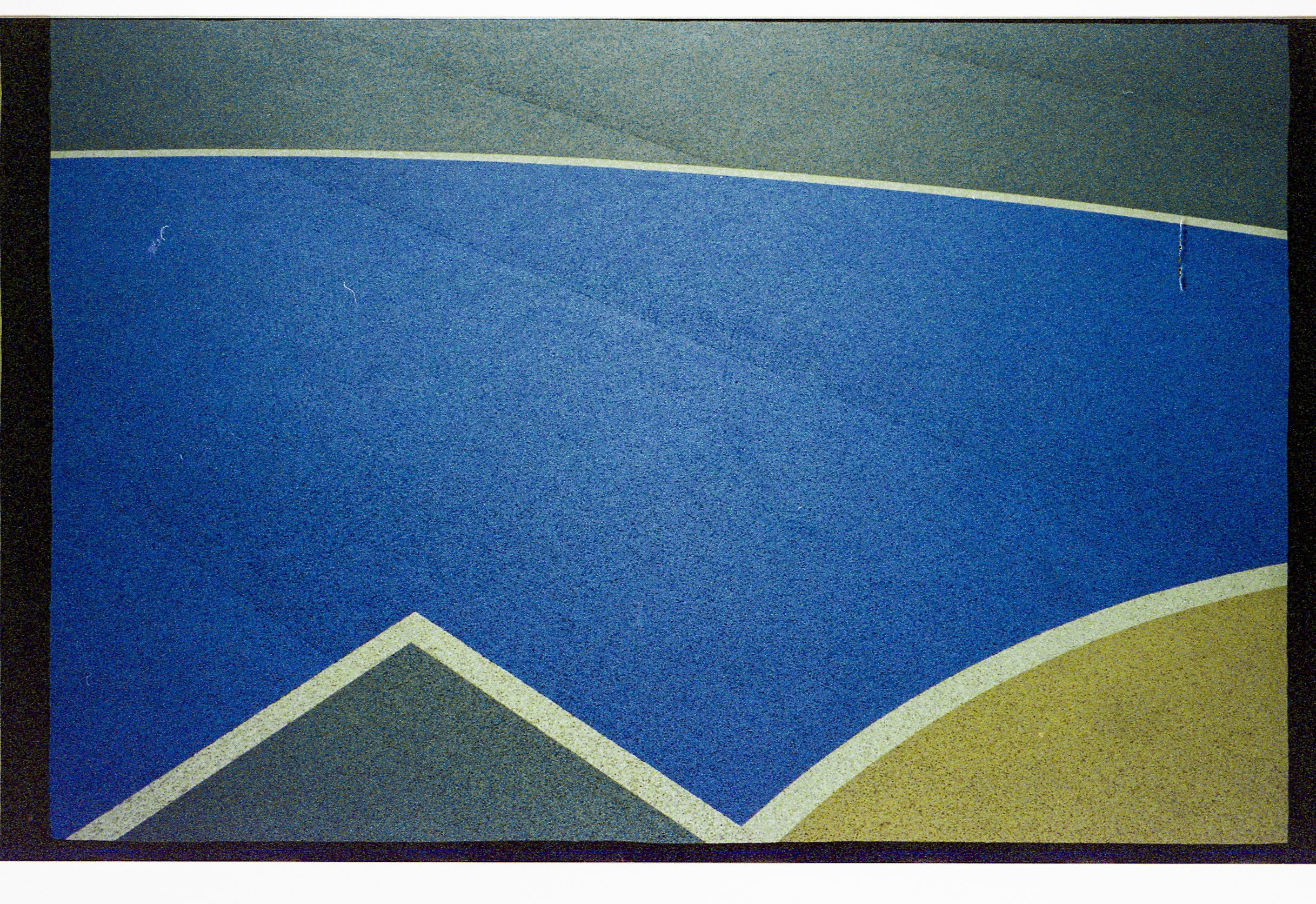
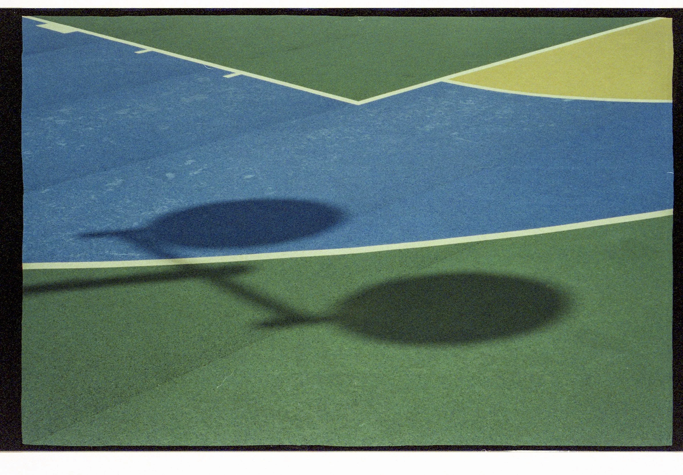
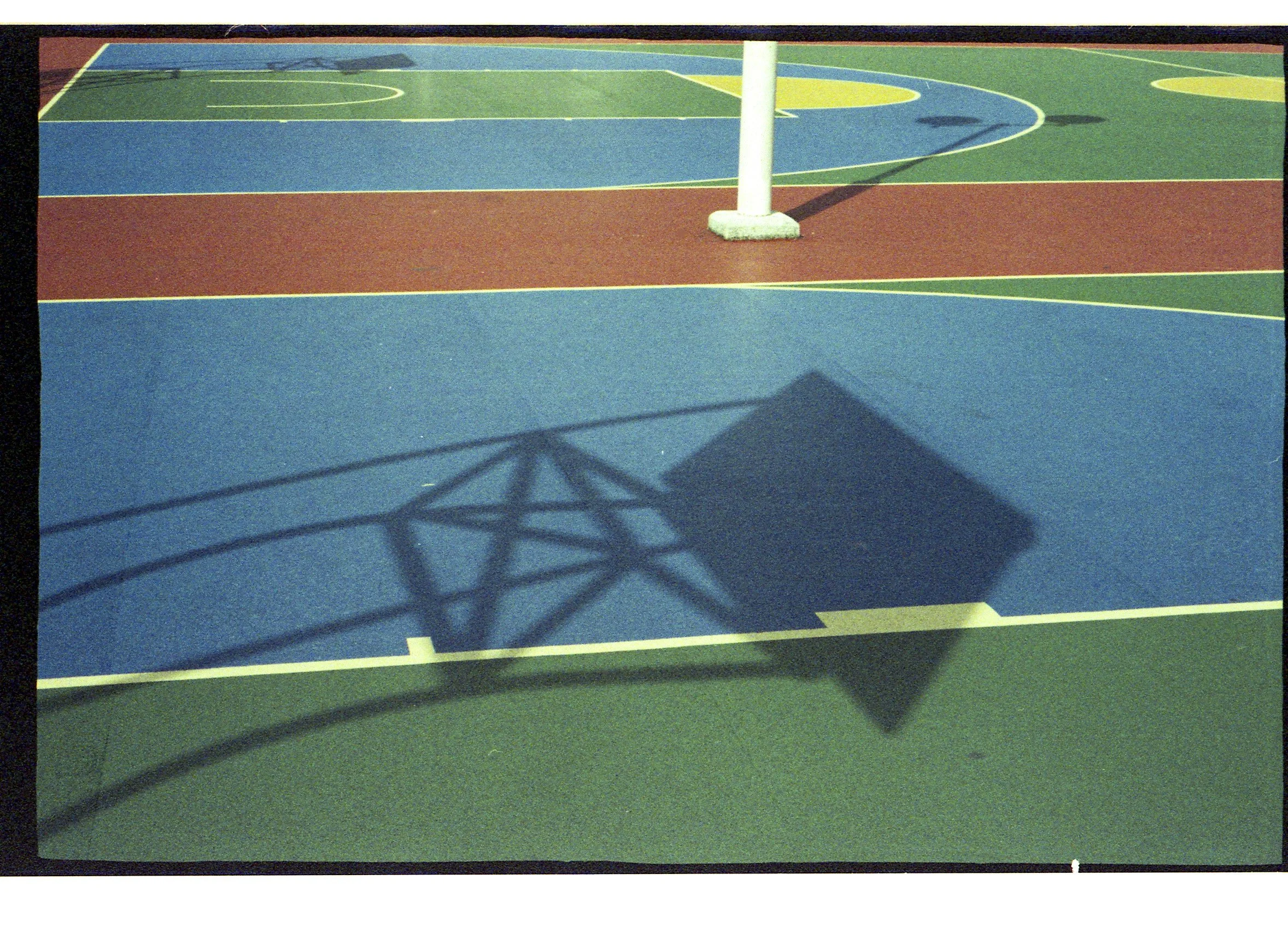
A vibrant exploration of Hong Kong’s urban basketball courts, where colour, geometry, and human energy intersect. This photographic series captures the courts as microcosms of the city, dynamic spaces shaped by sport, community, and everyday life. Bold lines, vivid surfaces, and fleeting moments of movement transform ordinary playgrounds into kaleidoscopic arenas, revealing the unexpected beauty of urban leisure.
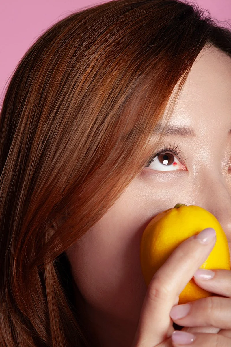
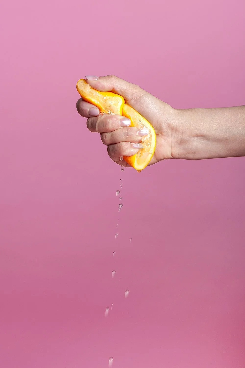
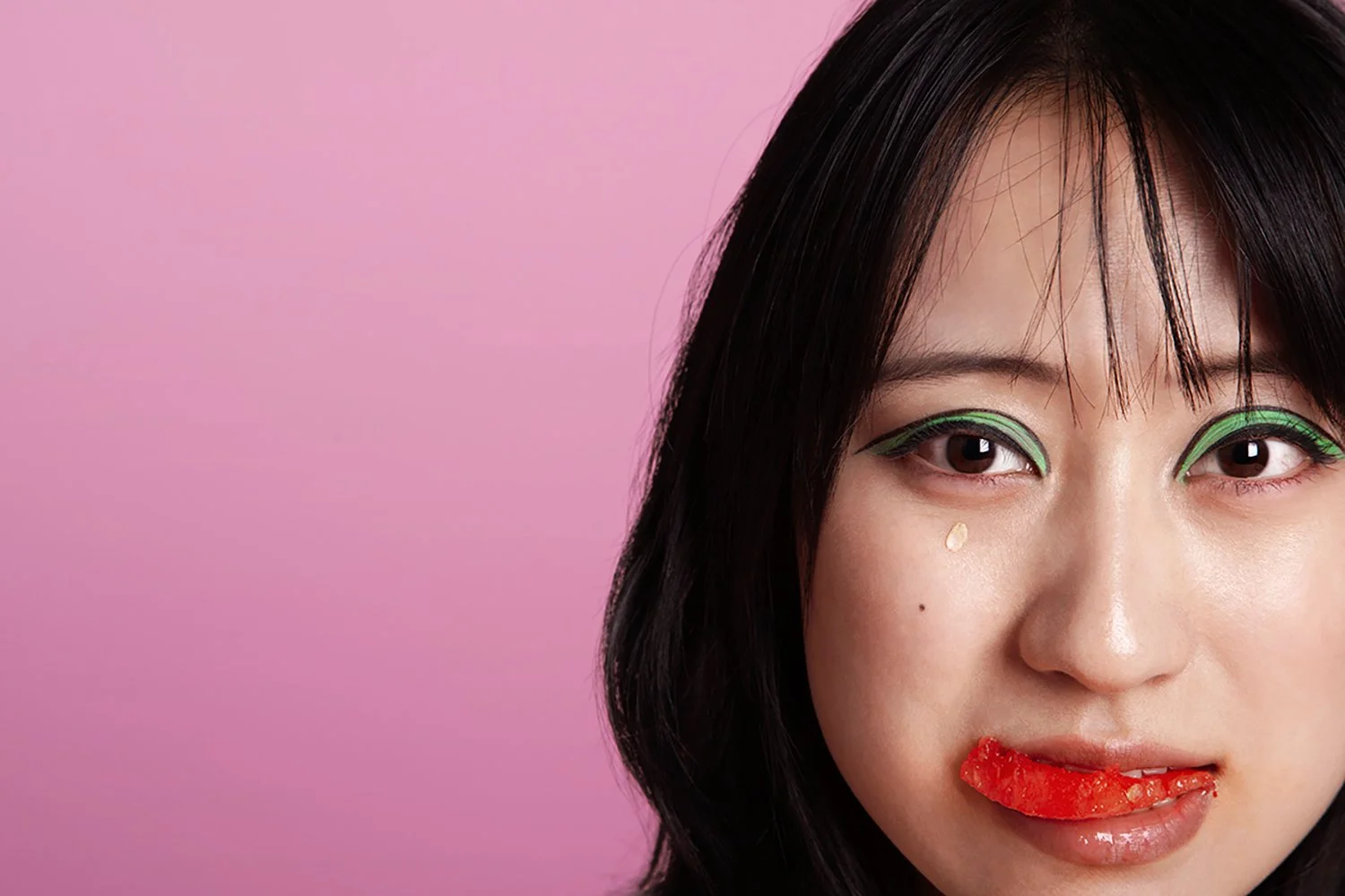
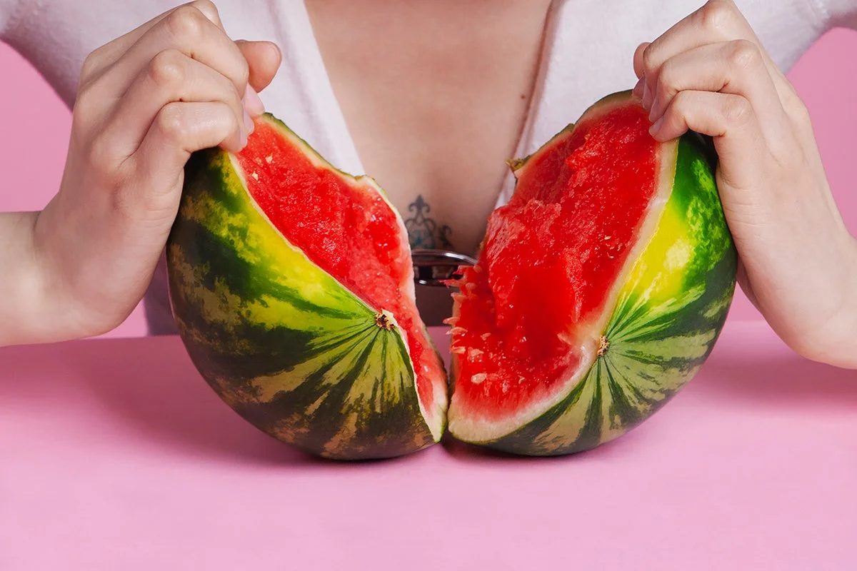
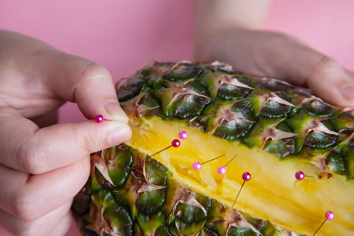
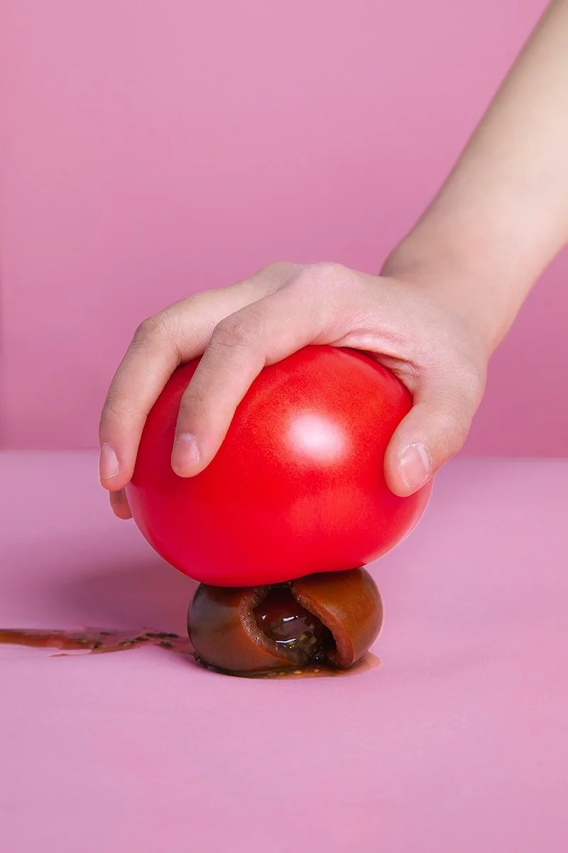
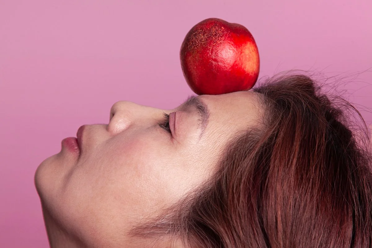
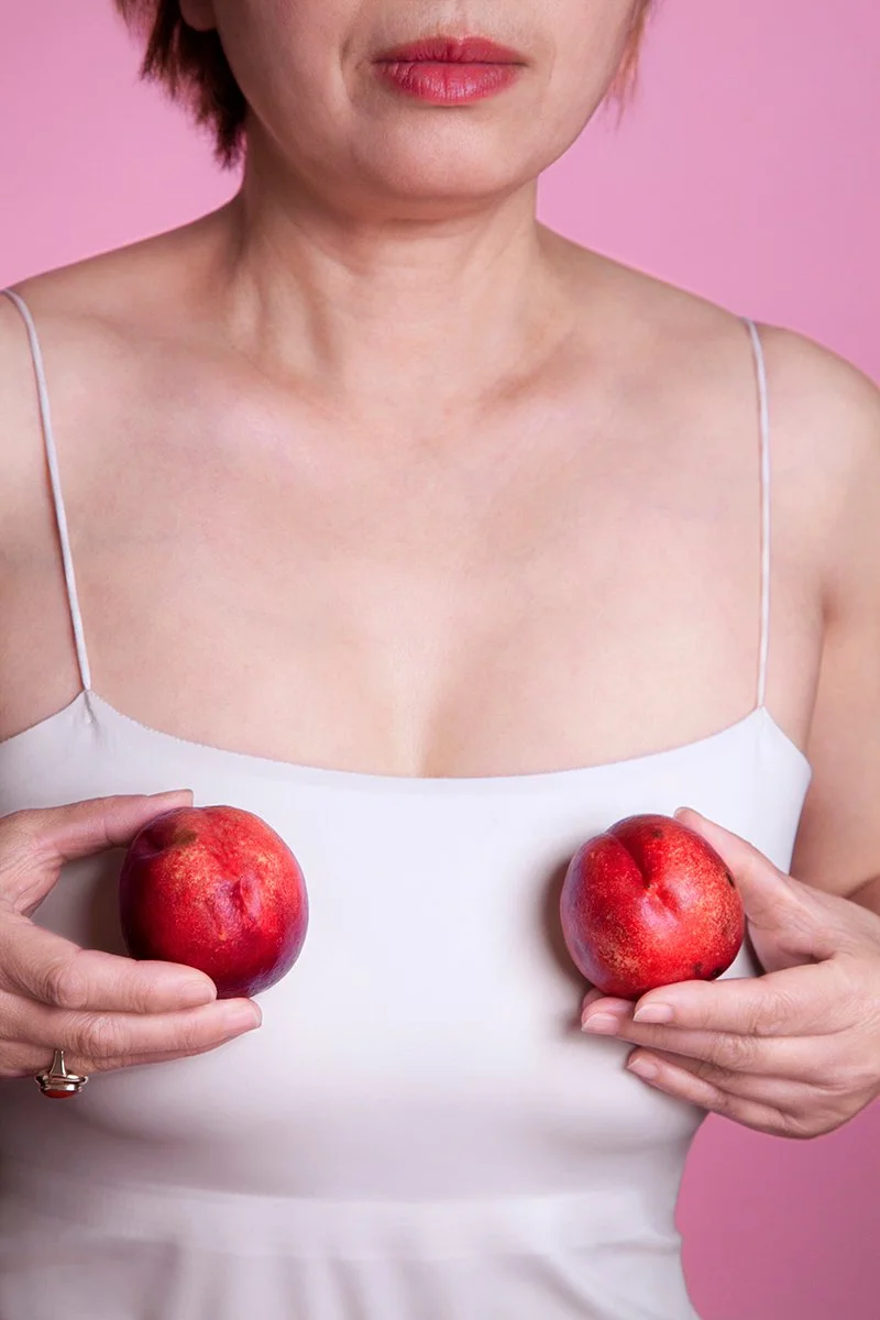
Joy Island Lei
-
Inspired by the words of feminist scholar Chizuko Ueno— “Being a woman isn’t a gender, it’s a situation.” —Pink Fantasy explores the gendered situation, identity, and agency of East Asian women— especially Chinese women—living in major cities abroad through the lens of migration. Their stories are also my stories, which is why I am also one of the subjects.
Pink Fantasy currently features nine Chinese women—all born between 1960 and 2000 and currently living in New York City—with more to be added. Some of them are my friends, while others I met through social media. Each participant represents a specific theme, such as their family of origin, anxiety related to identity and status, career concerns, and the complexities of intimate relationships, marriage, and fertility. In addition, they reflect differences in gender identity, self-awareness, and cultural belonging. It was clear that for them, migration and being in a foreign country heightened these issues.
I invited each subject into the studio and conducted an in-depth conversation before the photoshoot. These conversations were edited into oral histories for the accompanying book. Along with identifiable portraits, I shot body close-ups, usually of their hands, all against a uniformly pink background. I chose the color for two reasons. First, from a social perspective, pink is closely associated with femininity from birth, permeating visual domains such as popular culture, media, everyday contexts, and products targeted at women. Second, pink is frequently used in commercial and fashion photography to represent female-oriented themes. Even I, as a working professional, have often relied on it unconsciously. For this work, I used it quite intentionally to comment on the way it stereotypes female subjects. In the session, I also asked the subjects to choose a fruit that they felt represented themselves. Similar to pink, fruits are often associated with femininity; women are frequently compared to juicy, sensual fruits in literature, film, and everyday discourse. These metaphors carry strong implications of social discipline and the male gaze.
Using staged photography, oral histories, symbolic elements, and other forms, the project constructs images that examine East Asian women’s presence, choices, and positions within social structures.
Livvy Dawson
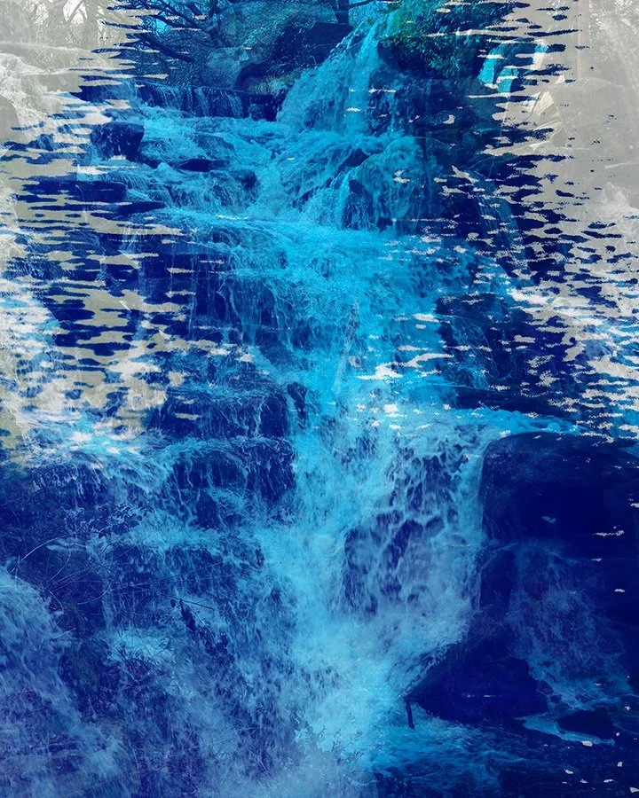
'The Power of Water'
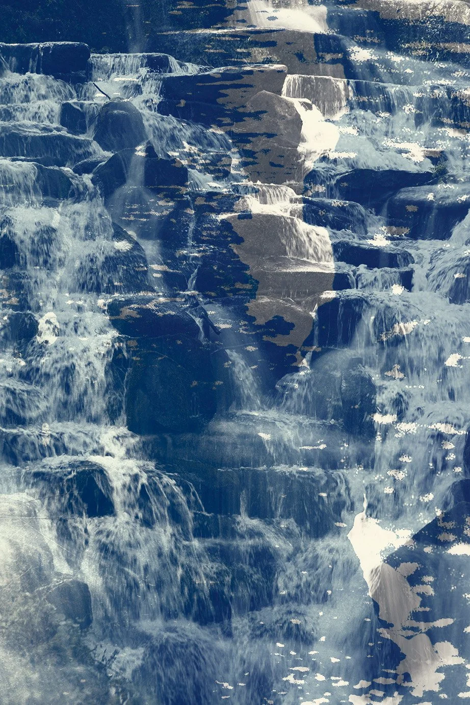
'Blue Nature'
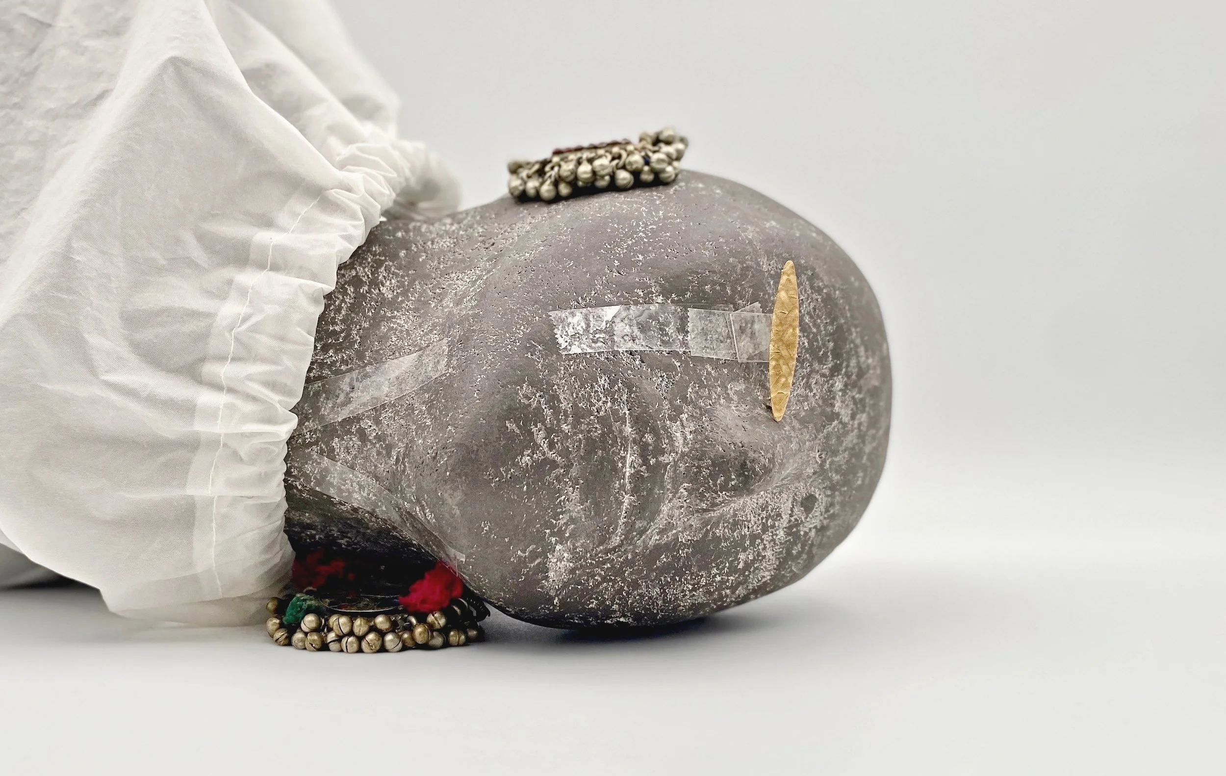
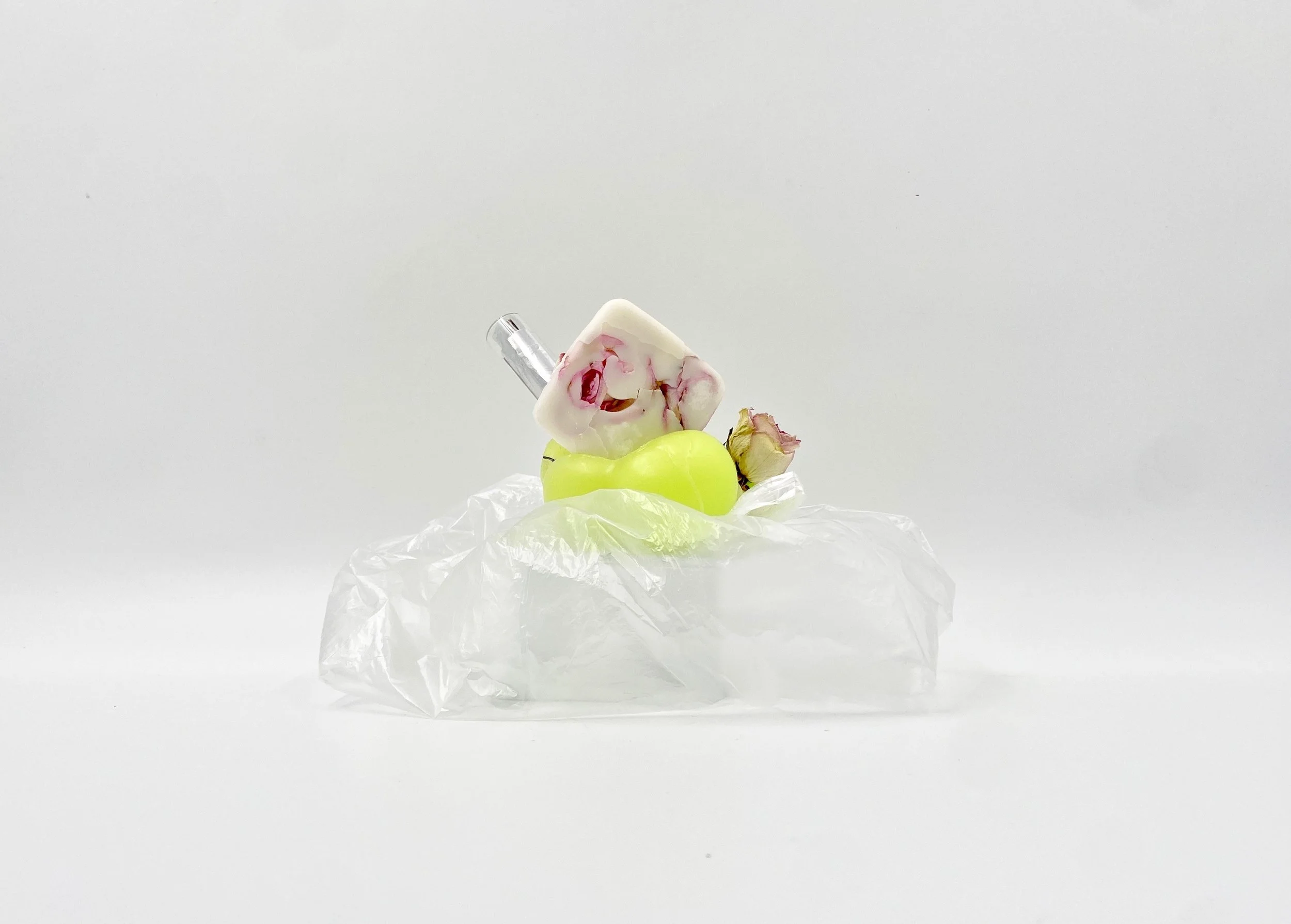
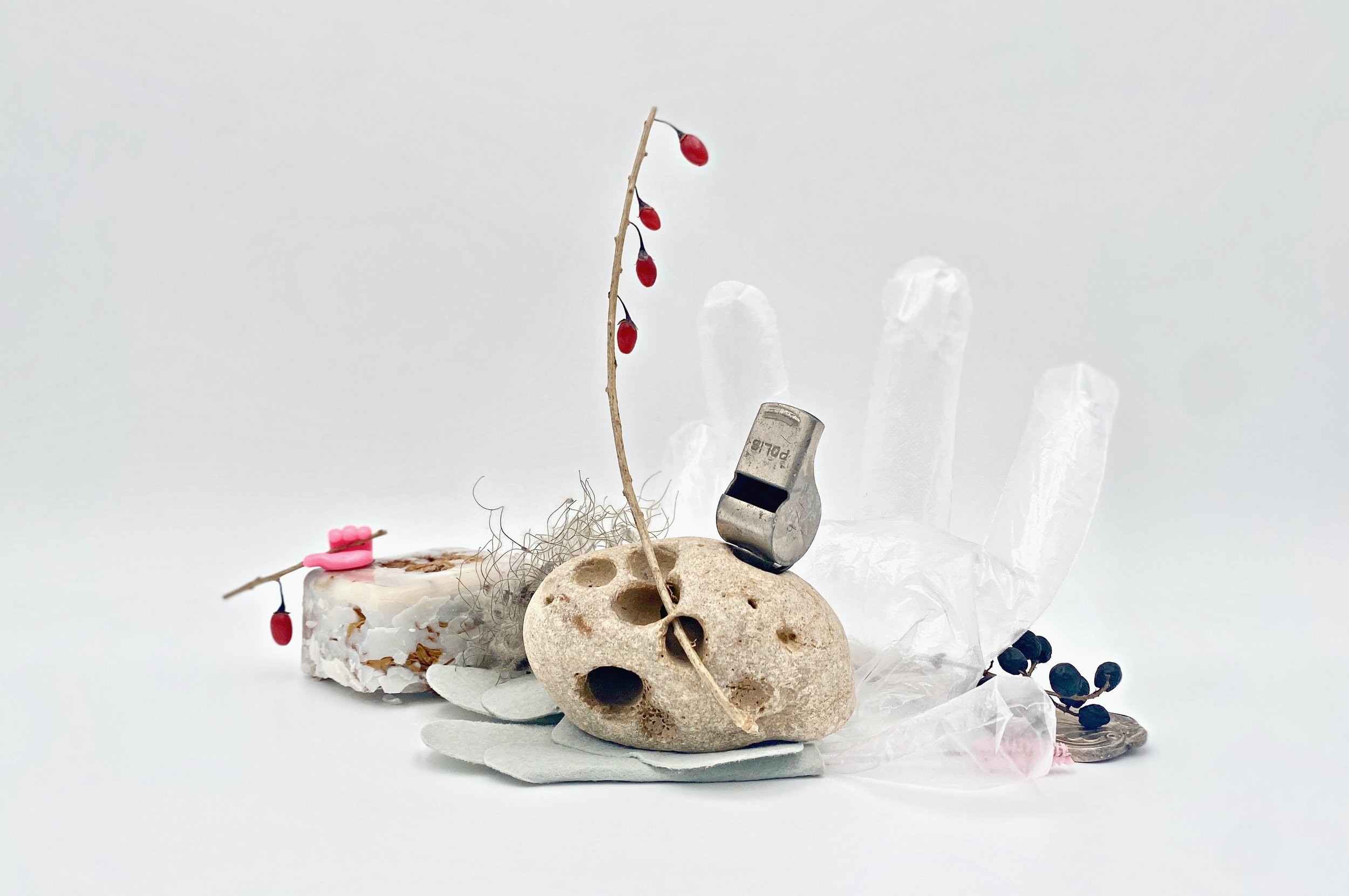
L A D by Daniele Alberto Lombardi
-
My work is not a mere reproduction of a face; it is a discourse on identity and time. I believe that a true portrait exists at the intersection of who we are and the artefacts we leave behind. Following the philosophy of Ladmood.com, my approach to photography treats the human experience as a layered narrative where memories entangle with personal objects to reveal the spirit beneath the skin.
In a world increasingly saturated by the ephemeral and the synthetic, I seek the tangible. Our lives are not a series of digital prompts; they are complex, physical histories. To capture this through the lens, I incorporate the keepsakes that define us—a weathered letter, a chipped heirloom, or a forgotten trinket. These are not mere props; they are the physical textures of memory. When these objects are integrated into the frame, they transform a simple likeness into a "map" of the individual’s journey.
Every composition and choice of lighting is an intentional act of narrative building. While AI can simulate the appearance of a person, it lacks the capacity for "soul-memory"—the visceral connection between a human and the items they have touched, kept, and loved. My photography celebrates these elements of the human soul that technology can never replicate. I am interested in the grit, the wear, and the sentimental weight of the things we carry.
By merging the subject with their most intimate belongings, I create a dialogue between the past and the present. Each photograph becomes a sanctuary for identity, ensuring that the subject is seen not just as a figure, but as a living, breathing history. My goal is to invite the viewer to look beyond the surface and engage with the profound, messy, and beautiful reality of being human
Enrique Gutiérrez
'Red Horizon'

'Quiet Geometry'
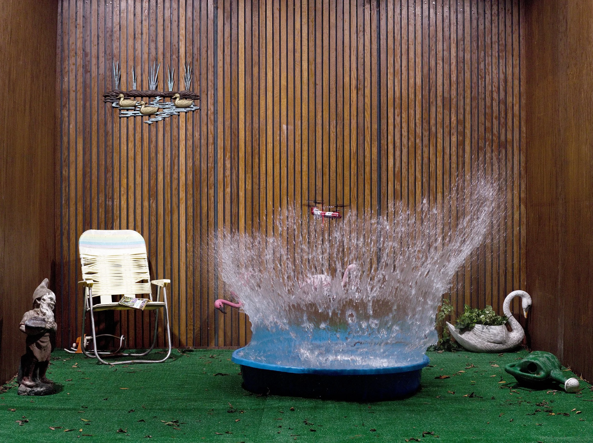
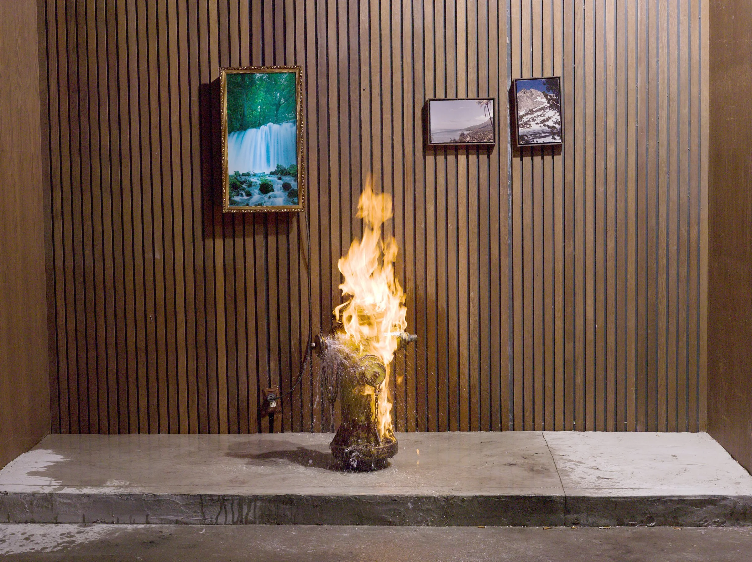
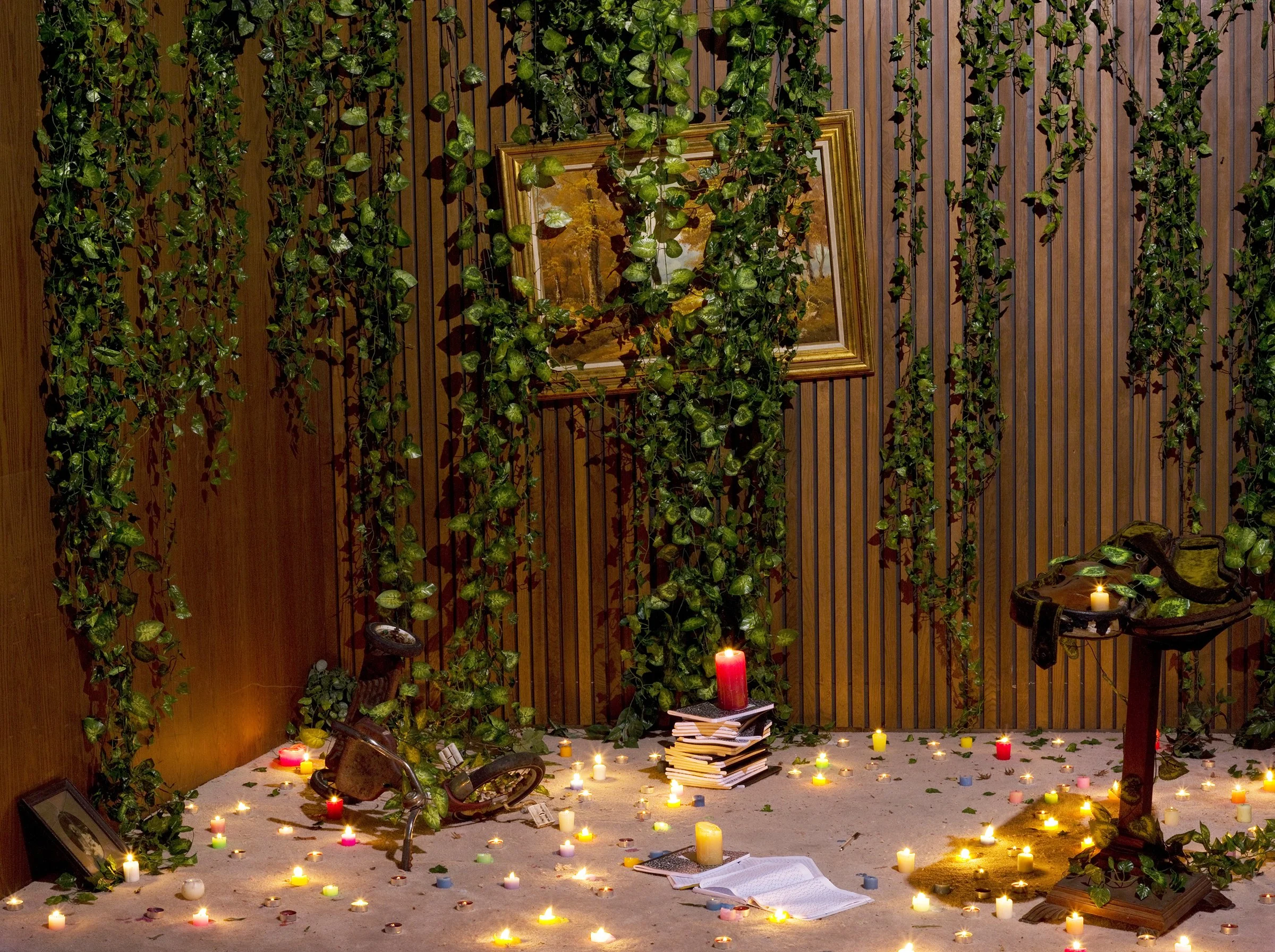
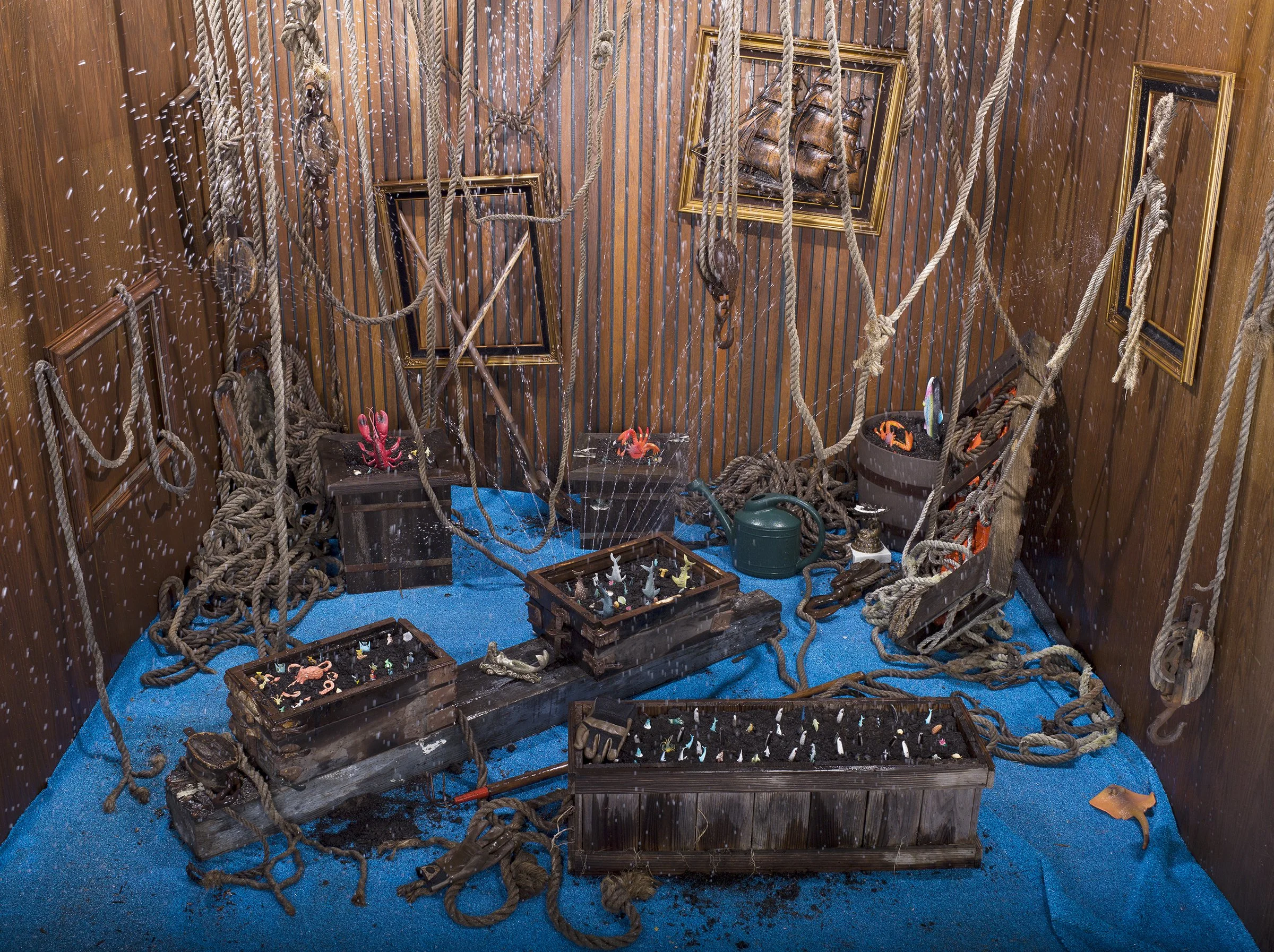
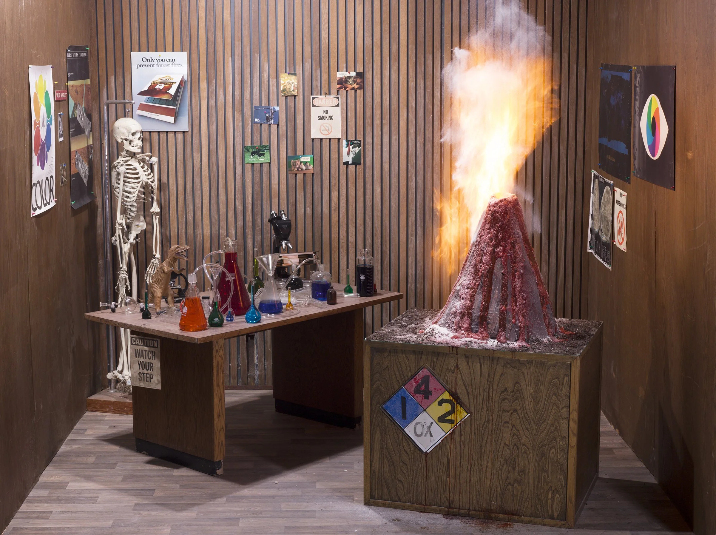
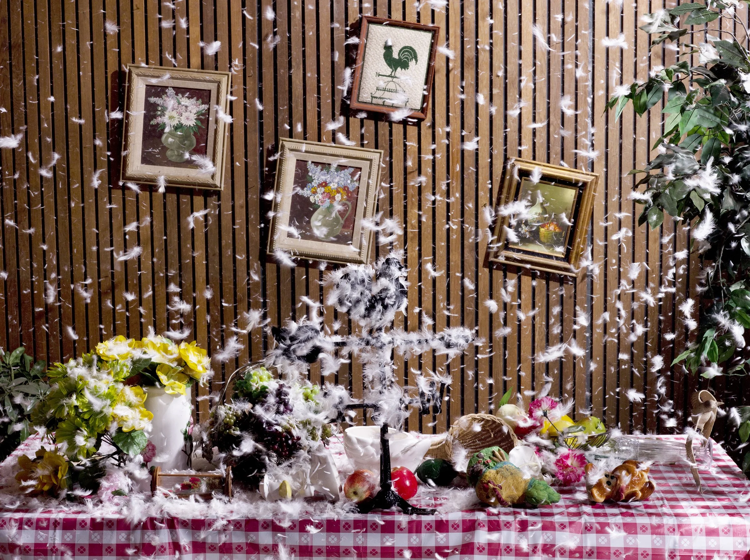
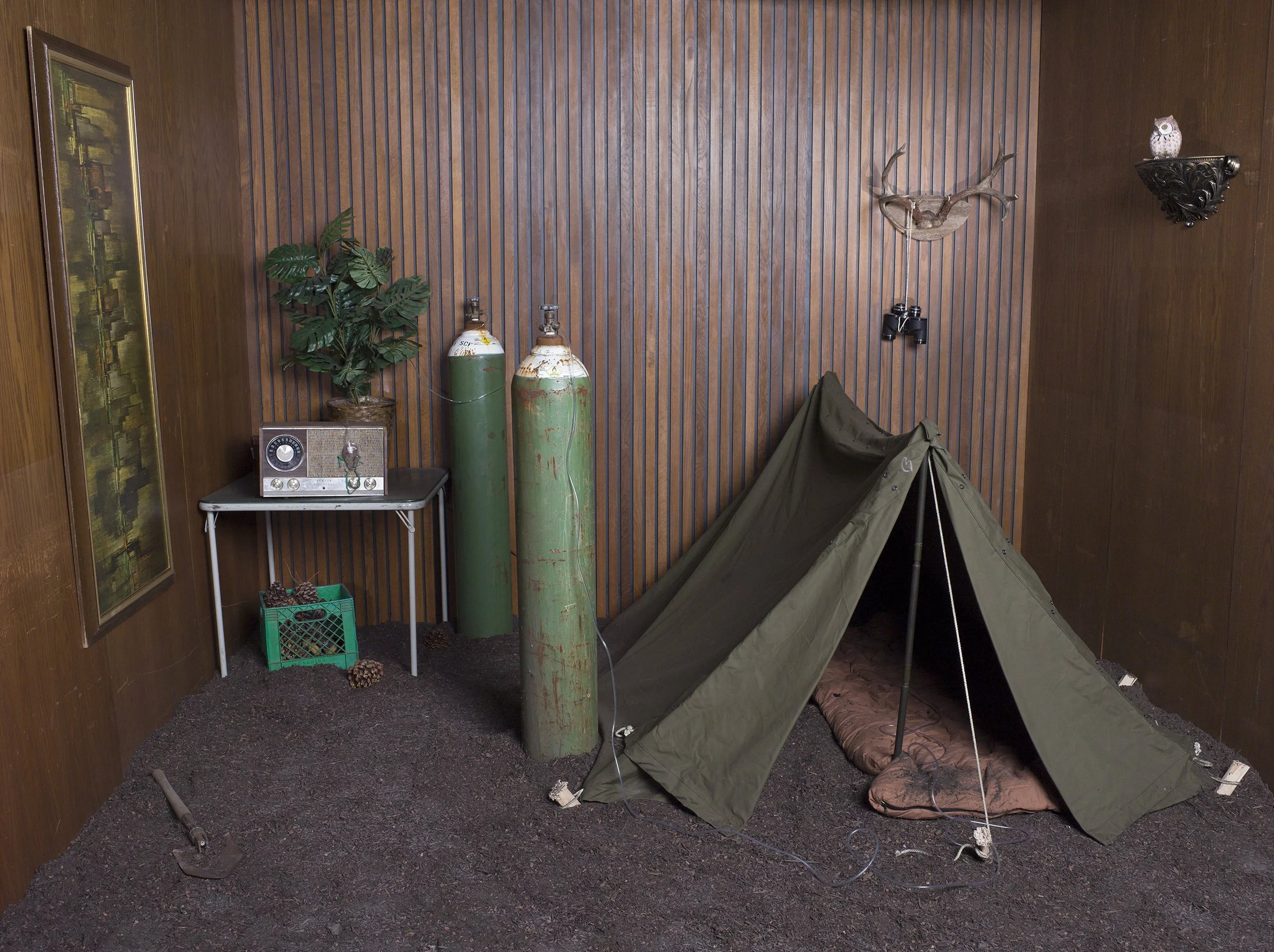
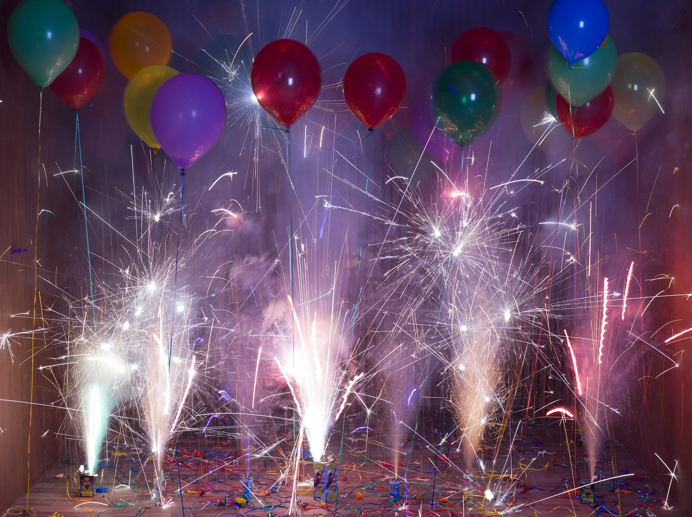
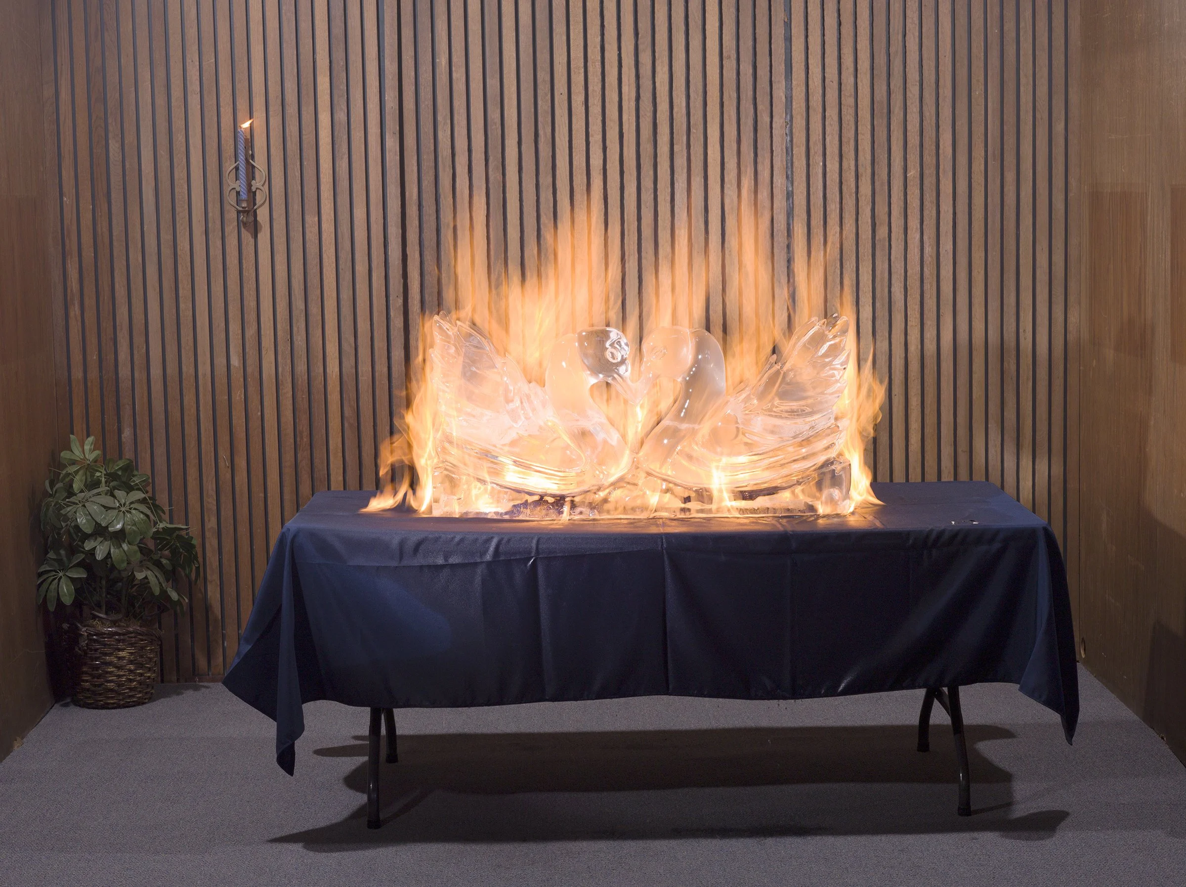
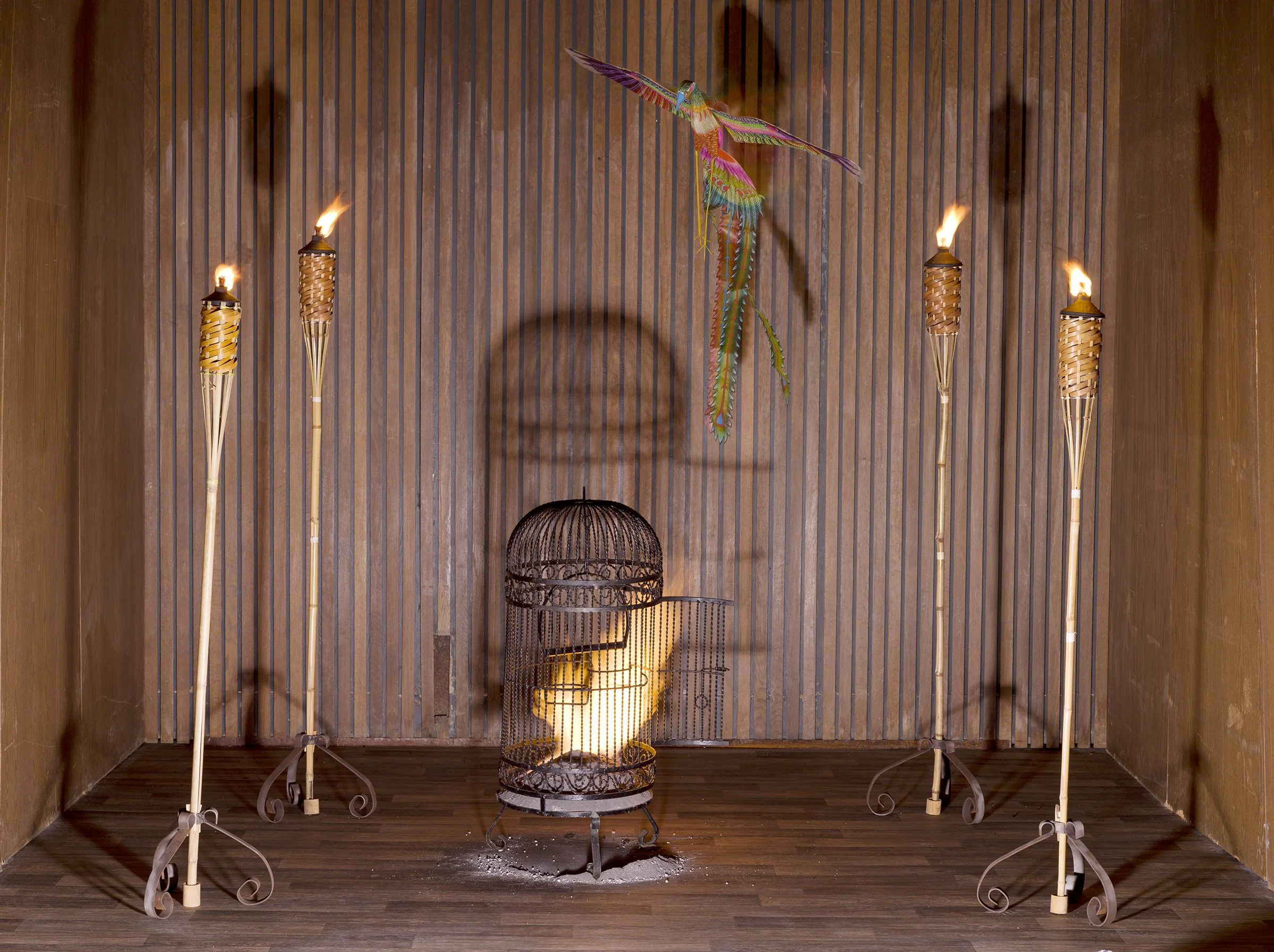
Philip Ringler and James Saxon
-
Constructed sets using props, special effects, and studio lighting to create conceptual color photographs inspired by the classical elements: Earth, Air, Fire, Water. Colors are used symbolically to represent the various elements. Created over 2 years by the photography duo Relaxing Realism with Philip Ringler and James Saxon.
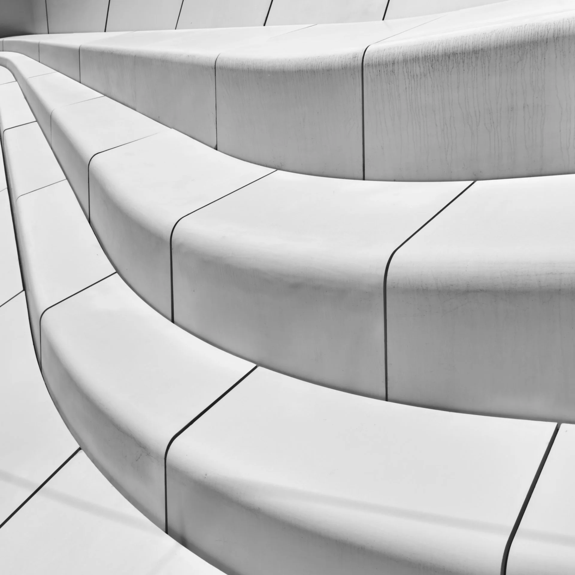
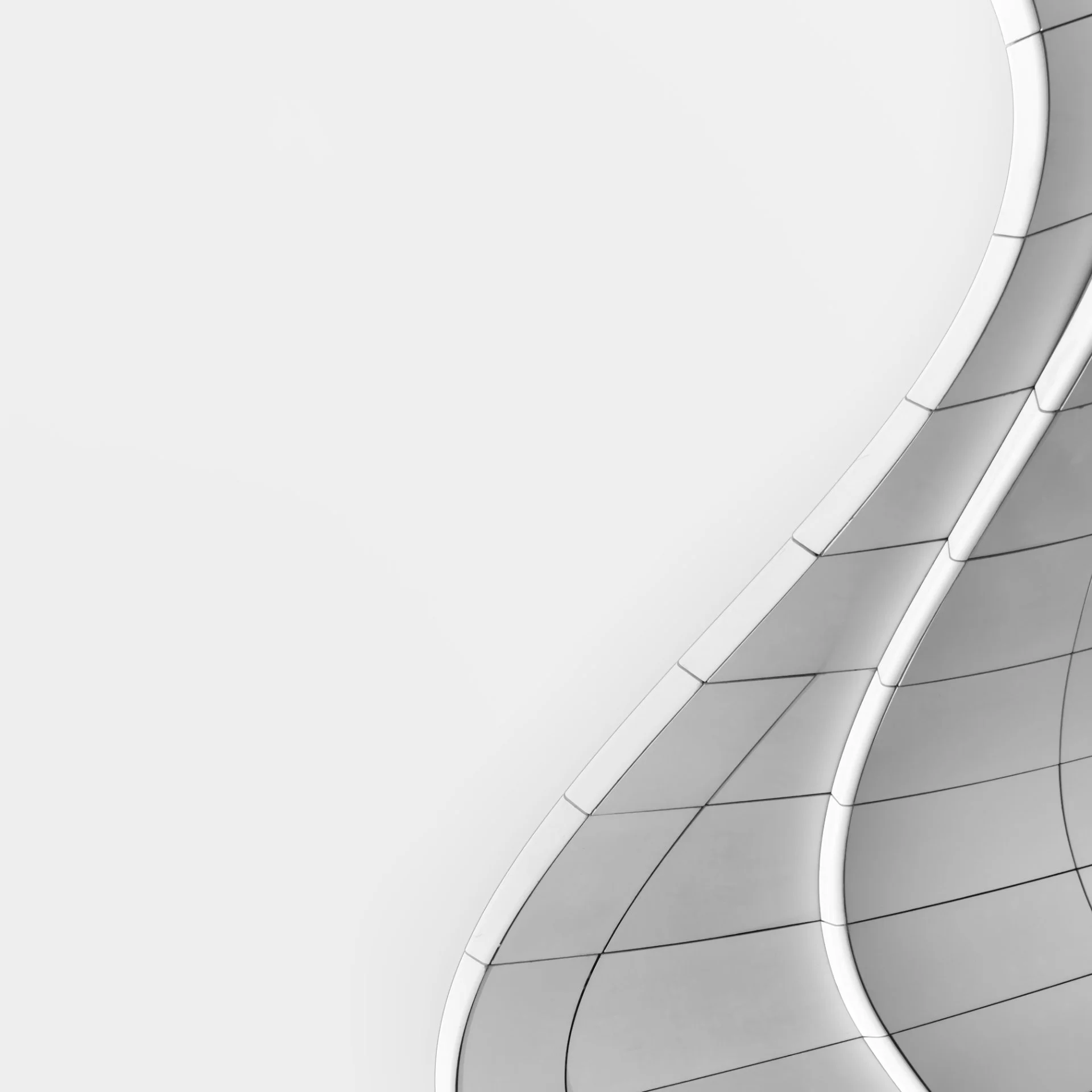
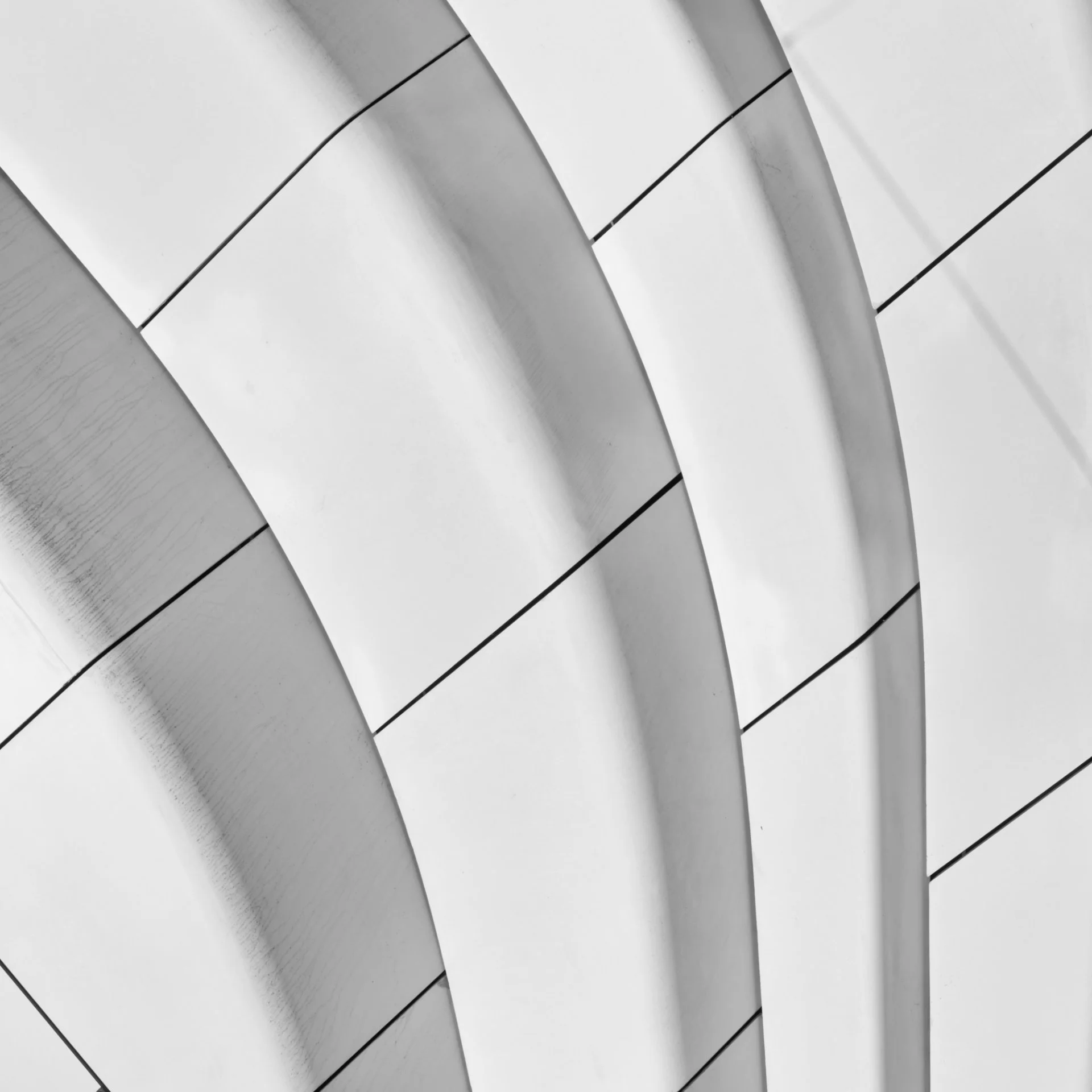
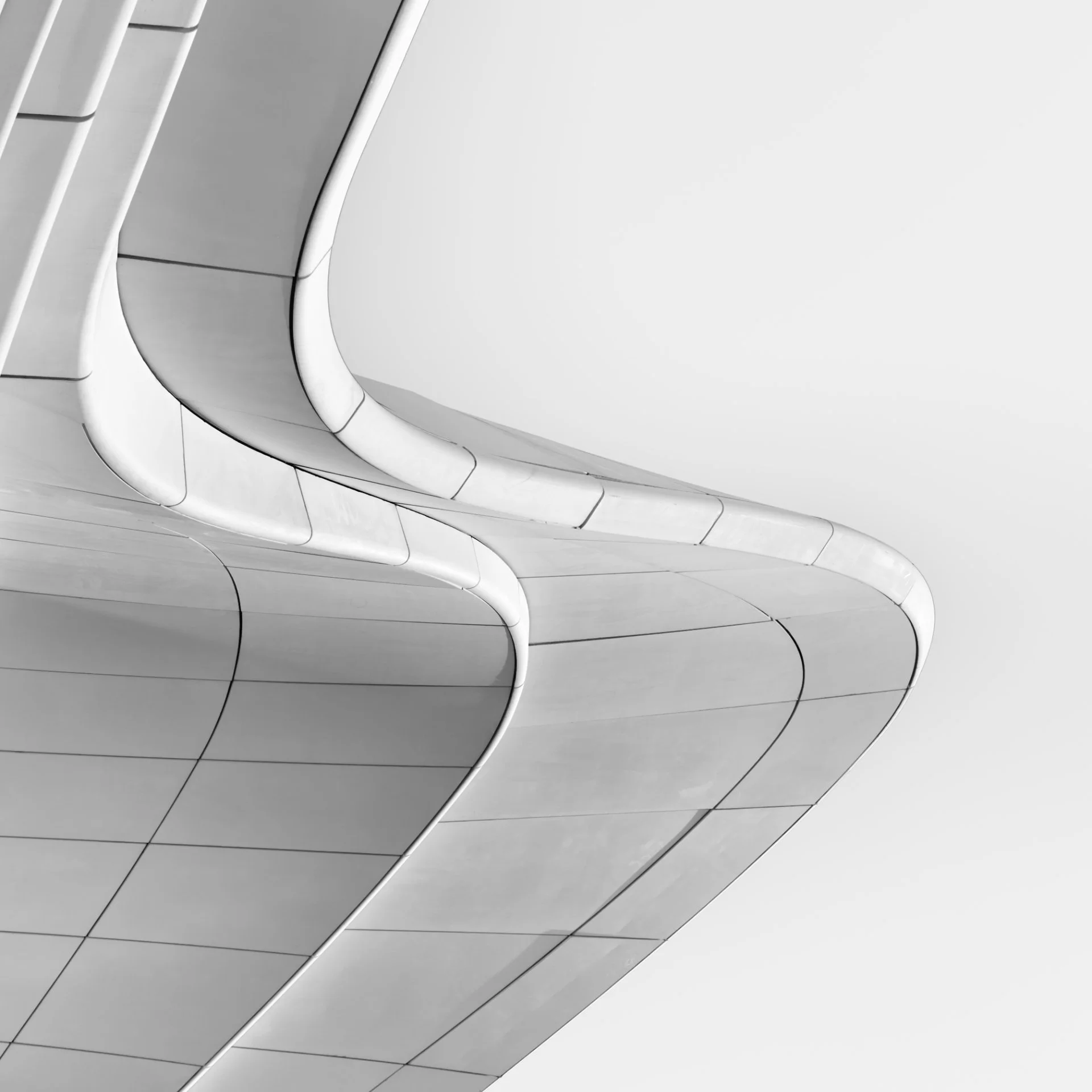
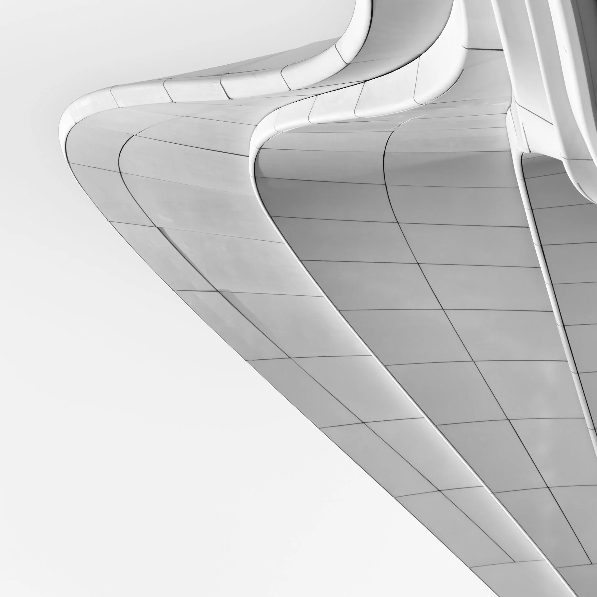
Rini Braber
White curves
Sofiia Hrushko
-
To grasp the subtle boundary between wakefulness and dreaming, when noise fills the space and erases certainty: is this still reality, or already a dream?
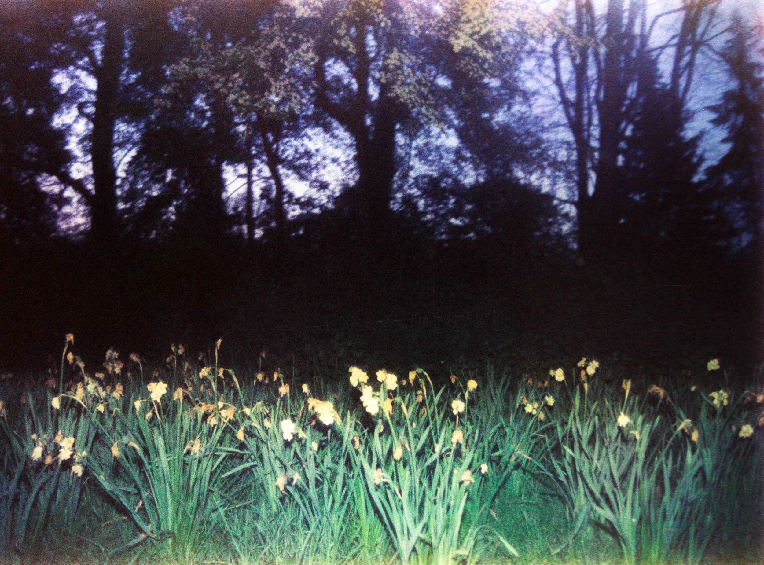
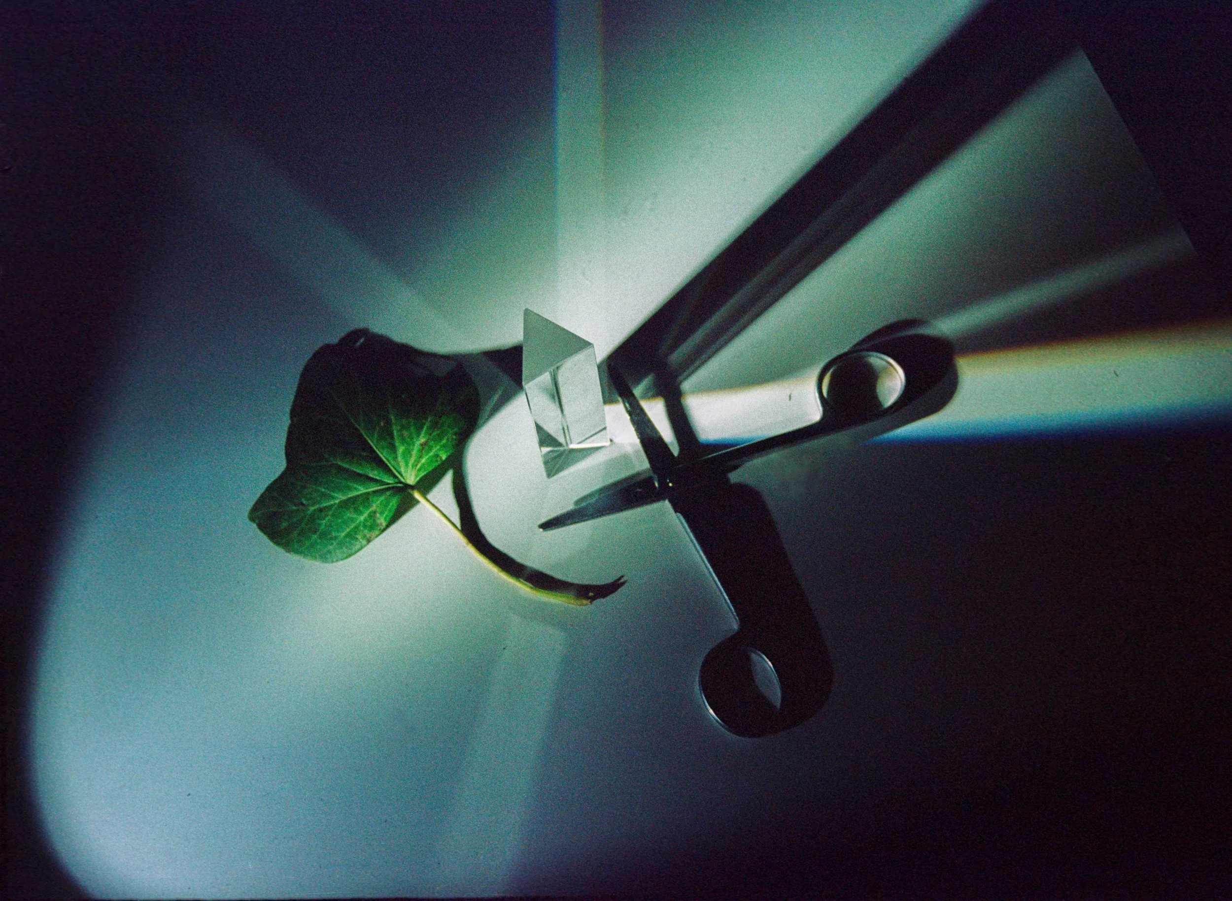
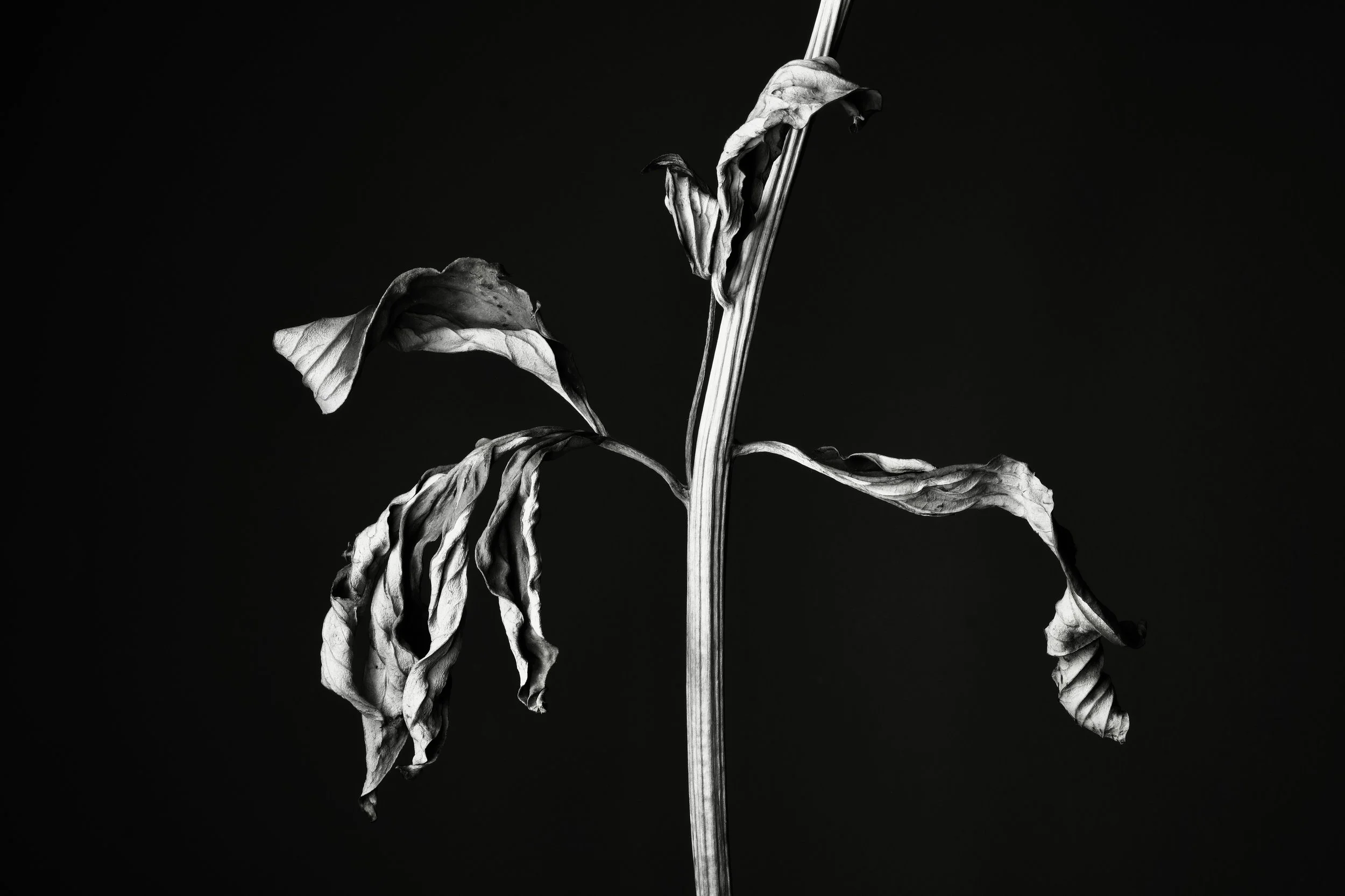
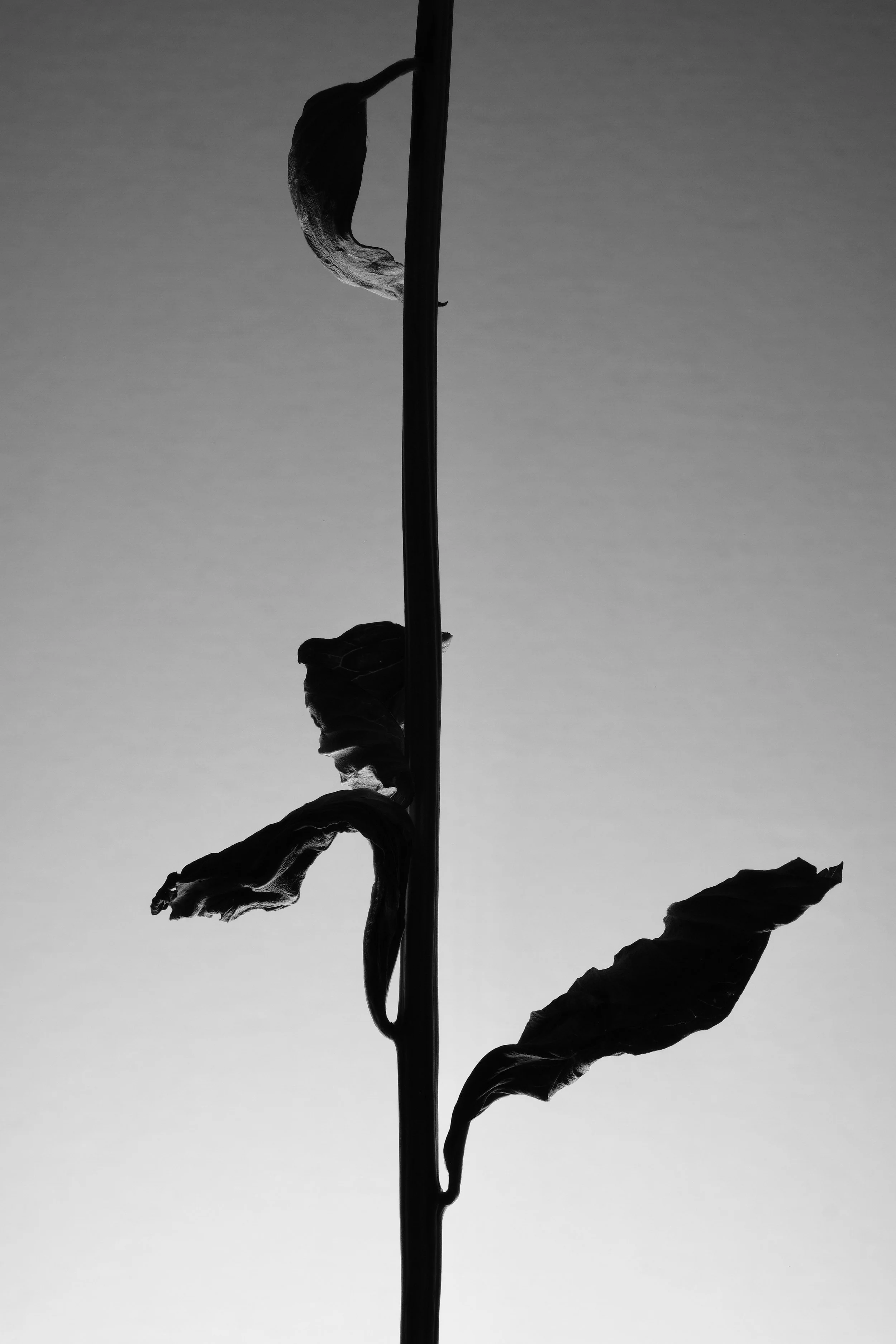
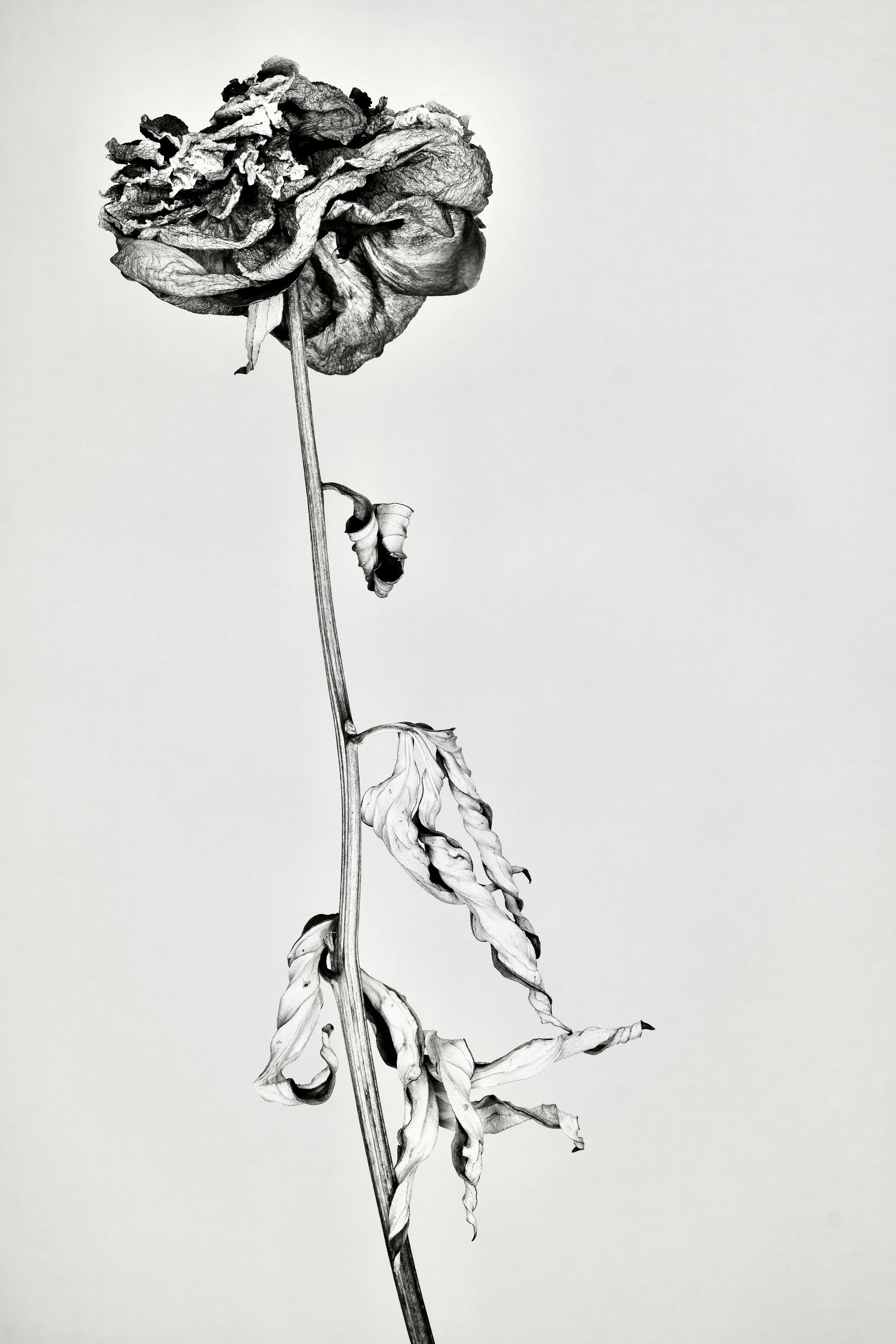
Melinda Thompson
-
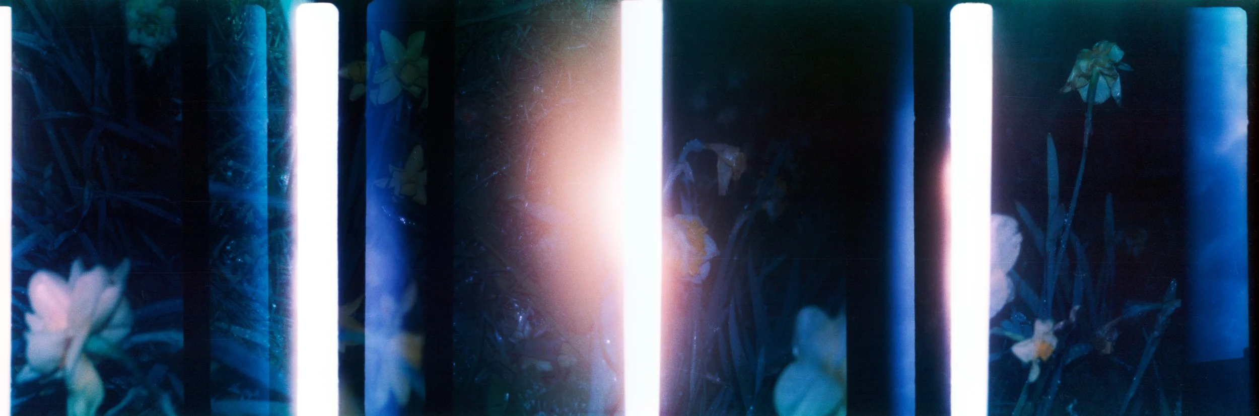
Encounters of loss and the complexity of personal experience can take many forms. Whether it is through the loss of people we love, the animals we cherish or displacement from the environments we inhabit that nurtured us, even our youth or the materials we collect and savour, temporality is a fact of life.
In this ongoing project, by observing plant life, in particular the tradition of gifted flowers, these photographs are an exploration and appreciation of the ephemeral and the elegant dignity to be found within the process.
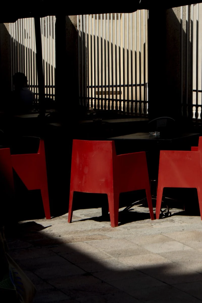
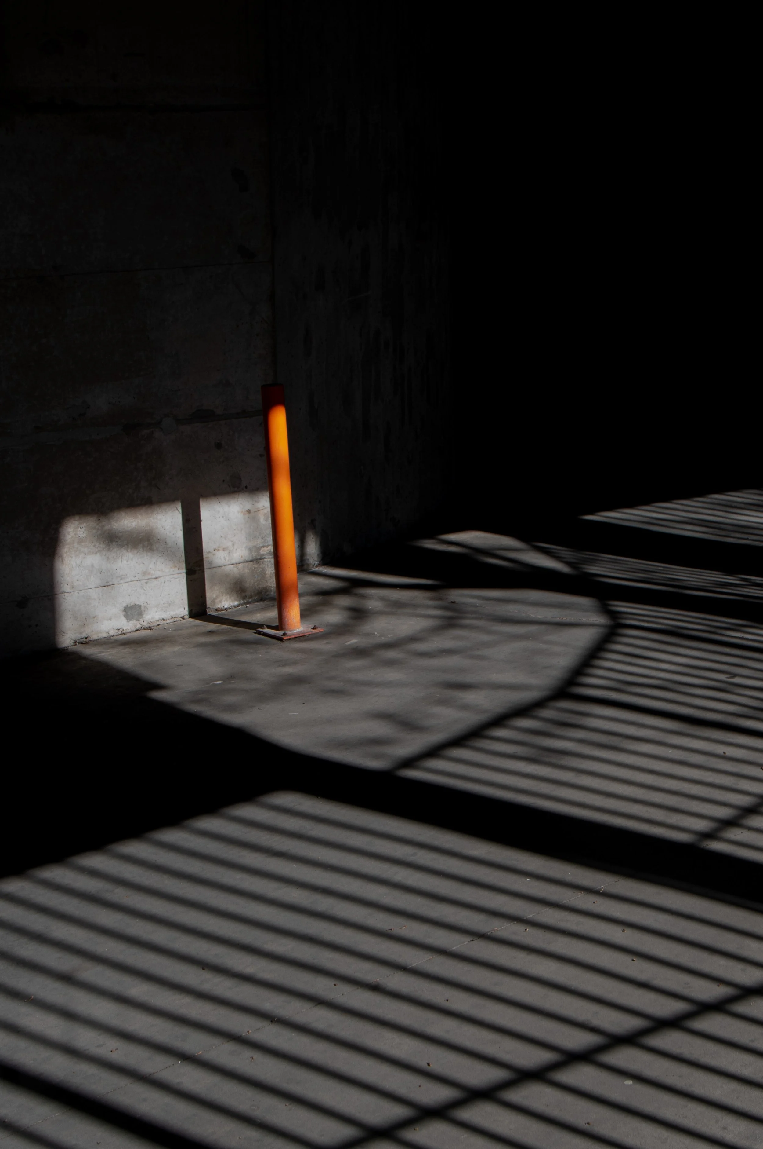
Patrick Zélis
-
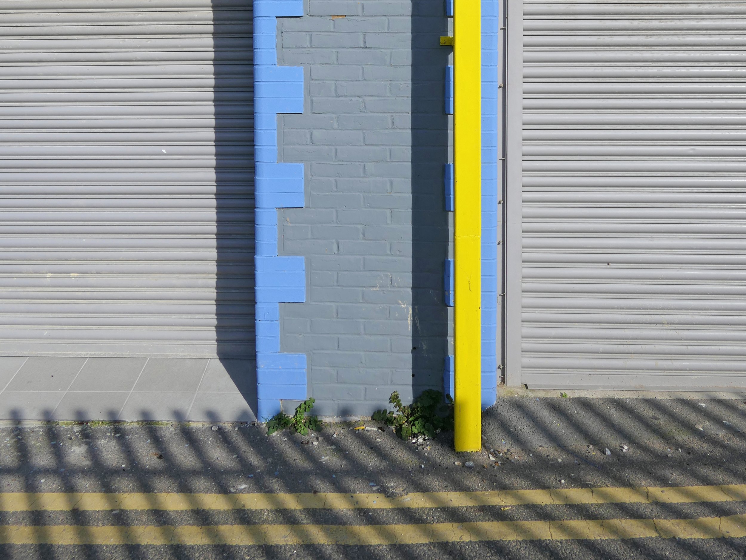
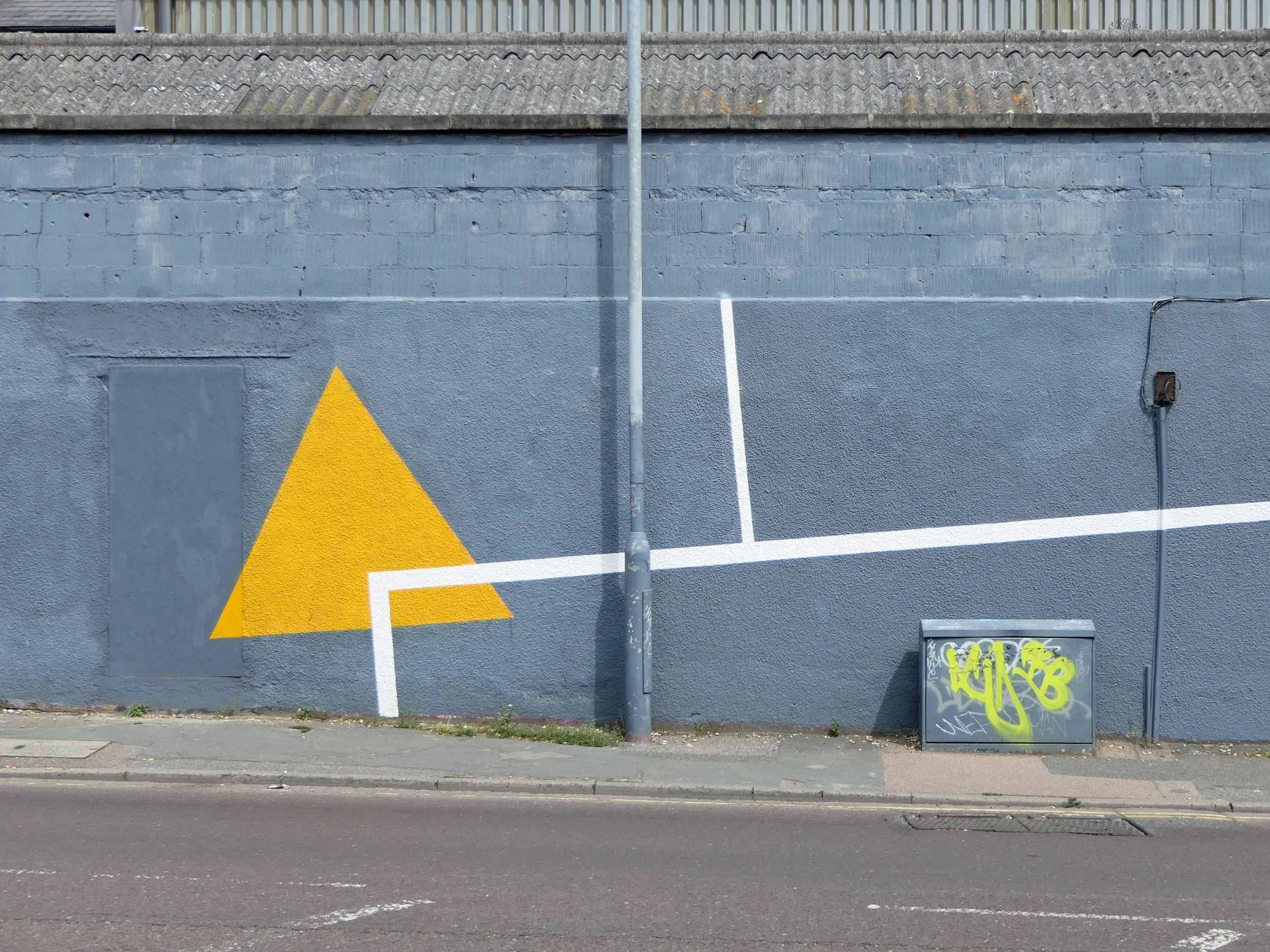
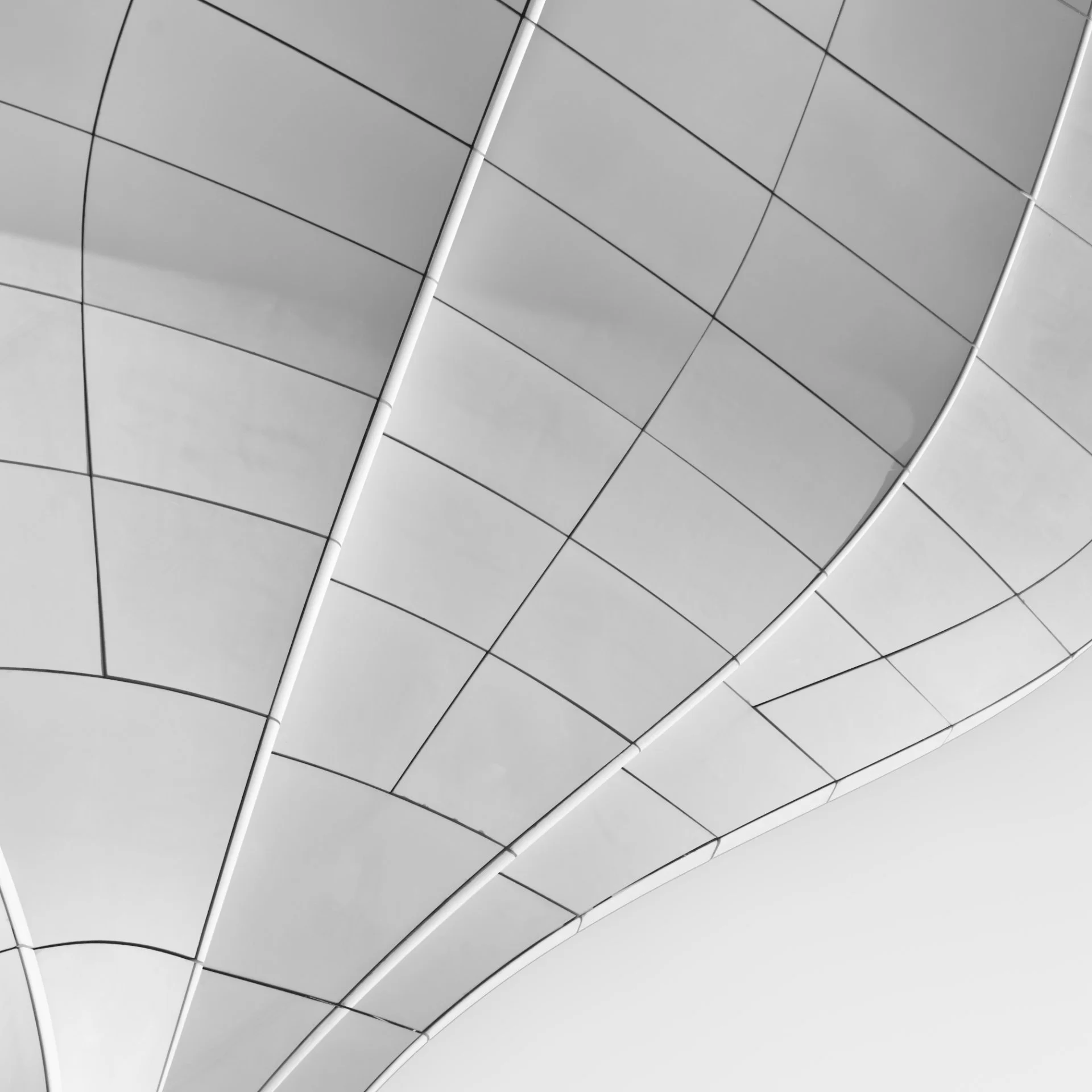
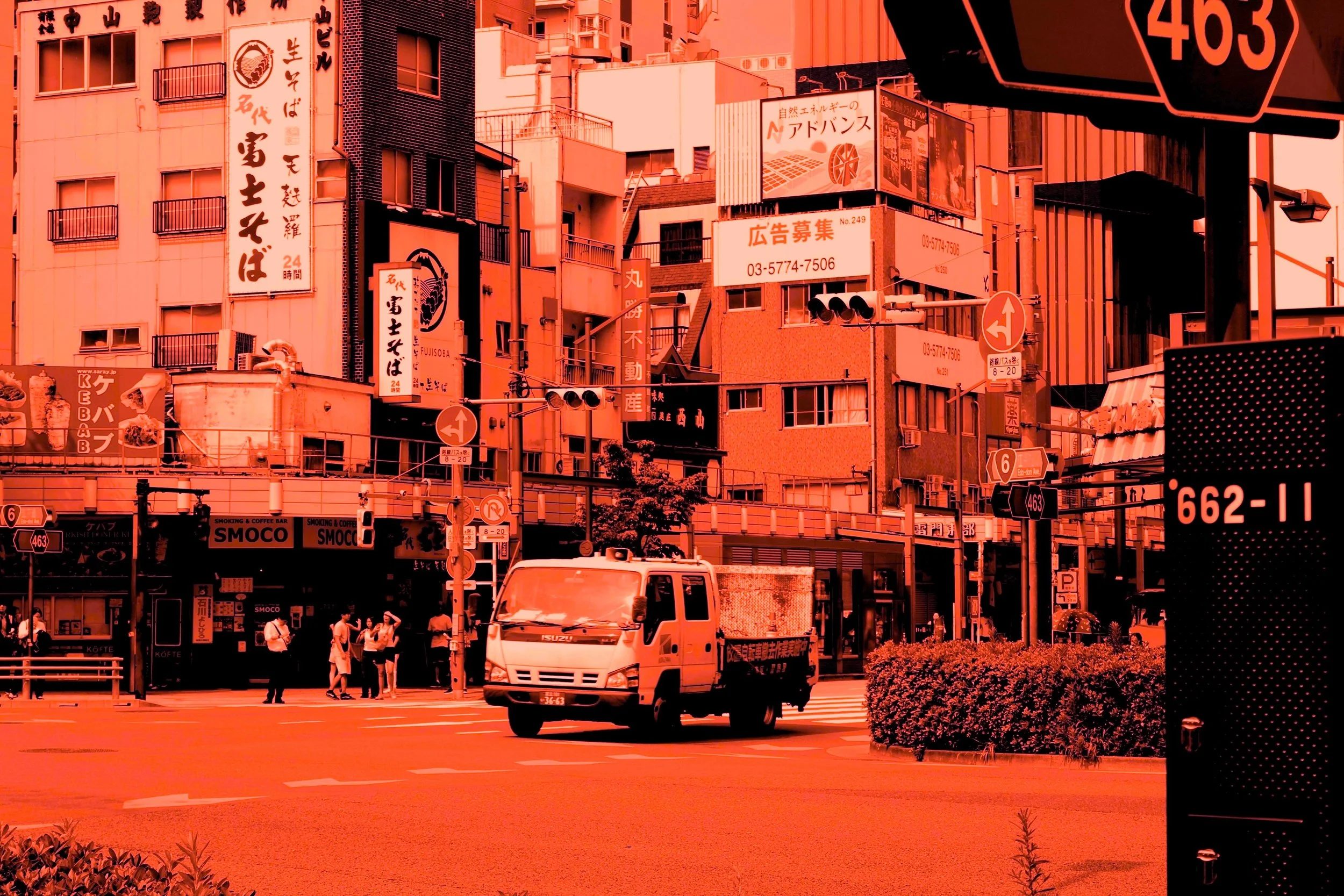
My photographic work is part of a continuous and unprecedented exploration of urban spaces. I am interested in shapes, textures and colors that combine to create my subject.
In my work, my main goal is to offer a fresh look at ordinary things by creating refined and graphic images. I seek the particular point of view, attempting to eliminate the chaos of our urban environment. I like to focus on details and I therefore compose minimalist images bordering on painting.
Emma Wix Montes
-
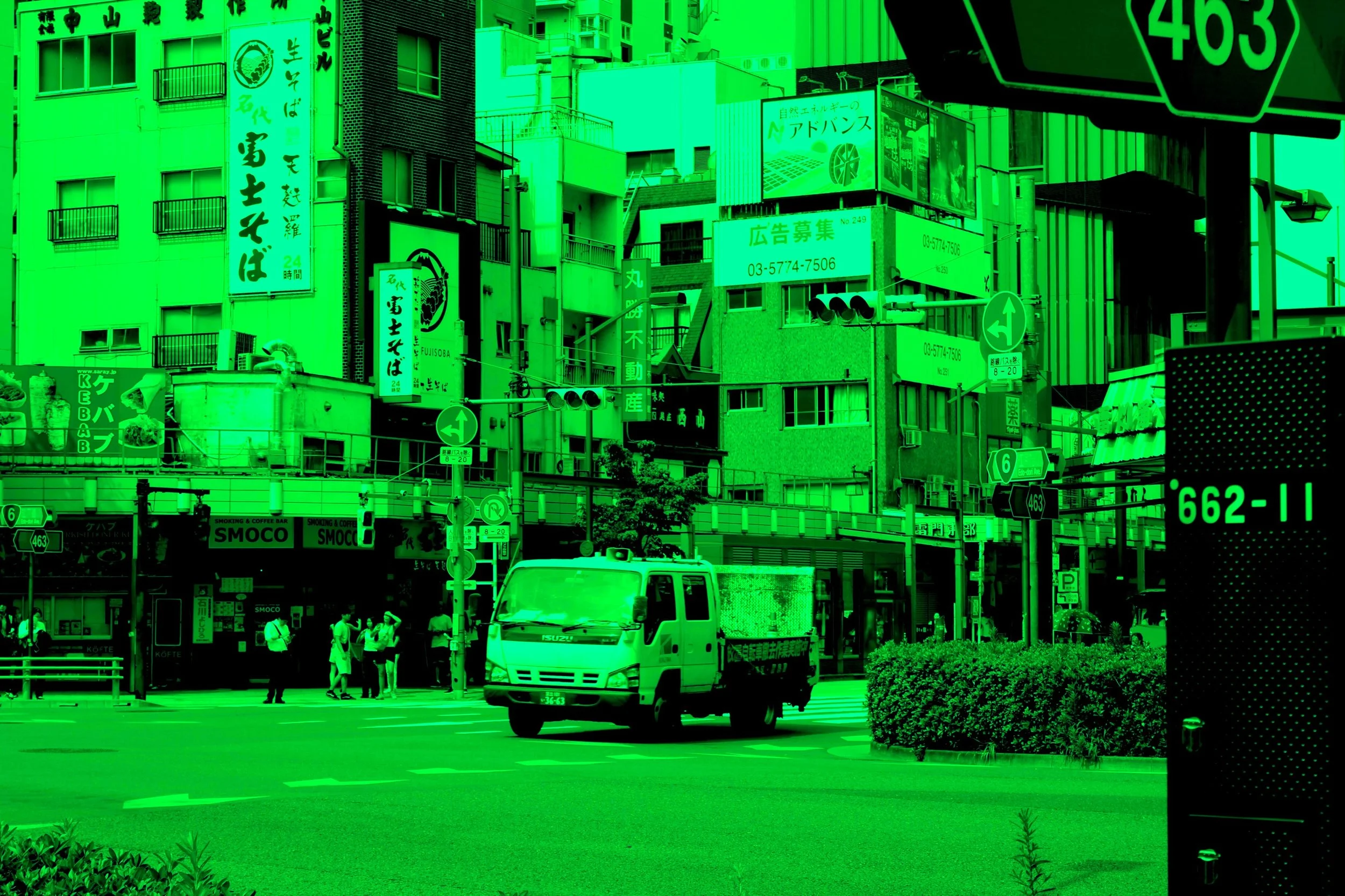
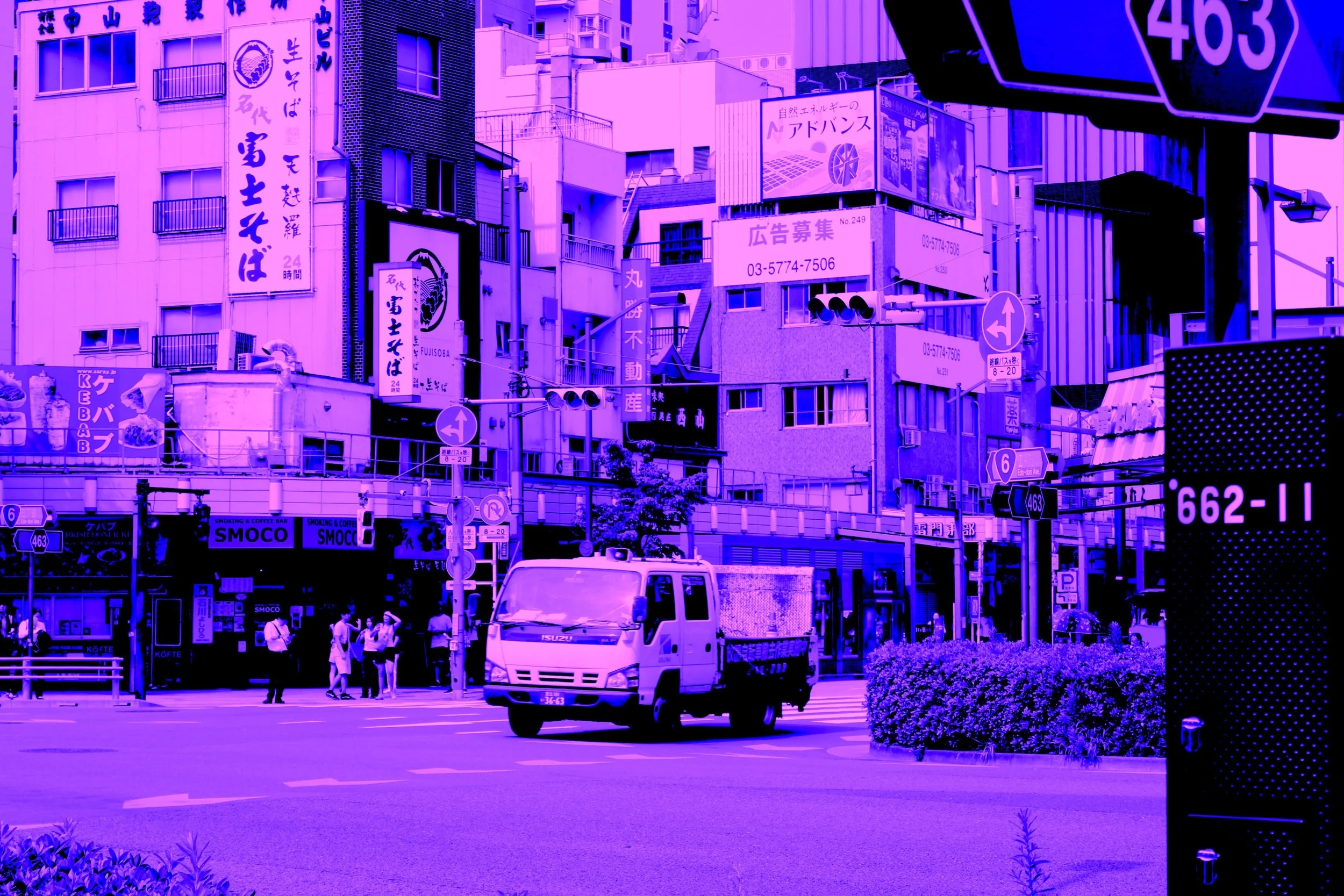
My project explores colour and duplicity.
¿Why use black and white?
This is a question I have often heard about photography. We often try to discover, does it carry our messages better than colour photography? With this project I aimed to explore even further from this.
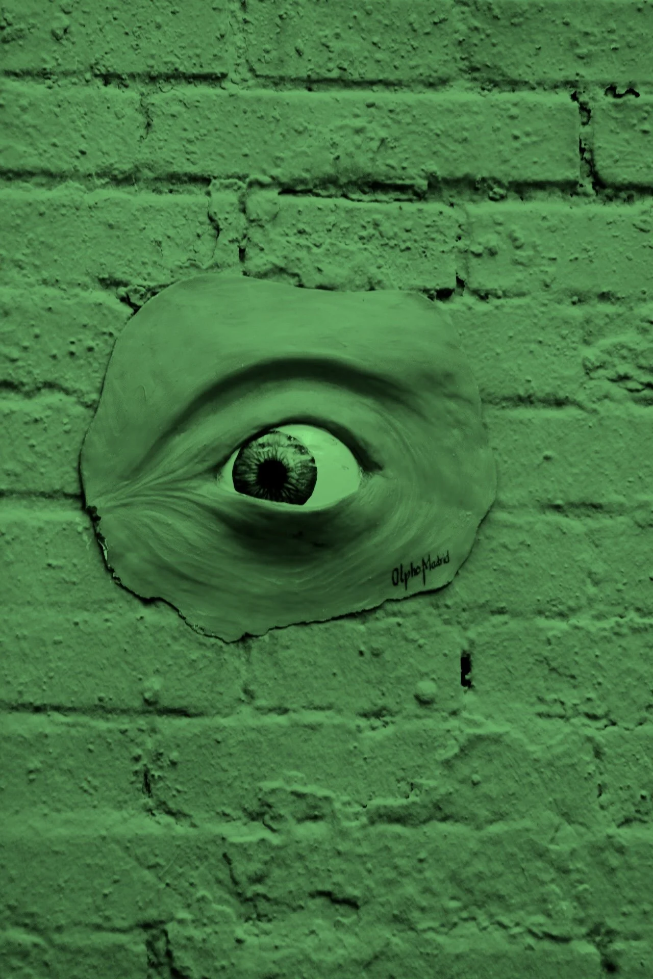
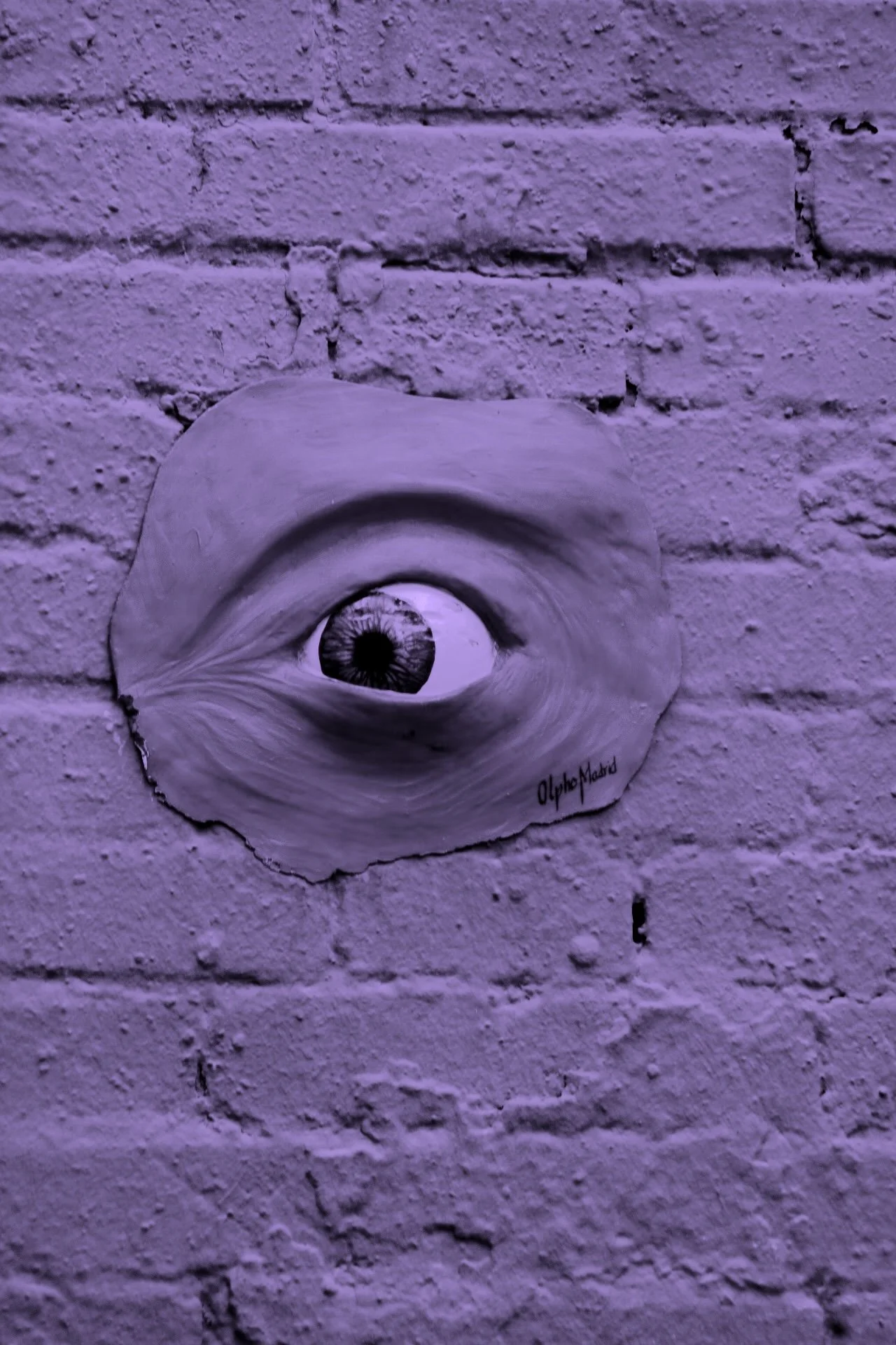
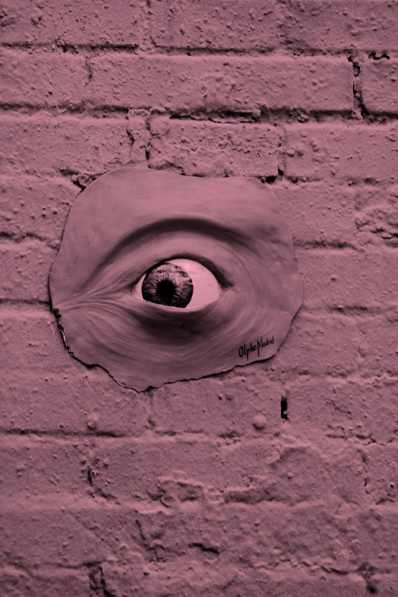
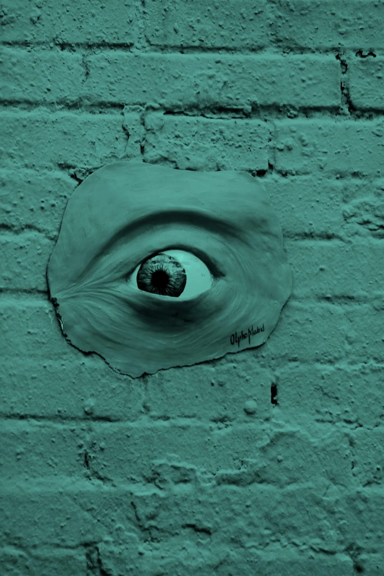
My images consist of several grayscale images, and then the same images copied three times and washed over with a colour. Each image's colour is unique within the project varying intensities and hues between images.
As a whole, this project aims to understand how an interpretation may vary, once a colour is added to an image, or removed. My photographs just add one colour, to show how just the simplest form of a colour changes the meaning of a photograph.
My project has no specific order, as I want to see every viewer to have a new interpretation, seeing the same images in different hues side by side creates a different effect than having them be scattered across the collection, just like seeing a bright image before the black and white creates a new sensation than seeing them the other way around. I want to obtain as many interpretations as possible from my images, so I want to encourage freedom in how one sees it.
Jenny Neale
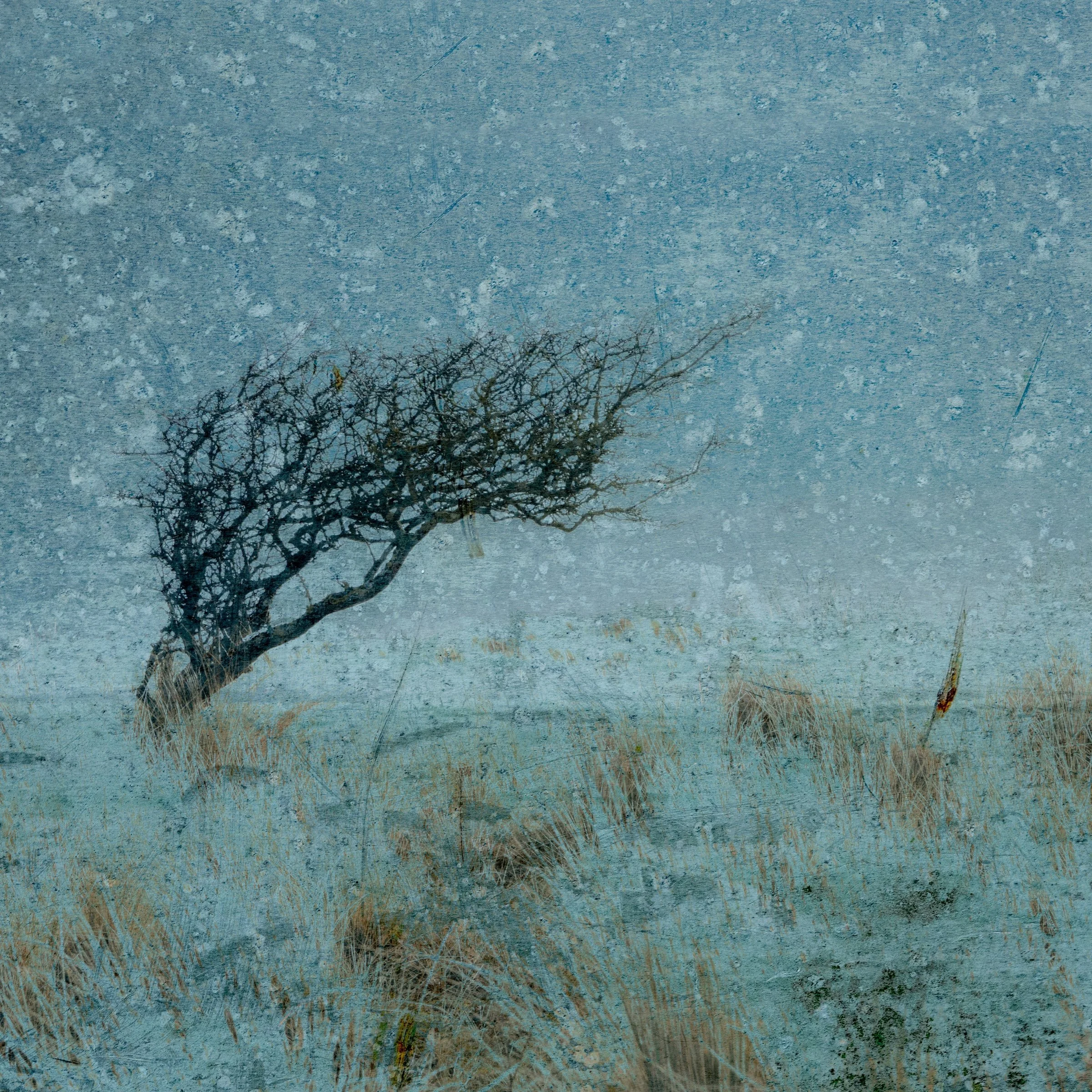
'Windswept'
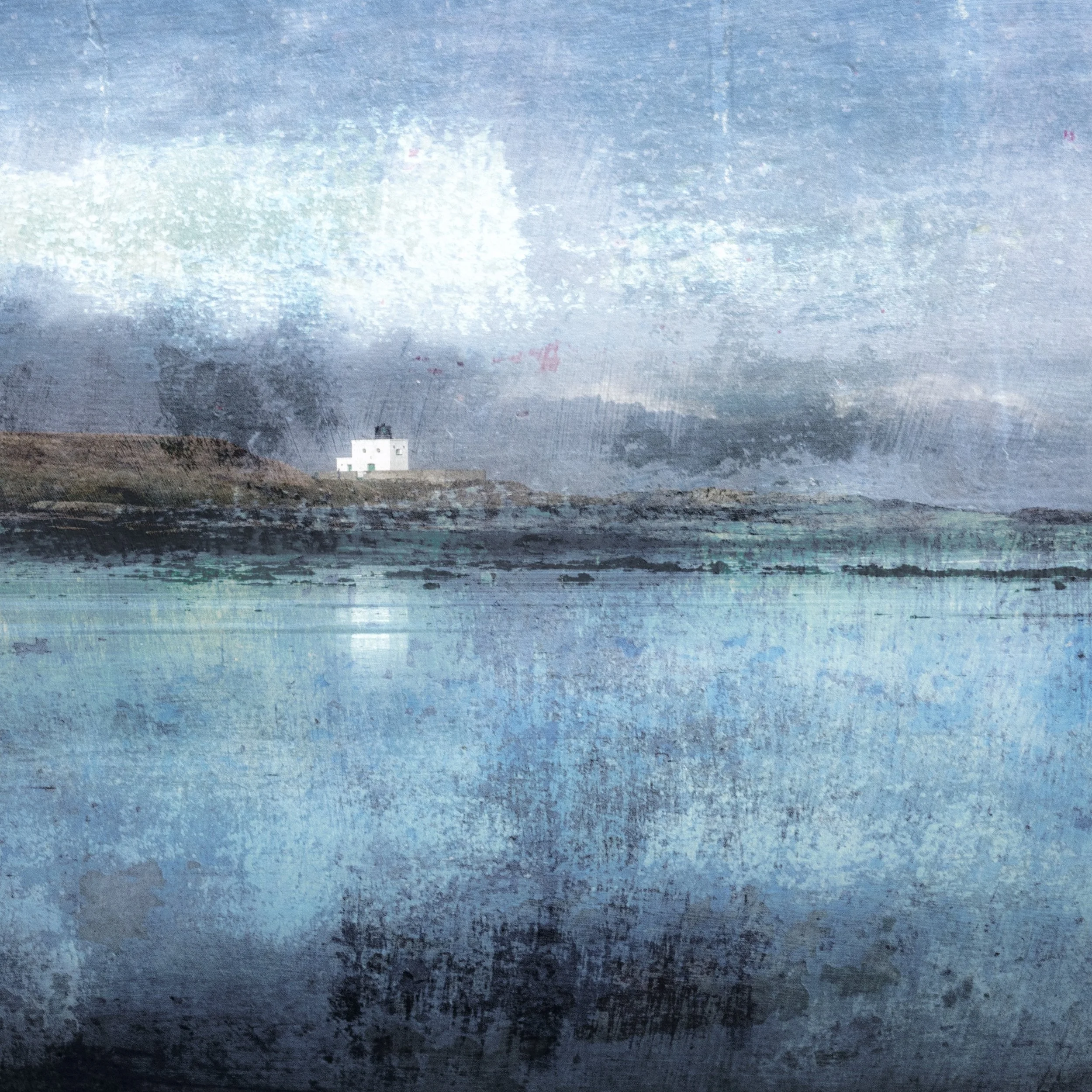
'The Bamburgh Lighthouse'
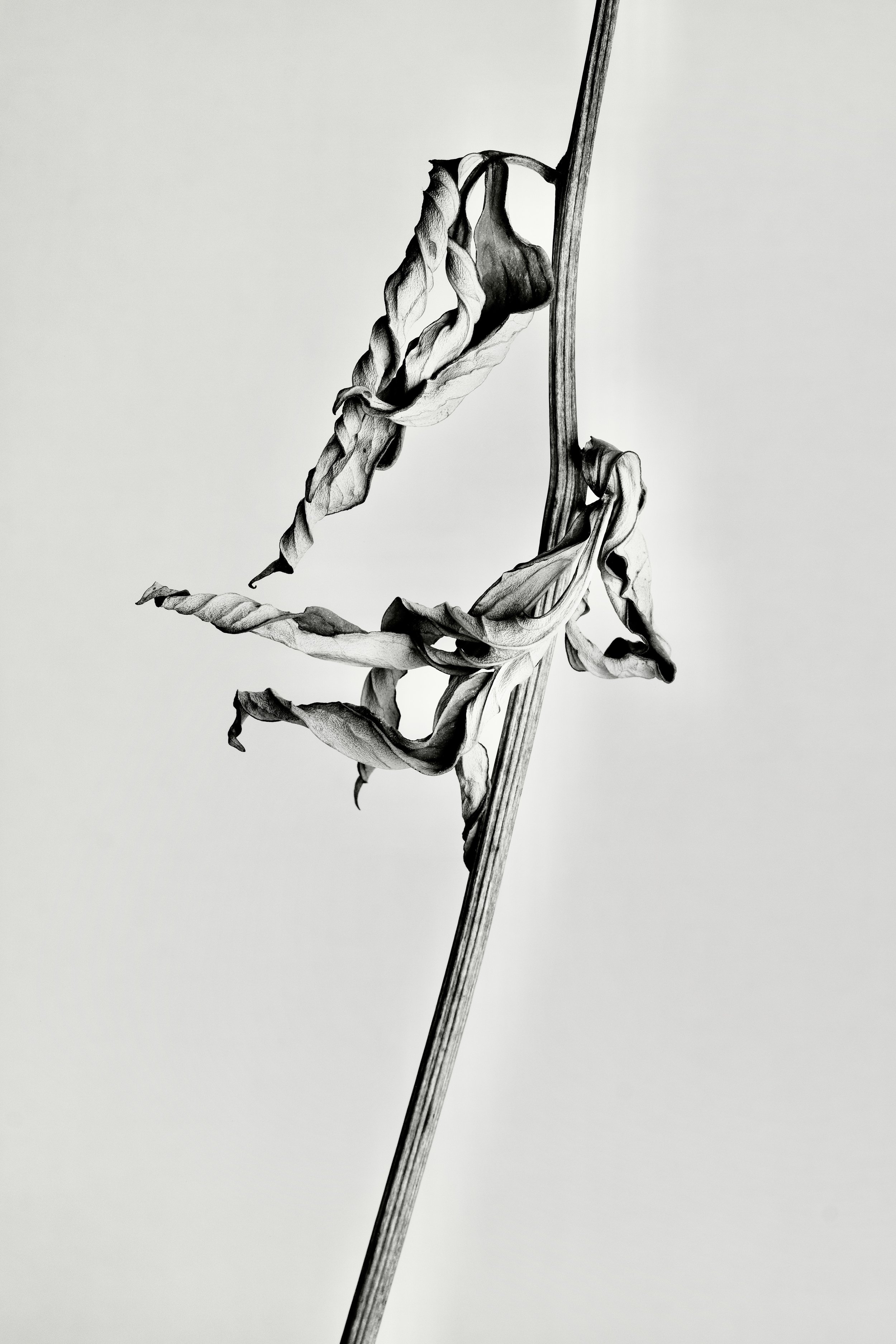
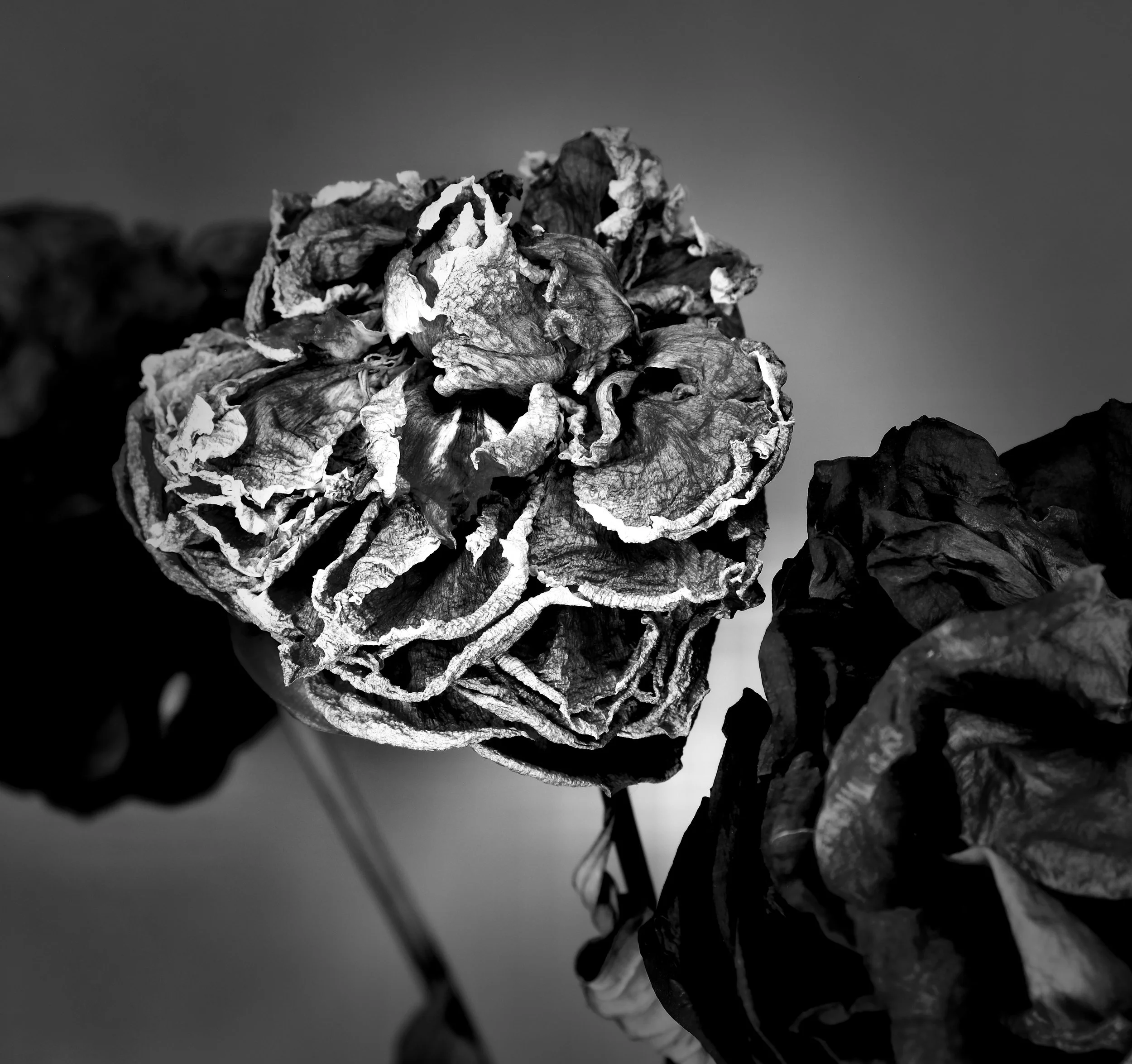
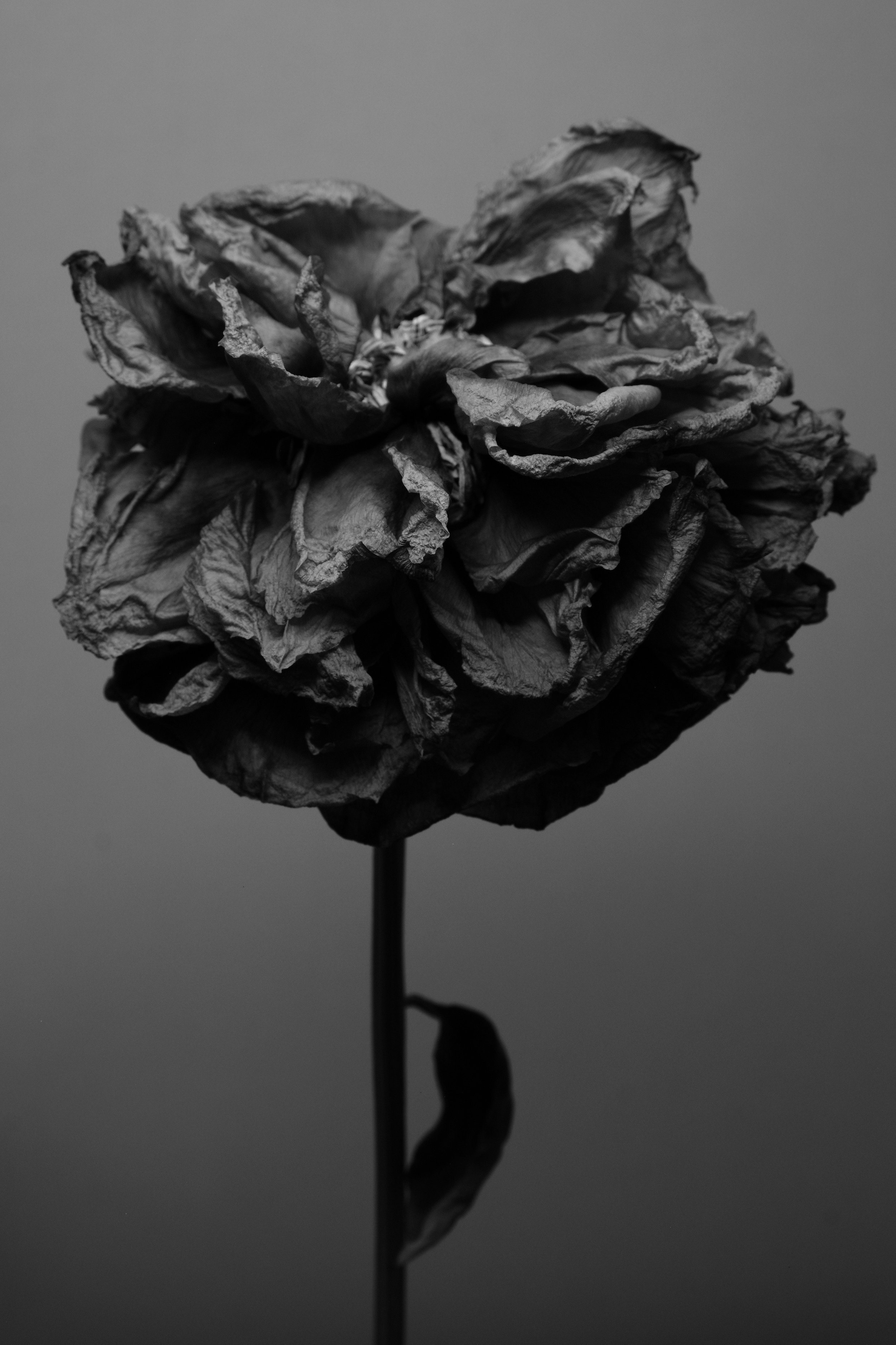
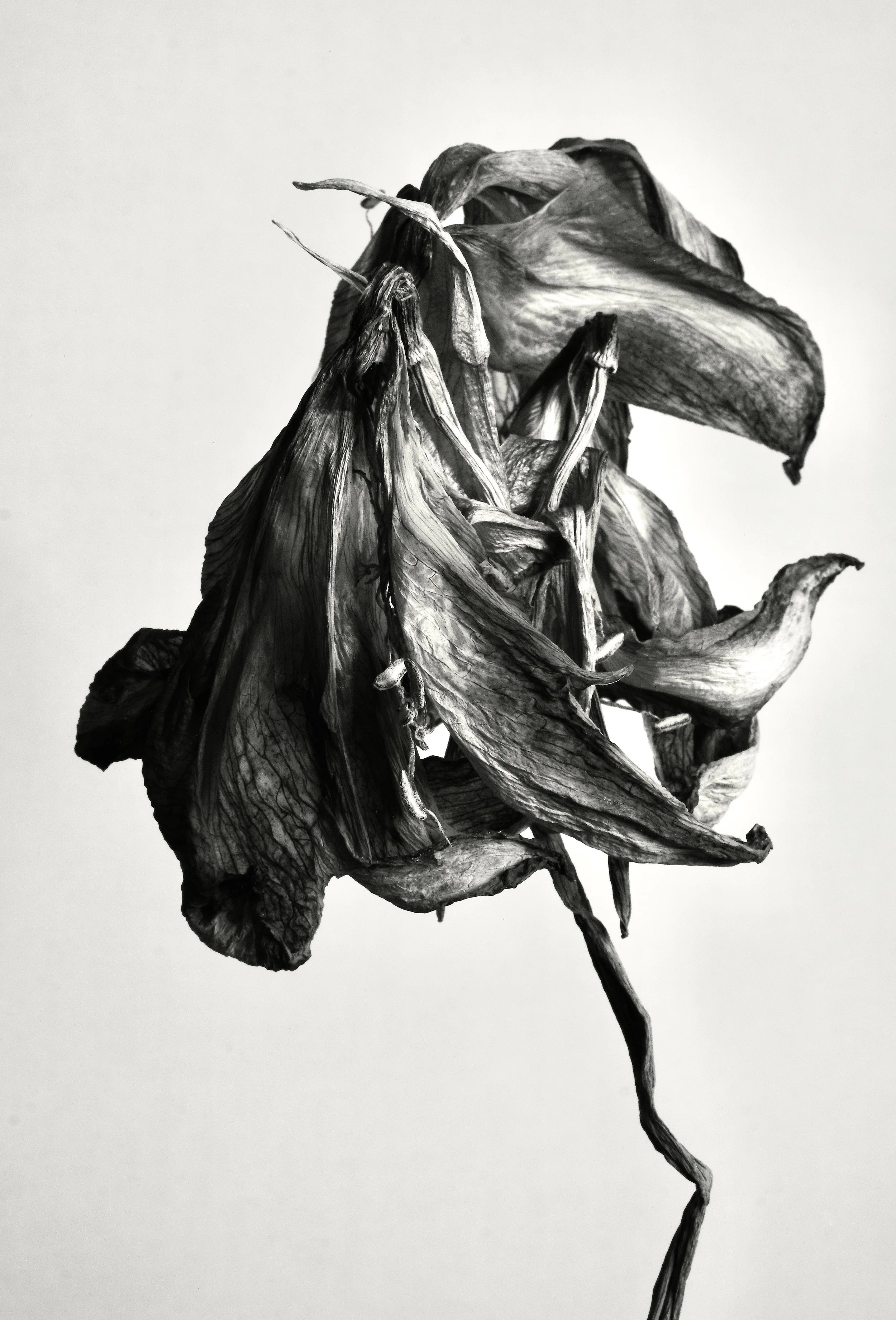
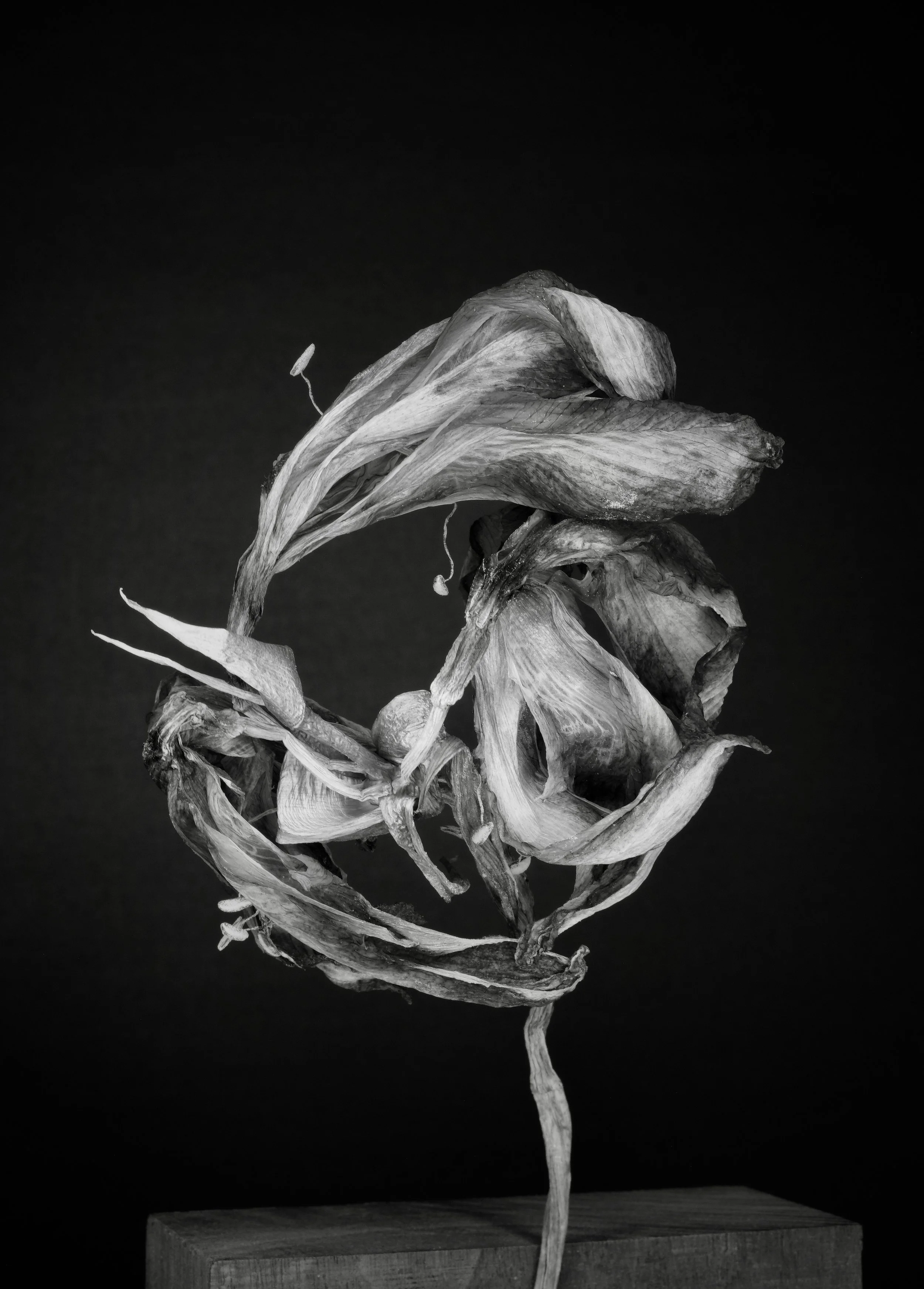
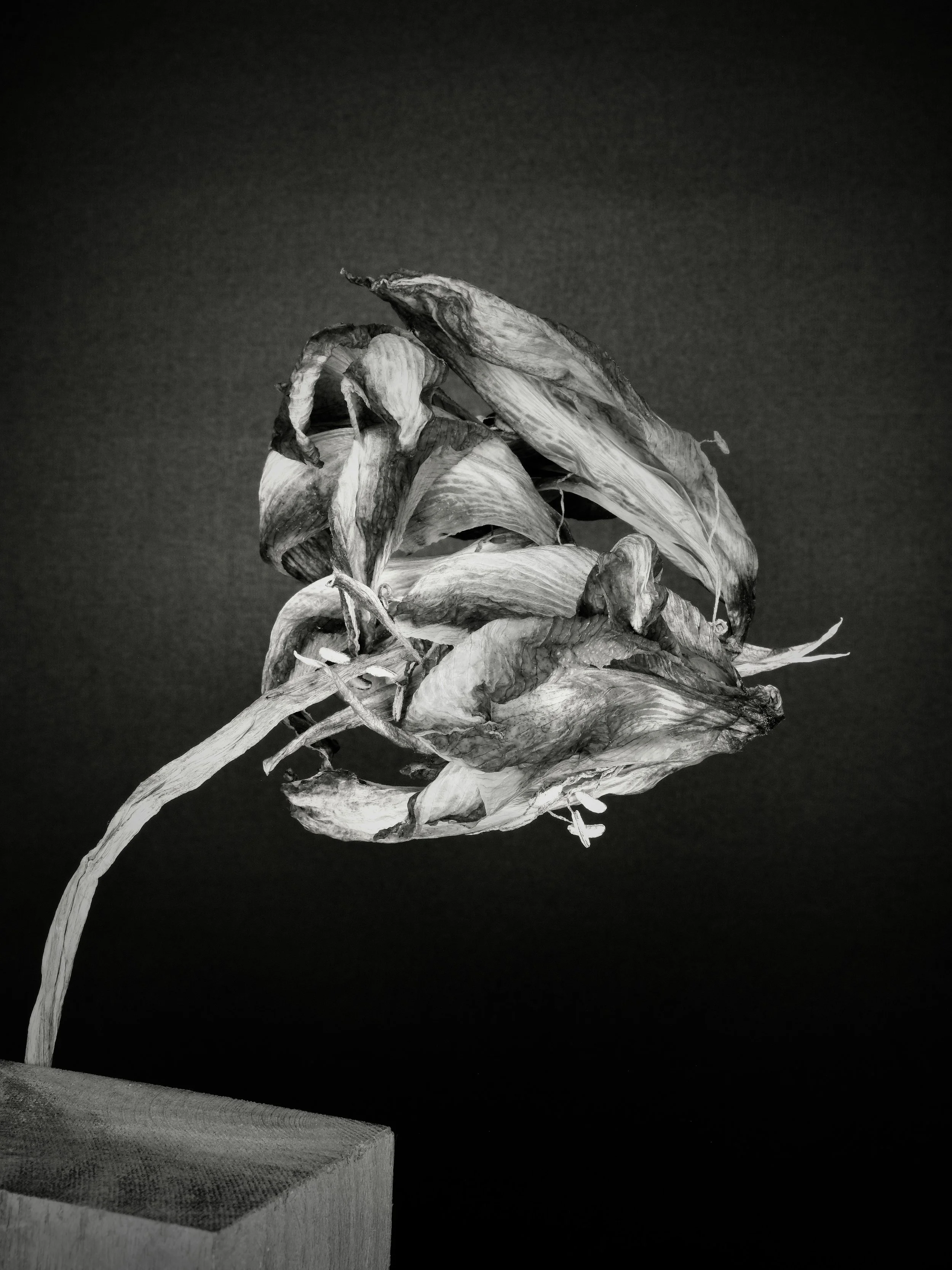
Katarzyna Janikowska-Leett
Discussion :) with Georgia O'Keeffe's joyful flowers — in murdering perimenopausal mood
'Girls Are Going Out'
This is basically how my perimenopausal friends and I look: a little
disheveled, a little bruised, a little headless, but here we go…
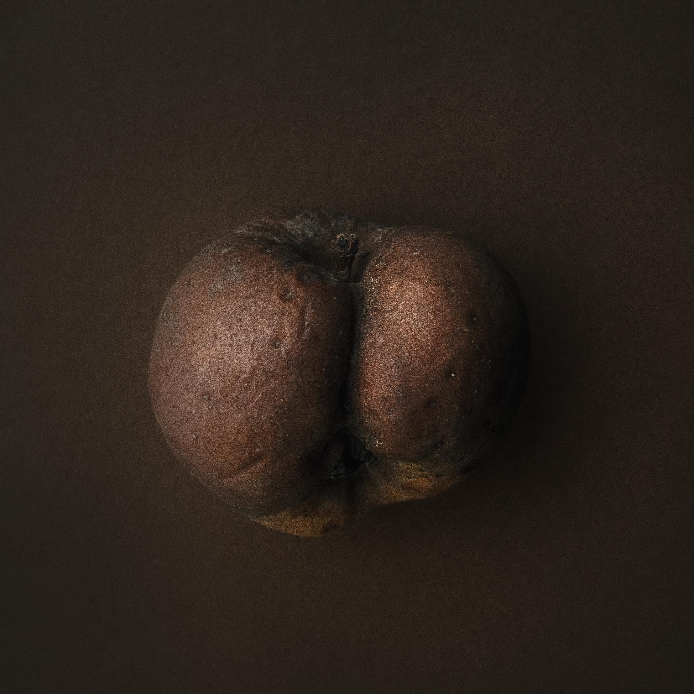
'The Temptation of Eve'
Should be the cherry on the cake, whit this new body language, but I
rather look like this apple than cherry.
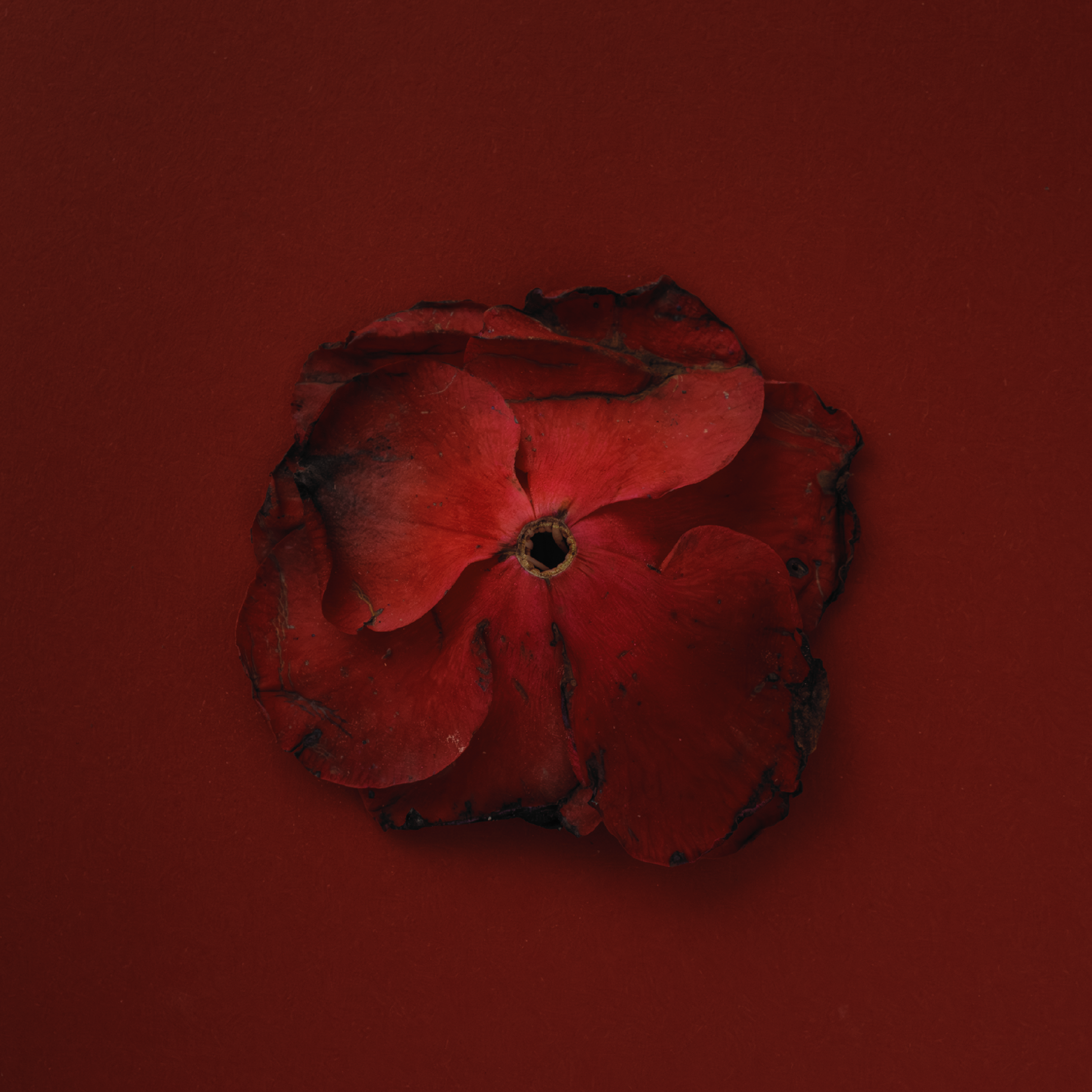
'The Fall of my Lady Camellia'
I am shame myself about my thoughts, no control of my body, how I look
like and after that, I am shame myself think like this.
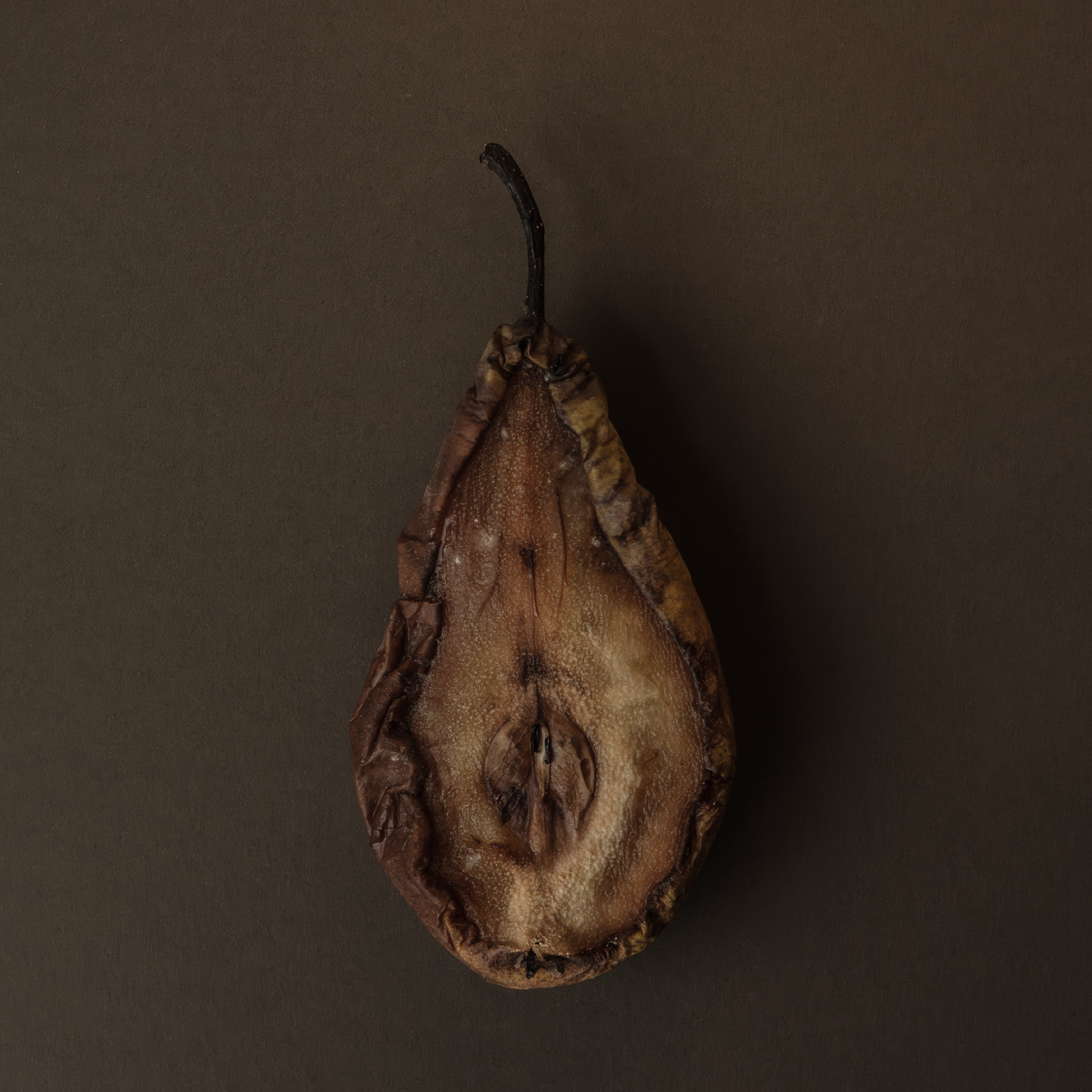
'Missing Myself in Too Many Ways'
I think I am still somewhere there. Behind my ear, under my nail, my
liver. Bloody hell, time to time I feel I am still be.
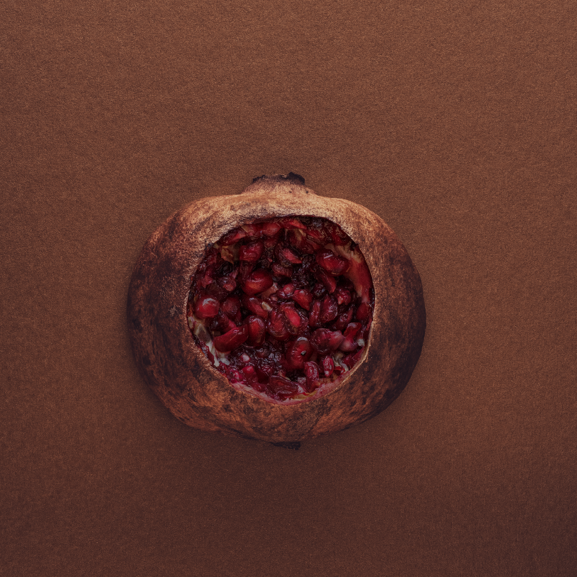
'My Brain Has Also Been Eaten Away'
I look at the crossword, a picture, a mirror: I know that I know, but I
cannot get it out of my head.
'Everything Went Good, Until It Did Not'
You have to love me despite knowing that sometimes it will be muddy
bloody bless.
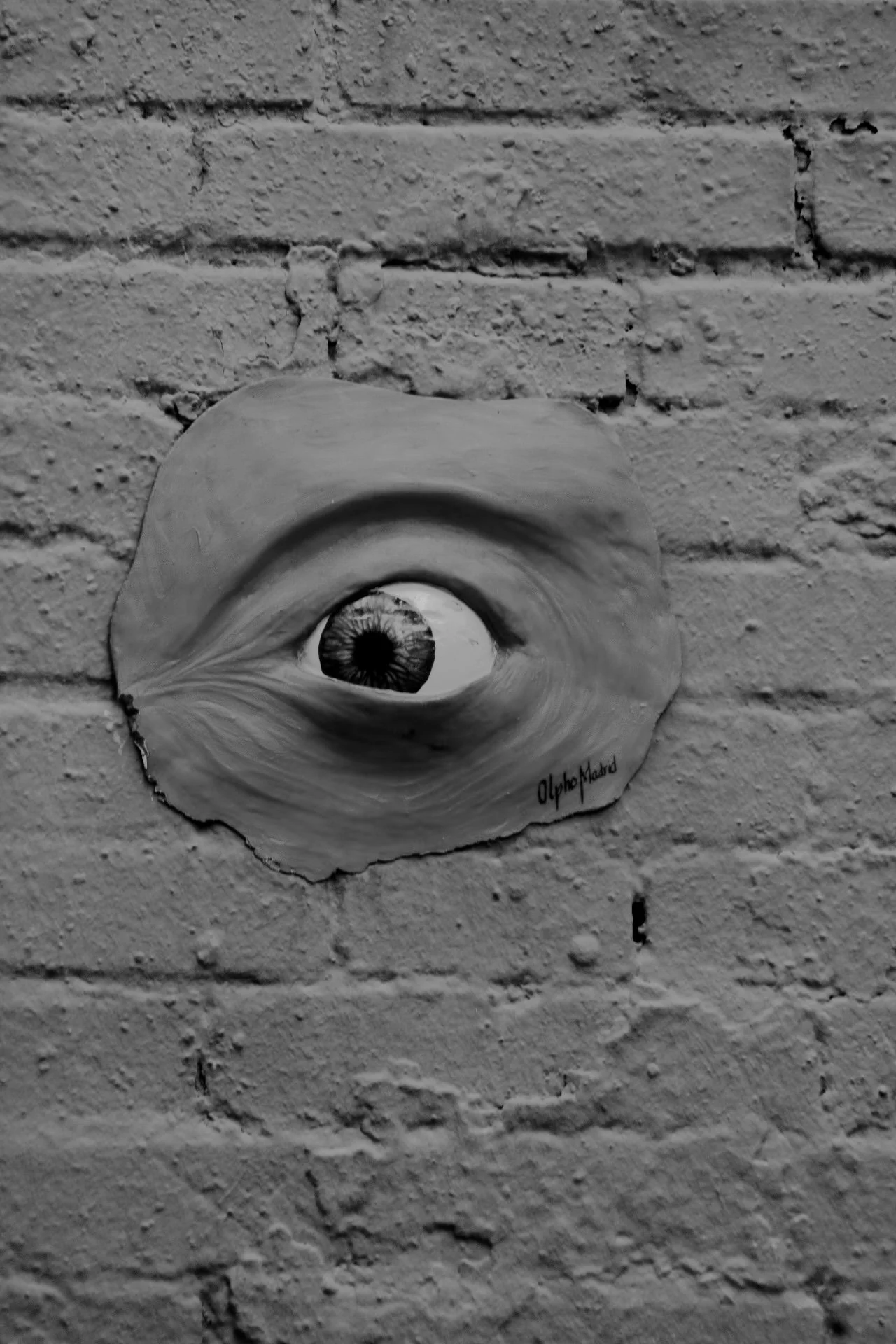
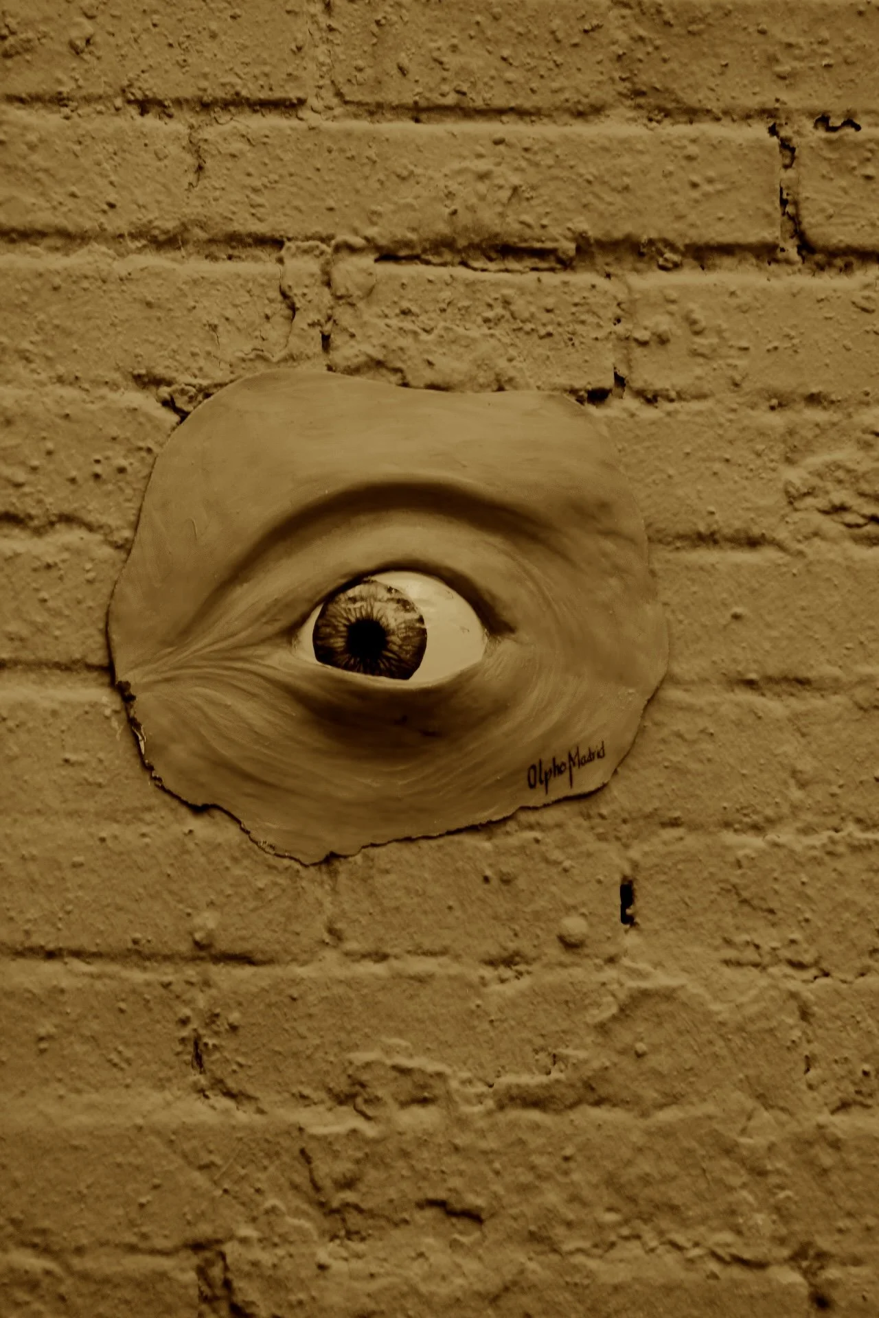
Liwen Tao
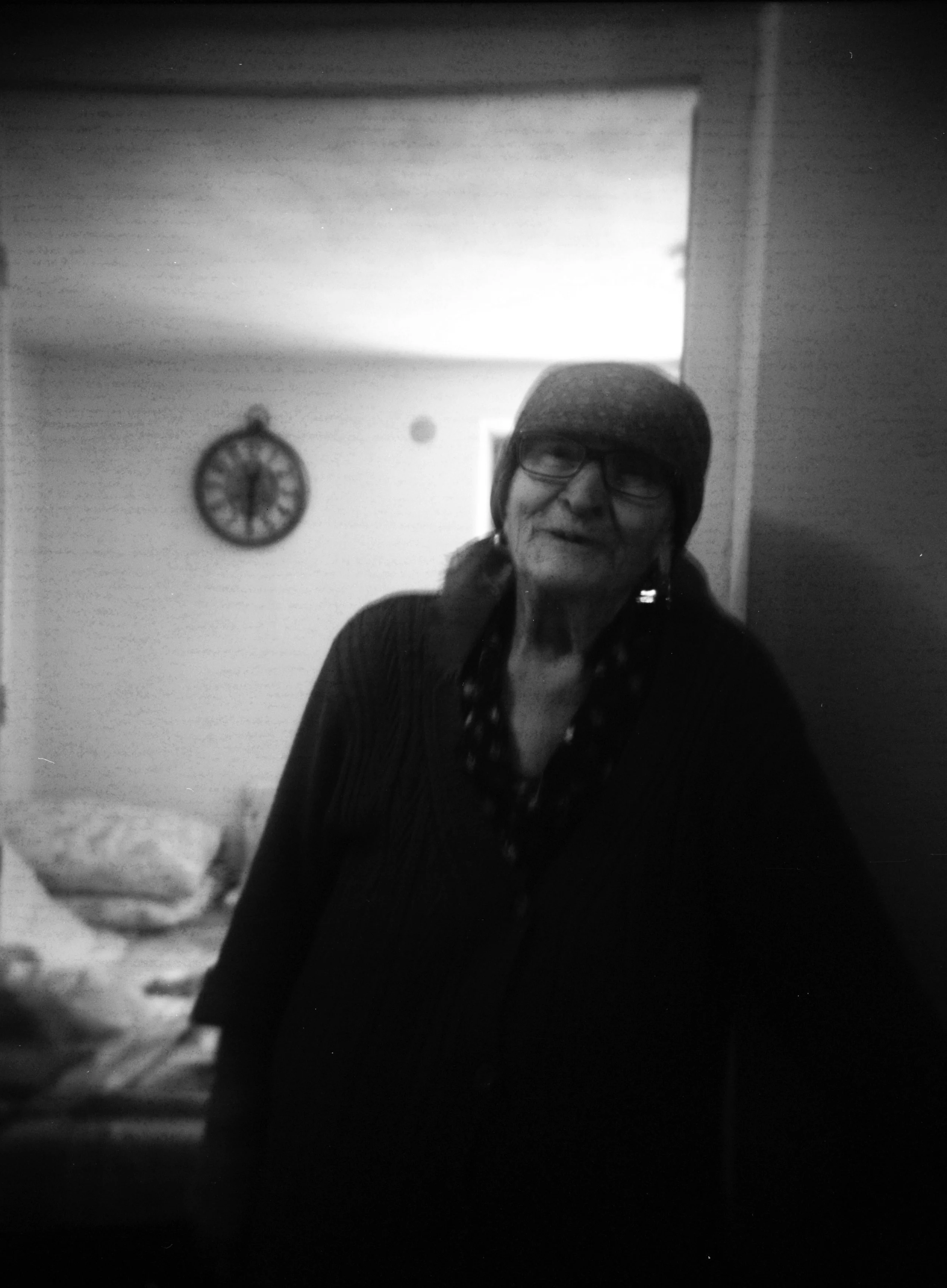
'With Mom'
"A Little Guard"
'Together'
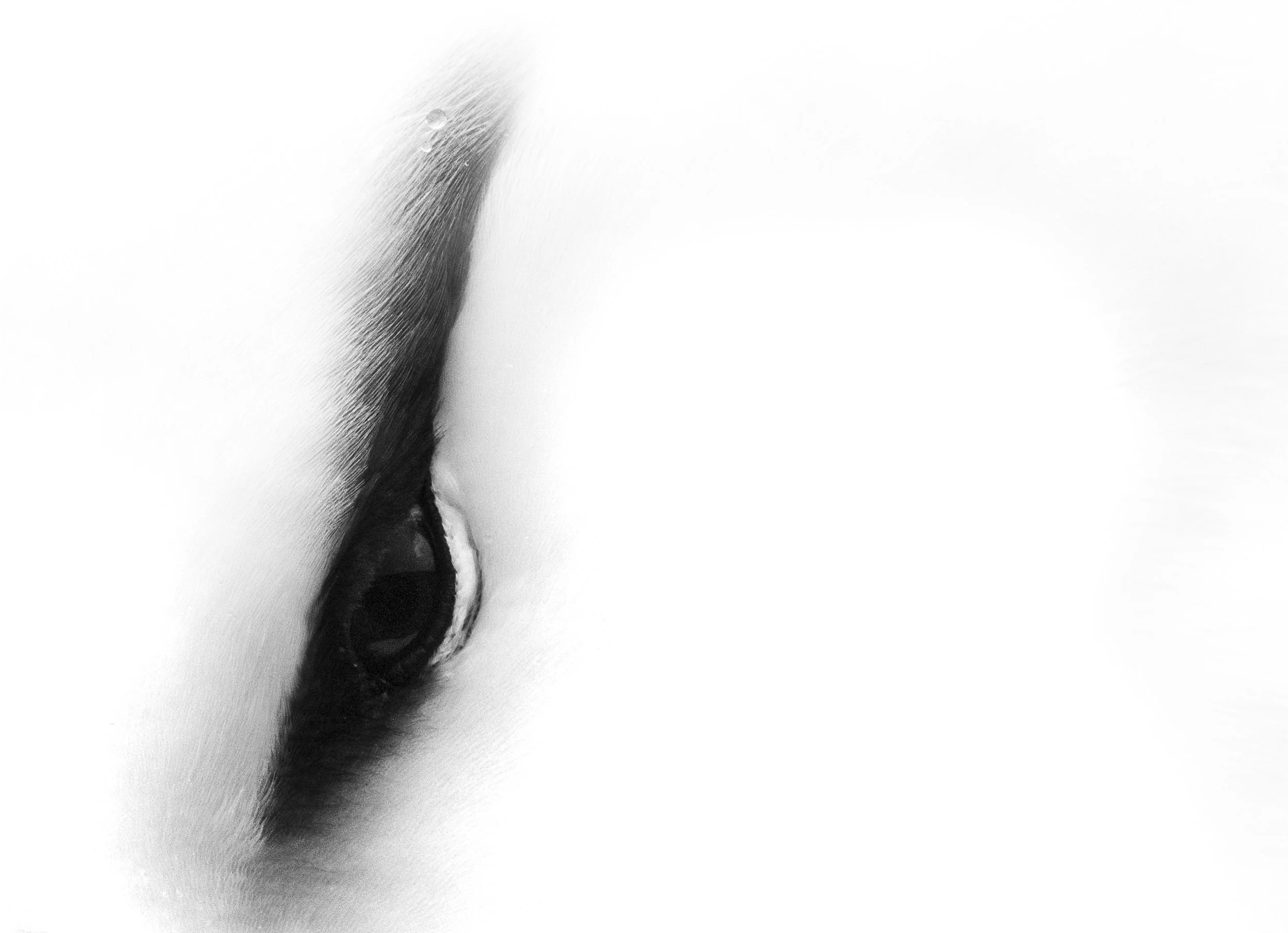
'An Eye'
curated by viktor barkhatov
Share your thoughts
We hope you enjoyed this exhibition as much as we did!
At the end of your visit, it would mean a lot if you could leave a few words of feedback below.
Every artist values being seen and heard and a few heartfelt lines are worth far more than a dozen emoji reactions.